
You've probably had this moment.
You've invested in your business. The office looks right. Your trucks, uniforms, packaging, or storefront all say the right things about who you are. Your team does solid work. But online, it still feels like you're blending in with everybody else.
That usually isn't just a website problem. It's often a brand recognition problem.
A lot of business owners still think of a logo as a finishing touch. Something you add after the "real" work is done. In practice, the logo is one of the first things people use to identify you, judge your professionalism, and decide whether your business feels established or forgettable.
For Cincinnati-area companies competing for attention in search results, social feeds, inboxes, and browser tabs, that matters fast. People rarely study a brand in detail on first contact. They scan. They compare. They make a quick call about whether you seem credible.
Your Logo Is More Than Just a Logo
A logo isn't your whole brand. But it is the anchor that holds the rest of your brand together.
That distinction matters because a lot of businesses put too much pressure on the mark itself. They expect one symbol to communicate everything about their company. It can't. What it can do is give customers a clear, repeatable signal that says, "Yes, you're in the right place."
Research-backed branding guidance makes this point clearly. A logo works best as a brand anchor, not a complete strategy. Recognition comes from consistent use across touchpoints like your website, social media, and documents, not from the mark in isolation, as noted in this explanation of why logo consistency builds recognition across touchpoints.
What business owners often get wrong
The common mistake is treating the logo like art on a wall instead of a working business asset.
A business owner approves a logo, gets a few PNG files, and moves on. Then six months later:
-
The website header uses one version
-
Facebook uses an old cropped icon
-
Google Business Profile shows a blurry upload
-
Sales proposals use a stretched logo from a Word document
-
Email signatures all look different
That's when the brand starts to feel loose, even if the company itself is solid.
Practical rule: If your logo looks different from one customer touchpoint to the next, you're asking people to re-learn your business every time they see it.
The logo's real job
The logo's job is simple. It creates continuity.
When the same mark shows up on your site, your trucks, your social accounts, your PDFs, and your ads, people connect those moments into one brand memory. That's what gives the logo value. Not decoration. Repetition with purpose.
That's also why brand identity work matters beyond the logo file itself. Things like color, typography, spacing, and usage rules turn a logo into a system people can recognize. If you're thinking through that bigger picture, HDM's overview of brand identity services is a useful example of what a more complete approach includes.
The 7-Second First Impression
Your logo does the job your storefront sign used to do first.
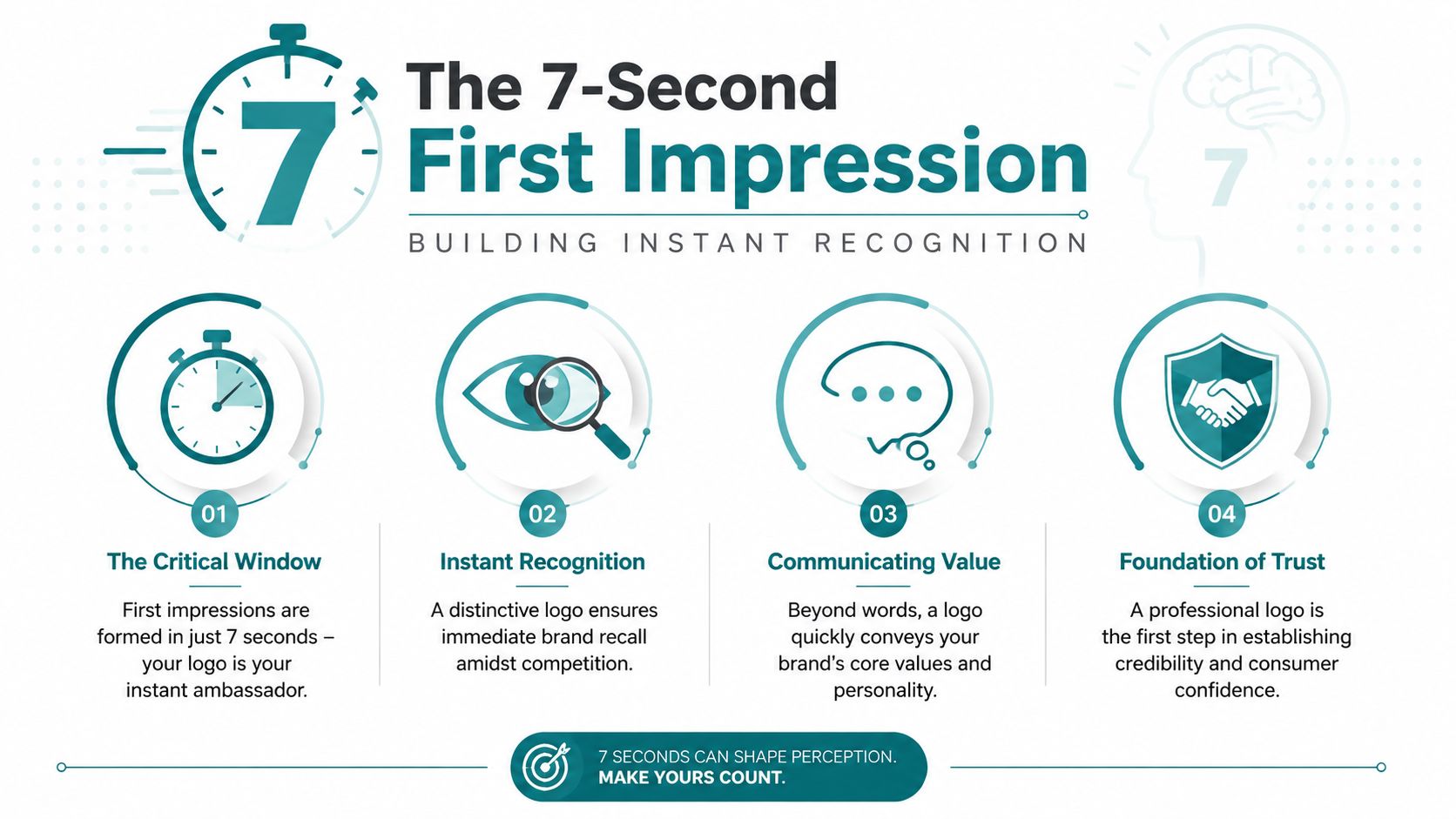
Before someone reads your headline, studies your services, or calls your office, they usually notice your visual identity. On a website, that often starts with the logo in the header. On social media, it's the profile image. In search and local discovery, it may show up before a customer knows anything else about you.
Recognition happens fast
The practical case for why logos are important isn't complicated. People use them to recognize brands quickly.
One industry summary reports that 75% of consumers recognize a brand by its logo, 80% say color plays a key role in that recognition, and 60% avoid brands with outdated or unappealing logos. The same source says consistent logo use across platforms is linked to a 23% revenue increase, which is why logo quality and consistency affect more than appearance. They influence whether people engage at all, according to Huddle Creative's logo statistics summary.
If you run a local service business, that should feel familiar. Two companies may offer similar services, similar pricing, and similar response times. The one that looks more established often gets the first call.
Here's a short video that captures the first-impression side of branding well.
What an unappealing logo signals
A weak logo doesn't just fail to impress. It introduces doubt.
That doubt usually comes from details customers can't explain out loud:
| Customer sees | Customer likely feels |
| --- | --- |
| Blurry logo | This business may not pay attention to details |
| Dated design | This company may be behind the times |
| Inconsistent versions | I'm not sure this brand is organized |
| Hard-to-read mark | I can't tell who this is quickly |
Nobody says those exact words in a focus group. But they make the decision anyway.
A logo doesn't need to be flashy. It needs to be clear, professional, and easy to recognize the moment someone lands on your brand.
In a competitive market, being remembered starts with being identifiable. That's the first practical answer to why logos are important.
Standing Out in a Crowded Digital Space
Recognition is only part of the job. The next question is whether the logo helps people understand what kind of business you are.
That's where many logos fall short. They may be polished, but they don't say much. They could belong to a law office, a tech startup, a coffee roaster, or a landscaping company. If your mark is too generic, it doesn't help you stand apart. It just proves you hired a designer.
What effective logos tend to do
A useful piece of evidence comes from Harvard Business Review. In a study of 597 logos, researchers found that logos that were more familiar and more descriptive of the brand's function tended to improve consumer brand perceptions and overall brand performance more effectively than abstract, nondescriptive logos, as covered in Harvard Business Review's study of 597 logos.
That doesn't mean every business needs a literal icon. A roofing company doesn't always need a roof shape. A bakery doesn't always need a loaf of bread. But the logo should give the right kind of signal.

Clear beats clever
I've seen this trade-off a lot. Owners want something "modern" or "different," and what they get is vague.
That usually shows up in a few ways:
-
Abstract marks with no context that only make sense after a long brand explanation
-
Overbuilt logos with too many details to work on mobile
-
Trend-driven styles that look current for a minute, then age badly
-
Fonts with personality but low readability, especially at smaller sizes
The better choice for most SMBs is simpler and more grounded. Your logo should fit the market you serve, the price point you sell at, and the expectations customers already bring into the decision.
Match the logo to the business model
A logo for a family-friendly restaurant should feel different from a logo for a private equity attorney. A manufacturing firm in the Cincinnati region may need a mark that feels durable and competent. A med spa may need one that feels refined and calm.
Use this lens when evaluating your own logo:
| If your logo feels like this | It may communicate this |
| --- | --- |
| Formal and restrained | Expertise, stability, trust |
| Friendly and approachable | Accessibility, warmth, service |
| Bold and high-contrast | Energy, confidence, action |
| Minimal and clean | Efficiency, modern process |
If your current logo doesn't match the customer experience you're trying to create, that mismatch will carry over into the website too. That's part of the reason visual direction matters in modern site design, which you can see reflected in HDM's take on web design trends for 2025.
How a Strong Logo Impacts Your Bottom Line
A strong logo affects revenue indirectly, but it affects it in very real ways.
It shapes whether a prospect trusts your website enough to stay on it. It affects how polished your proposal looks in a crowded inbox. It changes the perceived quality of your service before a salesperson says a word. Business owners sometimes want a straight line from logo to dollars, but the path is usually: logo to trust, trust to action.
Where the money shows up
A professional logo supports the moments where buyers decide whether to move forward:
-
Website visits If the site looks current but the logo looks cheap, the whole experience feels off. People may not know why, but they notice the mismatch.
-
Sales materials Quotes, pitch decks, brochures, and one-pagers all borrow credibility from the visual identity at the top.
-
Perceived value Companies with polished branding often have more room to present themselves as premium, specialized, or established.
-
Referral conversion Even warm referrals still check the website. If the brand looks sloppy, the referral loses momentum.
If a prospect has to choose between two unfamiliar providers, the business that looks more credible often gets the benefit of the doubt.
What doesn't work
A weak logo creates friction in small but costly ways.
Maybe it's a low-resolution file that looks fuzzy on a Retina screen. Maybe the colors clash with the website. Maybe the icon is too detailed to read in a browser tab. None of those issues sound dramatic on their own. Together, they make the business feel less buttoned-up.
That's why branding decisions shouldn't get separated from web and marketing decisions. When an agency builds a site, runs SEO, or sets up campaigns, the logo has to function inside that whole system. HDM is one example of a Cincinnati-area agency that handles design, websites, and growth marketing together, which matters when the goal is a digital presence that looks consistent and converts cleanly.
Putting Your Logo to Work Digitally
A logo that only works in one place isn't finished.
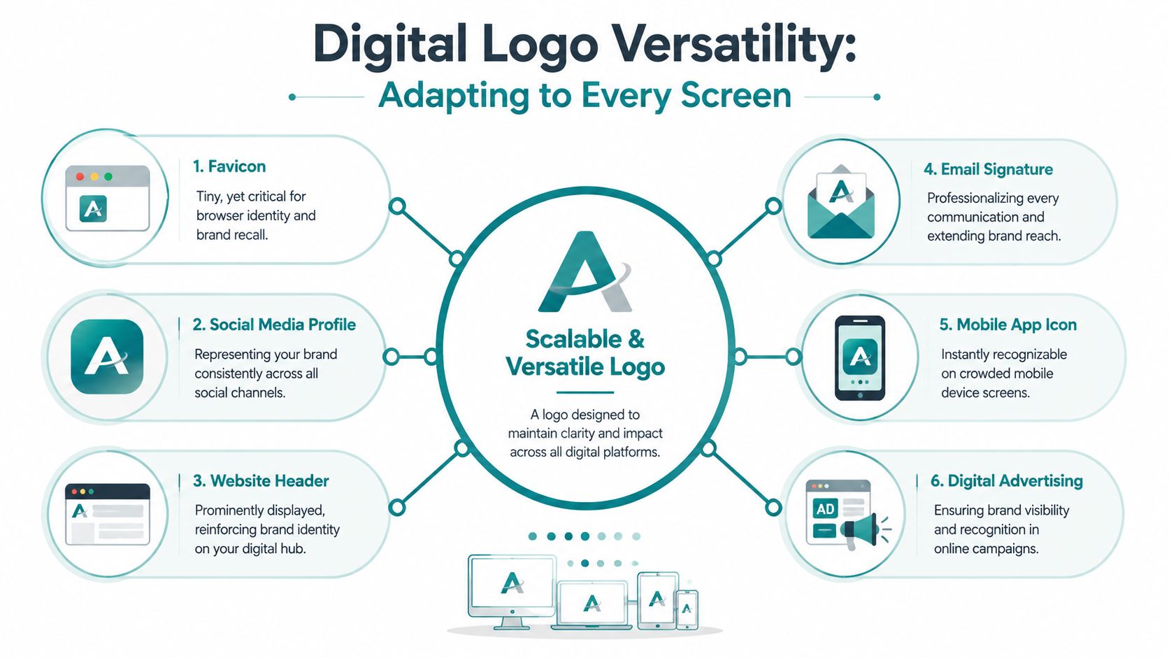
Today it has to perform on a website header, in a browser tab, on social media, inside email signatures, on invoices, in paid ads, and sometimes in app-style interfaces or customer portals. That means the logo is partly a design asset and partly a technical asset.
The file types you actually need
A lot of owners are surprised when a developer asks for an SVG or vector source file.
Here's the plain-English version:
-
SVG works well for websites because it scales cleanly without getting blurry.
-
AI or EPS files are source files designers use for print, edits, and future exports.
-
PNG is useful when you need transparency, but it's still a fixed-size raster image.
-
JPG is usually the least flexible option for logo use because it doesn't support transparency well and can lose quality.
If all you have is a tiny PNG from years ago, your logo is going to fight you every time you update your website or launch a new marketing asset.
Consistency is operational, not cosmetic
Logo consistency is often treated like a style preference. It's more than that.
According to Wix's branding guidance, repeated exposure to the same mark across web, print, and social assets strengthens memory associations and makes the brand easier to identify, while inconsistent use can reduce perceived professionalism. That's the practical reason to standardize usage, as explained in Wix's article on how logo consistency supports brand recognition.
Here's what consistent digital use usually requires:
-
One approved primary logo for standard use
-
A secondary version for tight spaces like social icons or narrow headers
-
Defined colors so the logo doesn't shift from one vendor or platform to another
-
Spacing rules so it isn't crowded by text, buttons, or photos
-
Light and dark versions for different backgrounds
Operational advice: Create a simple brand sheet and keep it where your staff, printer, designer, and web team can all access the same files.
Where to check your logo this week
If you want a quick audit, review these six places:
-
Website header and footer Make sure the logo is crisp, sized correctly, and linked to the homepage.
-
Favicon This is tiny, but it still matters. If your current logo disappears at that size, you may need a simplified icon.
-
Google Business Profile and social profiles Use the same version everywhere unless the platform forces a crop.
-
Email signatures Standardize them across the team so outbound communication looks like it comes from one company.
-
Lead magnets and PDFs Quotes, brochures, and downloads should use the same logo, color, and typography rules.
-
Ad creative and landing pages The logo should match the click destination. Disconnect here hurts trust.
If you need a framework for that broader system, HDM's article on why your brand needs a design system is a practical place to start.
Your Logo Is Your Hardest-Working Employee
Your logo clocks in before your sales team does.
It greets people on your website. It shows up in search, social, email, proposals, and invoices. It works when you're closed. It works when your team is off. It works when someone hears your company name from a friend and looks you up five minutes later.
That's why logos matter. Not because they're decorative, and not because every business needs some elaborate brand story. They matter because they help people recognize you, sort you from competitors, and decide whether you feel credible enough to contact.
What to remember
If you strip this down to the practical essentials, a strong logo should do four things well:
-
Identify your business quickly
-
Support trust at first glance
-
Fit the kind of customer you want to attract
-
Work consistently across every channel you use
If it does those four things, it's earning its keep.
If it doesn't, the problem usually isn't that the logo needs to be fancier. It usually needs to be clearer, more usable, and better integrated into the rest of your digital presence.
The logo is not the whole brand. It's the part people use first to recognize whether the rest of your brand hangs together.
For business owners in Cincinnati and the surrounding area, that's the key takeaway. A logo won't fix weak service, unclear messaging, or a poor website experience. But when your business is solid, your logo helps that quality register faster. It becomes the visual shortcut that tells people they're dealing with a company that knows who it is.
That's a business asset worth taking seriously.
If your current logo feels disconnected from your website, SEO, or day-to-day marketing, HDM can help you evaluate the full picture. That may mean refining the logo itself, building a cleaner brand system around it, or making sure your site and marketing assets use it consistently so your business looks as established online as it is in the physical world.