

A lot of Cincinnati firm owners end up in the same spot. Referrals still matter, your reputation is solid, and yet your website feels like an old brochure that happens to live online. It lists practice areas, shows a phone number, maybe has a stiff attorney headshot, but it doesn't consistently turn visitors into consultation requests.
That gap matters because people rarely look at just one firm and call right away. One legal marketing summary reports that 75% of people looking for a lawyer visit two to five firm websites before making contact, and the average legal website converts only 3% to 4% of visitors into leads, while only 35% of firms with a website had ever gained a client from it, according to the same summary at Connective Web Design's study roundup. In plain terms, your site usually isn't being judged in isolation. It's being compared side by side with other firms in your market.
That's why good law firm website design isn't a beauty contest. It's a trust and intake system. The firms that get more calls usually aren't the ones with the flashiest homepages. They're the ones that answer the visitor's question fast, make the next step obvious, and remove doubt on mobile.

Why Your Law Firm Website Is Your Best Intake Tool
A Cincinnati parent searches for a custody lawyer on her phone at 9:30 p.m. She opens three firm sites in a row. One loads with a slideshow, tiny menu text, and a long welcome paragraph. Another looks polished but makes her hunt for whether the firm handles her issue in Hamilton County. The site that gets the consultation request is usually the one that answers her questions fast, shows a clear call button, and makes the contact form feel easy.
That is why a law firm website works as an intake system first. Good looks help. Clear trust signals and low-friction action help more.
Trust gets built before anyone calls
Small firms rarely lose leads because a lawyer lacks qualifications. They lose leads because the site creates doubt in the first 15 seconds. Visitors are checking a short list: do you handle this kind of matter, do you serve my area, can I contact someone without jumping through hoops, does the firm look current and credible, and will this take two minutes or twenty.
If any answer feels fuzzy, people keep comparing firms.
That pressure has increased because having a website is no longer a differentiator. The ABA's 2022 Websites and Marketing TechReport summary, as cited by Taqtics, reported that 94% of firms had a website, while fewer reported having mobile-friendly sites or SSL/HTTPS security. The takeaway is simple. A basic site is common. A site that feels trustworthy and easy to use still stands out.
Practical rule: Your website does not need to impress everyone. It needs to reassure the right prospect quickly enough that they take the first step.
Smaller firms can still outcompete bigger ones online
I have seen this across small-firm rebuilds. Owners often assume they need dramatic visuals to look established. In practice, calm pages beat flashy ones when the goal is consultation volume.
A smaller firm can win with a cleaner intake path than a larger competitor. That means a visible phone number, thumb-friendly buttons, short forms, real attorney photos, and copy that sounds like a lawyer speaking to a worried client instead of writing for a directory listing. Those choices are not glamorous. They are effective.
If you want a quick way to evaluate whether another attorney site is running on a cookie-cutter system or something more custom, you can see which AI builder attorneyintown uses. That will not tell you whether the site converts, but it can help you spot when a polished design is mostly template dressing.
The sites that convert usually feel calmer
The best law firm websites act more like a front desk than an advertisement. They reduce uncertainty. They make the next action obvious. They work well with one thumb on a phone in a parking lot, a hospital hallway, or a kitchen after the kids are asleep.
That is the standard worth using. If the site helps a stressed visitor trust the firm enough to call or book a consultation, it is doing its job.
Planning Your Site Strategy and Structure Before You Design
Most bad law firm websites don't fail because of colors or fonts. They fail because nobody settled the structure before the design started. The result is a generic homepage, practice areas lumped together, missing local pages, and a menu that grew by accident.
Before anyone opens Figma, WordPress, Webflow, or another platform, map the site around how prospects search and decide.
Start with who you help and what they need
A useful website plan fits on one page. If it takes ten pages to explain your services, the site will probably confuse visitors too.
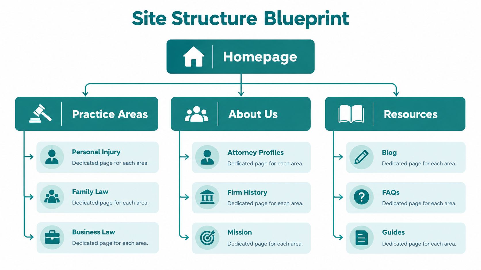
Write down three things. Your primary client types — be specific. "Families dealing with custody disputes in Greater Cincinnati" is more useful than "people needing legal help." Your core practice areas — each major service usually deserves its own page; don't bury personal injury, family law, or business law inside one generic services page. Your service geography — for firms targeting local clients, separate location pages for each office and a fully optimized Google Business Profile are repeatedly identified as key ranking factors, according to LawSEO's legal website design checklist.
That local point gets missed all the time. If your firm serves Cincinnati, Mason, West Chester, Blue Ash, Covington, or other nearby markets, the site should reflect that plainly.
Build a simple sitemap before design
A small firm doesn't need a sprawling information architecture. It needs one that mirrors intent.
A solid starting structure usually looks like this: a homepage with a clear statement of who you help, where you work, and how to contact you; practice area pages, one page per major service, each answering what the matter involves, who it's for, what concerns clients usually have, and what to do next; location pages, one page per office or major local market if those pages are distinct and useful; attorney profiles that do more than list bios — they should help a prospect decide whether they trust the people behind the firm; and an FAQ or resources section, good for answering intake questions before a call.
A sitemap should reduce choices, not create more of them.
Decide your calls to action early
A lot of redesigns go off track because nobody agrees on the primary conversion action. Is it a phone call, a consultation form, a booking request, or all three?
Choose a clear priority. Then repeat it consistently across the site. If every page asks visitors to do something different, many of them won't do anything.
A simple messaging brief helps here: a primary CTA for high-intent visitors, a secondary CTA for people who need a little more confidence, trust points you want visible sitewide, and questions clients ask before contacting you.
This also keeps scope under control if you hand the project to a designer, developer, or agency. If you want a plain-English look at how a build gets organized from discovery through launch, HDM has a helpful overview of its website design process.
Inventory what you already have
Don't start from scratch if your current site has useful assets. Gather your attorney headshots, reviews, practice area notes, intake forms, FAQs, office details, and brand materials before the build starts.
What usually slows a project isn't the platform. It's missing content and unclear decisions.
Designing for Trust and Easy Action on Any Device
A Cincinnati injury prospect finds your firm on a phone in a parking lot, between calls, with one hand free and very little patience. That person is not judging your site like a design panel. They are deciding, fast, whether your firm looks steady, credible, and easy to contact.
That is the core job of law firm website design. It is an intake system built on trust.
Legal sites often spend too much effort on effects that do not help someone take the next step. A rotating hero image, background video, or polished stock photo can make a site feel expensive without making it feel safer. What works better is a calm layout, plain language, authentic photos, and a contact path that stays obvious from the first screen to the last. Attorney at Work has pointed to the same shift toward trust-centered structure.
Cut anything that slows a worried visitor down
If the homepage makes a prospect stop and figure things out, the design is hurting intake.
The usual offenders are familiar: sliders and carousels that bury the main message, generic stock imagery that makes the firm look interchangeable, firm-first headlines that talk about the office instead of the client's problem, small mobile menus that are hard to tap cleanly, and long forms that ask for too much before the first conversation.
A stronger homepage does less. It states who the firm helps, where the firm works, and how to start. Then it repeats that path consistently.

Design for the thumb first
Small-firm owners often review a redesign on a laptop in the office and approve details that become irritating on a phone. That is a costly mistake. A large share of legal traffic comes from mobile visitors, and many of those visitors are ready to call if the site stays clear and easy to use.
Mobile-first design means making a few hard choices. You cannot keep every menu item, every badge, every paragraph, and still expect the page to feel easy on a small screen.
These standards matter in practice: keep the main CTA visible early — the phone number, consultation button, or short form should appear without much scrolling; make buttons easy to tap — size and spacing matter more than decorative styling; break copy into short sections — dense text can look acceptable on desktop and feel exhausting on a phone; and trim navigation options — fewer choices usually produce more action.
Teams that want cleaner performance across phones, tablets, and desktops should master device compatibility before launch, not after complaints start coming in.
The site does not need to look flashy. It needs to make contacting the firm feel safe and simple.
Use trust signals where they help a decision
Trust elements work best when they answer a question the visitor already has. Who am I talking to? Does this firm handle my kind of case? Is this a real local office? Will someone respond?
That is where attorney photos, bar admissions, practice-area specificity, reviews, office images, and response expectations pull their weight. Dumping every badge on the homepage usually does the opposite. It creates noise, especially on mobile.
I have seen small firms improve consultation volume after removing clutter, shortening forms, and tightening page structure without changing their branding at all. The gain came from reducing friction. Keep the primary action prominent, ask for only what intake needs, and place proof near the moment a visitor is deciding whether to call or submit a form.
If you want examples of page layouts built around conversion, HDM's guide to landing page best practices is a useful reference.
Creating Content and Local SEO That Brings the Right Clients
A Cincinnati prospect lands on your site after searching for help, scans one practice page, and still cannot tell whether you handle their problem, serve their county, or what happens after they reach out. That visitor does not need prettier design. They need clarity fast.
Content on a law firm website has one job. It should help the right person feel confident enough to contact the firm, while giving Google a clear read on the topic, location, and intent of each page.
Write pages for decisions, not just keywords
Good practice area pages answer the questions people ask before they call. Do you handle this type of case? Is this urgent? What does the process usually look like? Will I talk to a lawyer or a receptionist first?
Thin copy misses both trust and search intent. A short paragraph stuffed with city names rarely earns strong rankings, and it does even less for intake. Firms get better results when each page is built around one service, one audience, and one next step.
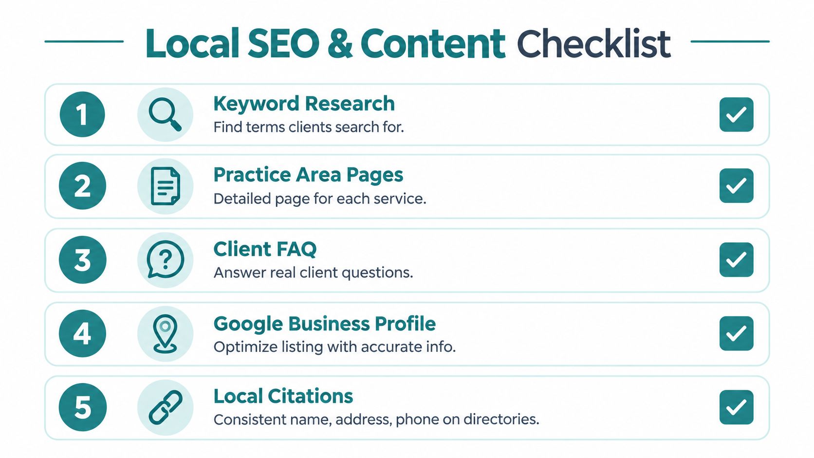
A practical content mix usually includes core practice pages that explain the issue in plain English and make the service area clear, FAQ pages built from real intake questions your staff hears every week, attorney bios that show experience, licensing, and fit for the matter, location pages for real offices or distinct service areas you serve, and resource articles that answer early-stage questions and guide readers toward a consultation.
For firms trying to improve visibility in maps and local search, this guide on local seo for lawyers is a useful outside reference.
Connect your content to Cincinnati-area searches
Local SEO works best when the site reflects how people search in real life. They do not look for a vague firm with vague services. They search for a divorce lawyer in West Chester, an injury attorney near downtown Cincinnati, or an estate planning lawyer in Northern Kentucky.
That means the website should tie services to actual places in a natural way. Use your office address consistently. Mention the counties, neighborhoods, or nearby courts you regularly serve when it helps a visitor confirm they are in the right place. Keep your Google Business Profile complete and aligned with the site. Skip cloned location pages that change only the city name. Those pages usually add little and can weaken the whole content set.
This video offers a useful visual walkthrough of how firms think about legal website visibility and content quality.
Track page performance by intent
Traffic reports can hide weak intake performance. A blog post may bring visits and never produce a consultation. A strong practice page may bring less traffic and still drive better cases.
Measure pages by the job they are supposed to do. Homepages should move qualified visitors into the right practice area or contact path. Practice pages should produce calls and form submissions from people with clear legal intent. FAQ and resource pages should push readers deeper into the site, especially toward service pages and attorney profiles.
A simple review framework looks like this:
| Page Type | Primary Goal | What to Measure |
|---|---|---|
| Homepage | Direct visitors to the right service or contact action | Clicks to practice pages, calls, form starts |
| Practice area page | Turn legal intent into a consultation request | Calls, form submissions, consultation requests |
| High-intent landing page | Capture demand from specific searches or campaigns | Conversion rate, call quality, matter fit |
| FAQ or resource page | Move early-stage visitors toward contacting the firm | Clicks to service pages, contact-page visits, assisted conversions |
If you want a practical framework for building that content around search intent and local visibility, HDM has a useful guide on SEO for law firms.
Building a Secure Compliant Site That Captures Leads
A prospective client lands on your site after a stressful night, taps your phone number with one thumb, then hesitates at the contact form. If the page feels cluttered, the form asks for too much, or the site throws off trust signals, that consultation can die before intake ever sees it.
That is why law firm website design should be treated as an intake system with security built into it. A polished homepage means very little if the form handling is sloppy, the privacy language is vague, or the site is hard to use for someone on a phone.
Security and privacy support conversion
People rarely ask whether your site is configured correctly. They judge what they can feel. A secure form, a clear privacy notice, and a contact process that feels orderly lower hesitation.
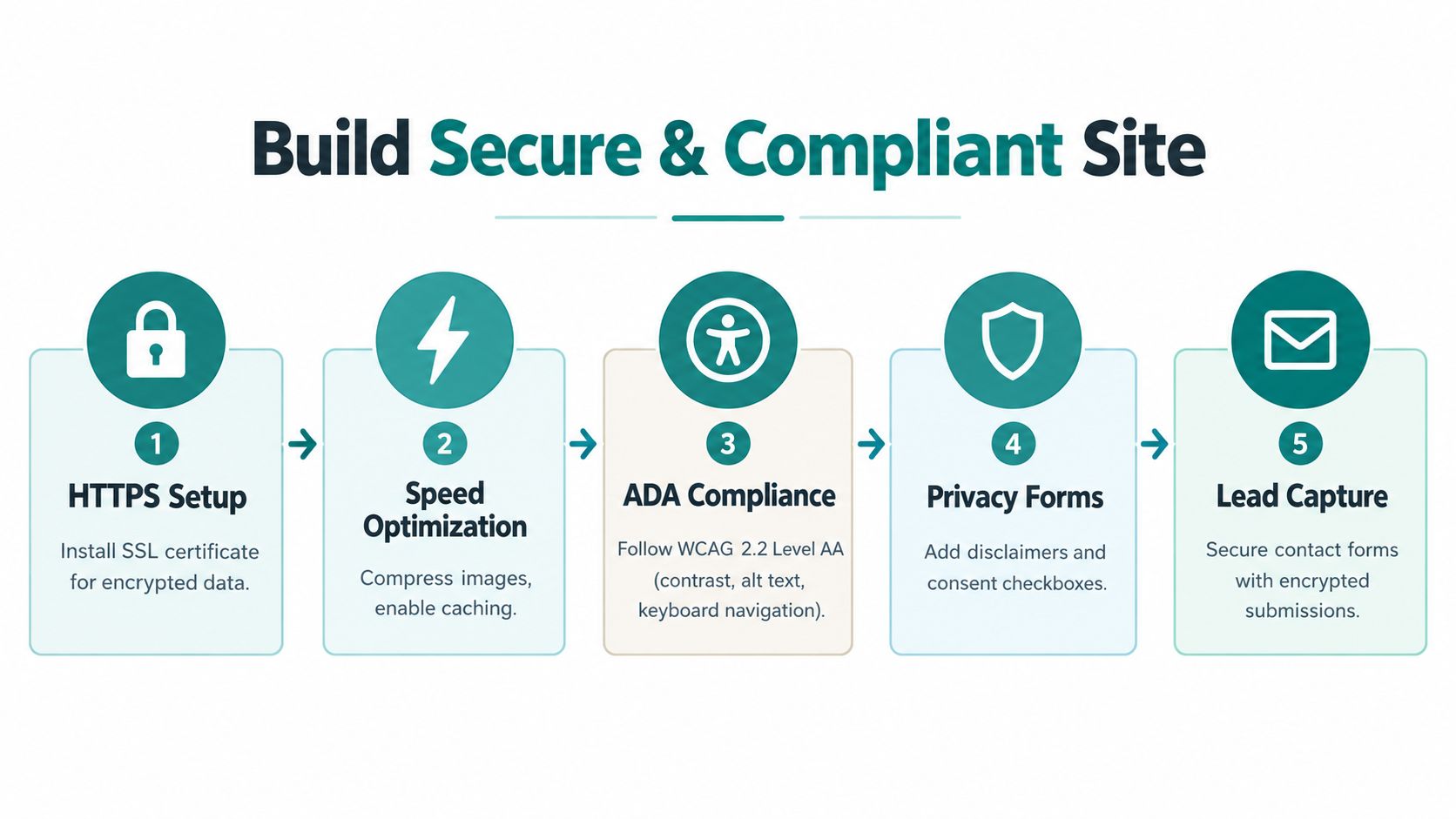
The legal field still leaves room to stand out on the basics. In the ABA 2022 website and marketing snapshot summarized by Taqtics earlier, only 43% of firms with websites said they used SSL/HTTPS security. For a small firm, getting that right is not a technical trophy. It is a trust signal.
Current legal web guidance also treats accessibility, privacy, and search visibility as connected site decisions, not separate tasks. TheeDigital's law firm web design trends notes that firms are being pushed to address ADA compliance, secure intake, privacy policies, and structured content together.
Accessibility affects who can contact you
Accessibility problems are intake problems.
For legal websites, a common target is WCAG 2.2 Level AA, built around four principles: content should be perceivable, operable, understandable, and adaptable, as explained by Be Accessible.
In practice, that usually means alt text for attorney photos so screen readers can identify the content, captions for videos so audio is not the only path to the information, form labels and clear field instructions so users know what to enter, and keyboard access across the site so the menu, buttons, and forms work without a mouse.
Legal-specific accessibility guidance also continues to point firms toward WCAG 2.1 Level AA as the benchmark commonly tied to Department of Justice expectations. CaseLedGE recommends a practical review process that includes automated scans, keyboard-only testing, screen-reader checks, color contrast testing to at least 4.5:1 for normal text, and fixes for headings and focus states.
If someone cannot use your menu, read your page, or finish your form, the site is not ready.
Build lead capture around calm, low-friction intake
A lot of small firms chase more traffic before fixing the contact path. I usually advise the opposite. Quiet improvements to intake often produce a faster return than a dramatic visual redesign.
A better order looks like this: clarify what the firm handles and who should call, keep forms short enough to finish on a phone, make tap-to-call and directions easy to find, confirm that submissions are stored and routed securely, and add clear privacy language around forms, chat, and tracking tools.
Design trade-offs matter. A long intake form may help screen out bad leads, but it will also cost you some good ones. Chat can increase contact volume, but it can also create noise if no one manages it well. A photo-heavy page may look impressive in a boardroom review and still underperform with real prospects who just want reassurance, location details, and a clear next step.
For firms with more complex requirements, platform choice starts to matter here too. Some owners do well with WordPress or Webflow. Others need a headless CMS, CRM integration, secure hosting, or custom intake workflows. In Cincinnati and the surrounding market, HDM is one option that handles those kinds of legal-site builds along with ongoing maintenance, security, and performance support.
Launching, Measuring and Keeping Your Site Healthy
A site can look polished in the final review and still miss leads on day one.
I have seen firms approve a redesign, launch on Friday, and find out Monday that contact form notices never reached the office manager, the call button was awkward on iPhone, or a practice page ranked for the wrong city. None of that shows up in a homepage mockup. Launch is where a law firm website starts doing its real job as a trust and intake system.
Treat the site like part of operations, not a brochure you post and forget. If nobody checks forms, watches consultation starts, updates plugins and dependencies, reviews speed, or tests the contact path on a phone, the site slips. Usually the decline is gradual. Fewer completed forms. More abandoned visits. More calls coming from people you do not serve.
Run a real pre-launch check
Before the site goes live, test it the way a stressed prospect would use it. Open it on a phone. Try to call. Try to submit a short form. Try to find the office address, attorney name, and next step in a few seconds.
Use a short checklist: call and form testing to confirm every phone link, consultation form, and booking path works and reaches the right person; a mobile review to check the homepage, practice pages, and contact flow on actual phones, not just a browser preview; a content review to confirm attorney names, office details, disclaimers, and service descriptions are current and accurate; and an accessibility pass to test keyboard use, form labels, heading structure, and color contrast.
Small launch misses cause real intake problems. A button that is hard to tap, a thank-you page that never loads, or a page title that misstates the service can cut consultations.
Measure what turns into consultations
Track the actions tied to intake. For many firms, that means form submissions, click-to-call taps, booked consultations, and the pages people viewed before they reached out.
Traffic alone does not tell you much. A page can pull in visits and still produce weak leads because it attracts people outside your practice area, outside your geography, or too early in the decision process. The better question is simple. Which pages help the right clients contact the firm?
Field note: Healthy legal websites get reviewed monthly.
That review should include lead quality, not just lead volume. If a page brings ten contacts and eight are a poor fit, the page needs work. Often the fix is clearer location signals, tighter practice descriptions, or a stronger consultation path.
Keep a monthly website wellness routine
Small firms rarely need constant redesigns. They need steady maintenance and a clear owner.
A practical monthly routine includes software and security updates, backups and uptime checks, form testing, performance review, content improvements on key pages, and analytics review by page type.
Some sites need selective repairs. Others have deeper problems. An outdated structure, weak mobile contact flow, or thin service pages can reach a point where patching costs more than rebuilding.
For Cincinnati-area firms, consistency usually wins. A calm, well-maintained site with clear next steps, easy thumb-friendly contact options, and regular measurement will outperform a flashier site built around sliders, stock photos, and a neglected intake path.
If your firm's website looks acceptable but is not reliably producing consultations, the problem is usually fixable. HDM works with Cincinnati-area law firms on planning, rebuilding, and maintaining websites that support trust, usable intake, and real client inquiries.