

Is Your Website Confusing Customers (and Costing You Sales?)
If you're a business owner in Cincinnati, you already know your work. You know your service, your process, and why clients choose you. The problem is that a first-time visitor to your website doesn't know any of that yet.
That gap is where a lot of websites lose business. The homepage talks like an insider. The headline is clever but vague. The call to action hides in the menu. A potential customer lands on the site, feels a little unsure, and leaves.
That's exactly why the StoryBrand framework has become so useful. It's built around a seven-part messaging structure that casts the customer as the hero and the business as the guide. In practice, the StoryBrand website examples that work best usually rely on the same basics: a clear headline, customer problems, a simple plan, a strong call to action, and trust-building proof.
For local companies, that matters more than many understand. Whether you run a law firm in Blue Ash, a contractor business in West Chester, or a healthcare practice near downtown, clarity usually beats cleverness. Below are seven strong StoryBrand website examples and resources worth studying, not as inspiration boards, but as practical models you can apply to your own site.
1. ClearBrand
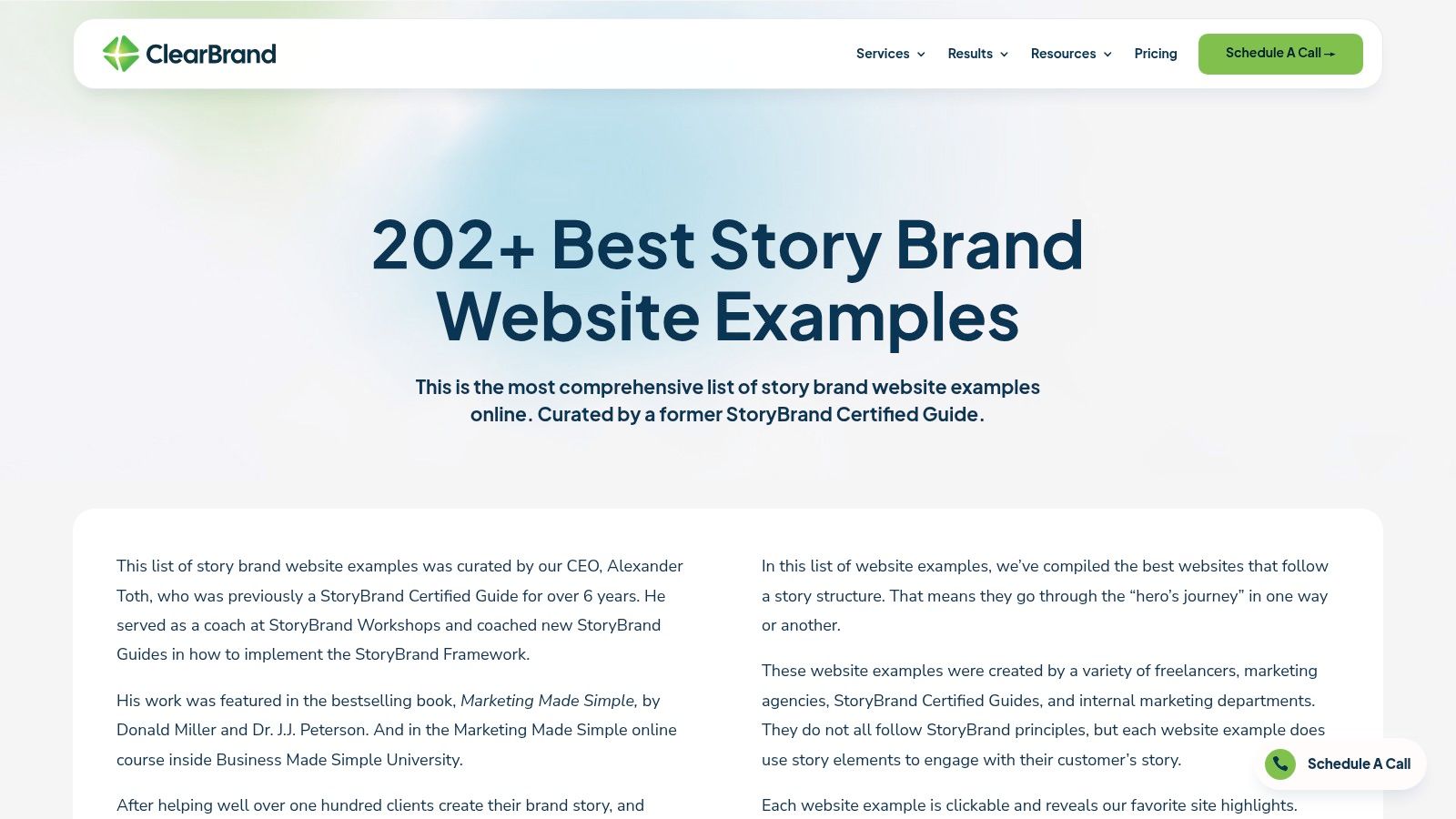
ClearBrand is the one I'd hand to a business owner who says, “I just need to see a lot of examples fast.” It's broad, easy to skim, and useful when you want to compare how different companies structure their homepage message.
What makes it practical is volume. You can scan multiple industries in one sitting and start spotting patterns. The strongest examples tend to open with a direct promise, move into the customer's problem, and then make the next step obvious.
What ClearBrand helps you see fast
If your site feels muddled, this kind of gallery is helpful because it makes weak messaging obvious by comparison. After a few minutes, you start to notice which hero sections say something concrete and which ones drift into agency-speak or corporate filler.
-
Best use case: Benchmarking your homepage against companies in adjacent industries.
-
What stands out: Quick visual scanning lets you compare headline clarity, CTA placement, and problem-solution flow.
-
What to watch for: Some examples are better on layout than messaging, so don't copy a design just because it looks polished.
Practical rule: If a homepage headline wouldn't make sense to someone in Mason or Loveland who's never heard of your company, it probably needs rewriting.
For Cincinnati businesses, ClearBrand is especially useful early in the process. Before you redesign anything, look at ten or fifteen examples and ask one simple question: would a stranger understand what this company does in a few seconds? That exercise alone can sharpen your homepage copy.
If you need help tightening that top-line message first, HDM's guide to StoryBrand one-liner examples is a good next step before you start changing layout.
The downside is depth. ClearBrand is strong for pattern recognition, but it won't always give you a detailed teardown of why one example converts better than another.
2. BrandNerd
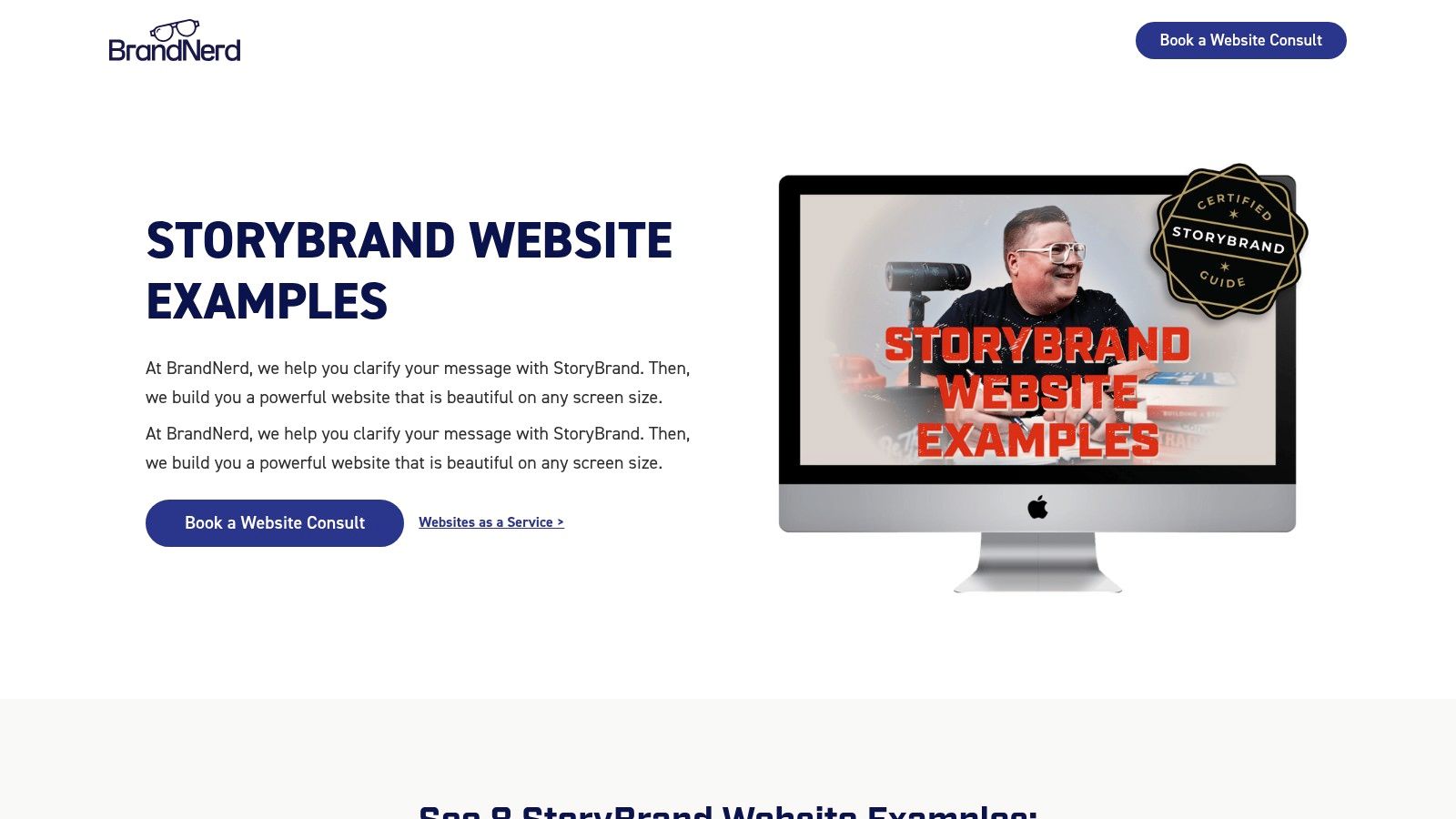
BrandNerd is tighter and more opinionated than a giant roundup. That's a good thing. Instead of giving you a huge pile of screenshots, it leans more into why certain StoryBrand website examples follow the framework well.
That matters if you're not just shopping for design ideas. A lot of business owners don't need more visual inspiration. They need help understanding why one message lands and another one doesn't.
Better for learning the framework
BrandNerd is useful when you want examples selected with fidelity to StoryBrand in mind. The commentary tends to stay close to the framework itself, which makes it easier to connect page sections back to messaging strategy.
I like resources like this for service businesses that have a more complicated sale. If you sell consulting, legal services, financial guidance, or a custom B2B offer, you usually need more than a pretty homepage. You need a message that reduces confusion and gives the buyer a clear path.
Most businesses don't have a traffic problem first. They have a clarity problem first.
That's where BrandNerd earns its keep. It helps you evaluate things like:
-
Headline quality: Does the page lead with what the customer wants?
-
Guide positioning: Does the brand show empathy and authority without making itself the hero?
-
Call to action: Is the next step direct, visible, and easy to understand?
For teams working through the messaging side before design, HDM's article on StoryBrand BrandScript examples pairs well with this kind of resource because it helps translate homepage language back into the underlying message architecture.
The trade-off is simple. You get more practitioner thinking, but fewer total examples than the larger galleries.
3. Banker Creative
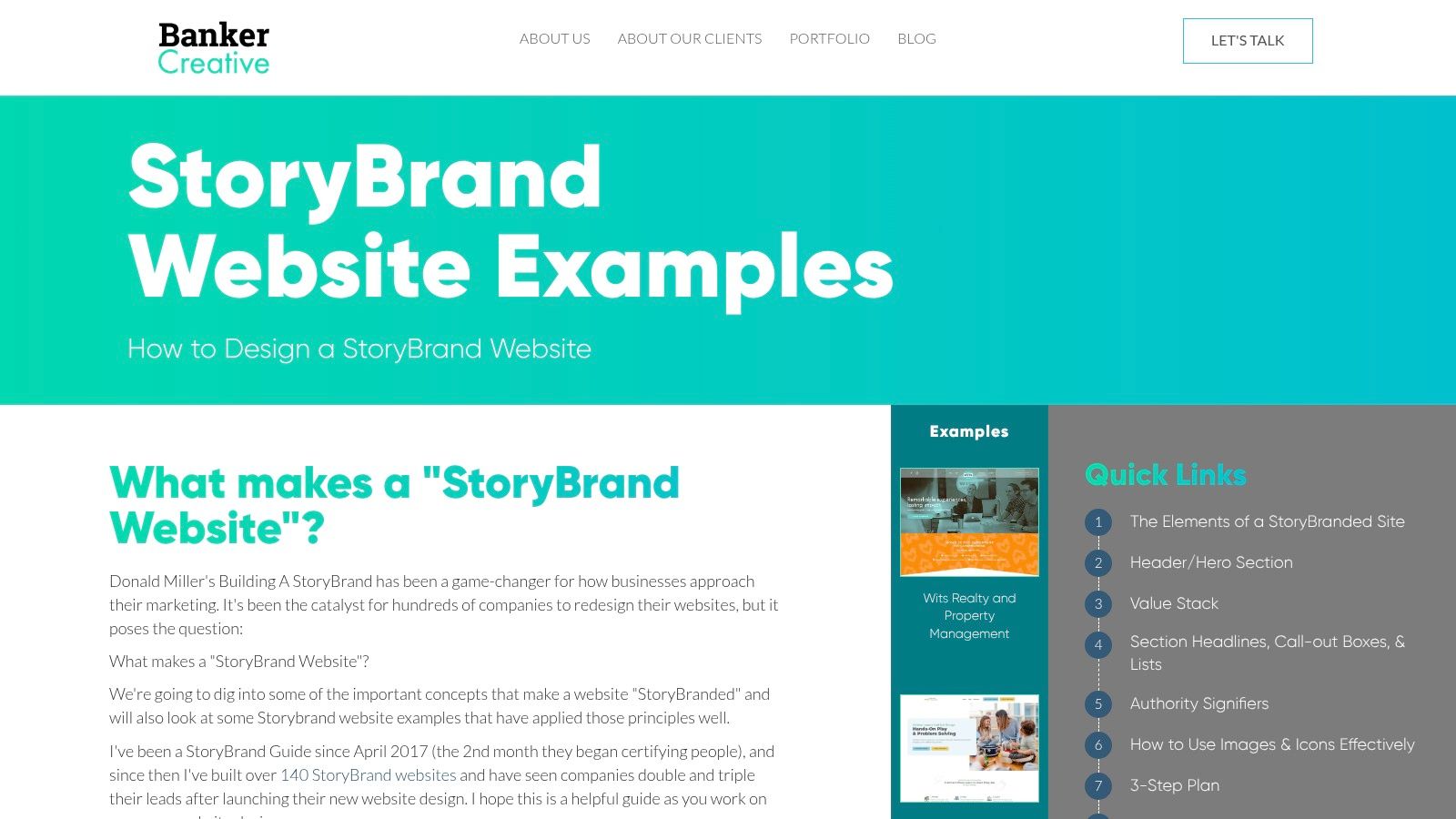
Banker Creative is the most conversion-minded option on this list. If your question is less “what looks good?” and more “what helps a lead take action?” this is one of the better places to spend time.
The agency's perspective shows up clearly. That can be a drawback if you want neutral analysis, but it's a strength if you want practical heuristics from people who've built a lot of these sites.
Strong for B2B and lead generation thinking
A contractor, professional service firm, or B2B company needing help structuring a homepage around action would find this approach beneficial. The strongest StoryBrand examples usually aren't trying to say everything. They guide the visitor through a sequence.
In one cited StoryBrand redesign example, traffic increased by 500% after a site redesign by a certified StoryBrand expert. You shouldn't treat that as a guaranteed outcome, but it does underline the practical value of clearer hierarchy, sharper value propositions, and better calls to action.
That's the lens Banker Creative tends to reinforce. It's less about decoration and more about section order, friction reduction, and conversion intent.
-
Where it helps most: Hero section, problem framing, simple plan, CTA placement.
-
Why it's useful: The advice tends to stay grounded in actual business outcomes.
-
Where to be careful: Agency-created frameworks can become repetitive if you copy them too exactly.
If you're in the trades or home services, this approach translates well. A contractor in Cincinnati doesn't need a homepage that sounds award-winning. They need one that tells people what they do, where they work, and how to get an estimate. For that audience, simple wins.
If that's your world, HDM's breakdown of StoryBrand examples for contractors gives a more industry-specific angle on the same core principles.
4. Agency Boon
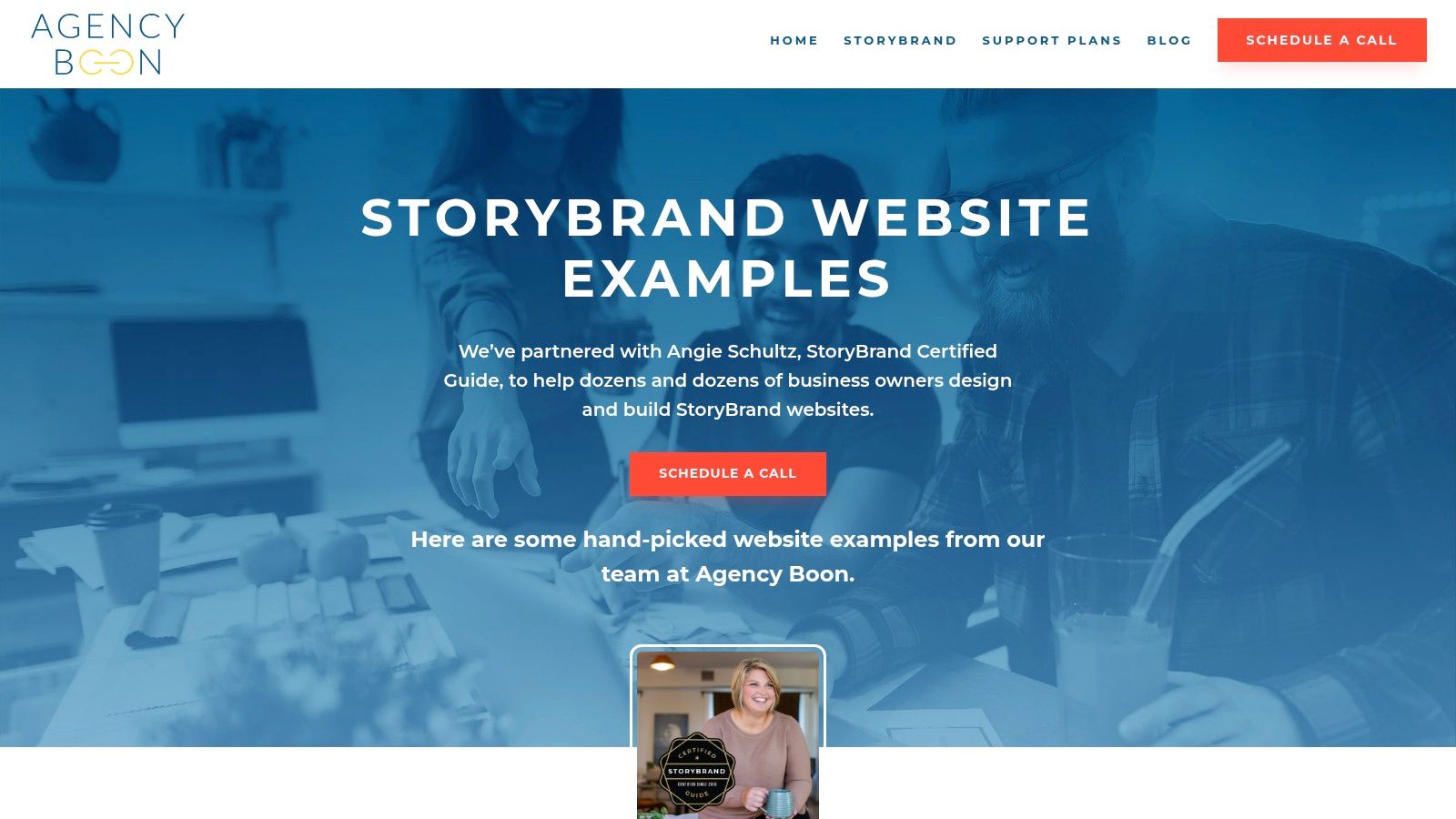
Agency Boon is useful because it shows real client work in a portfolio-style format. That sounds basic, but it matters. Some StoryBrand content lives too much in theory. Agency Boon gives you shipped websites you can inspect as actual business tools.
You can see how messaging and design support each other. That's a big distinction. Good StoryBrand execution isn't just about writing the right headline. It's also about making the page easy to scan and easy to act on.
What local businesses can steal from these examples
A lot of Cincinnati businesses don't need a dramatic rebrand. They need cleaner alignment between words and layout. Agency Boon helps with that because the examples often show a consistent pattern: clear hero, visible CTA, supportive proof, then a simple path forward.
That structure works especially well for service firms, nonprofits, and regional businesses that depend on trust and clarity.
-
Useful lesson: Copy should drive layout, not the other way around.
-
Strong point: You get real-world execution rather than just abstract advice.
-
Limitation: You won't always get a full teardown explaining every decision.
If the page design looks clean but the message still makes the visitor think too hard, the page isn't doing its job.
This resource is a good reminder that StoryBrand works best when design supports message hierarchy. A strong headline buried in a cluttered layout won't help much. Neither will a beautiful page with a vague call to action.
For business owners reviewing their own site, this is a good exercise. Ignore your brand colors and ask whether the page tells a simple story from top to bottom. If it doesn't, that's the first thing to fix.
5. Creativeo
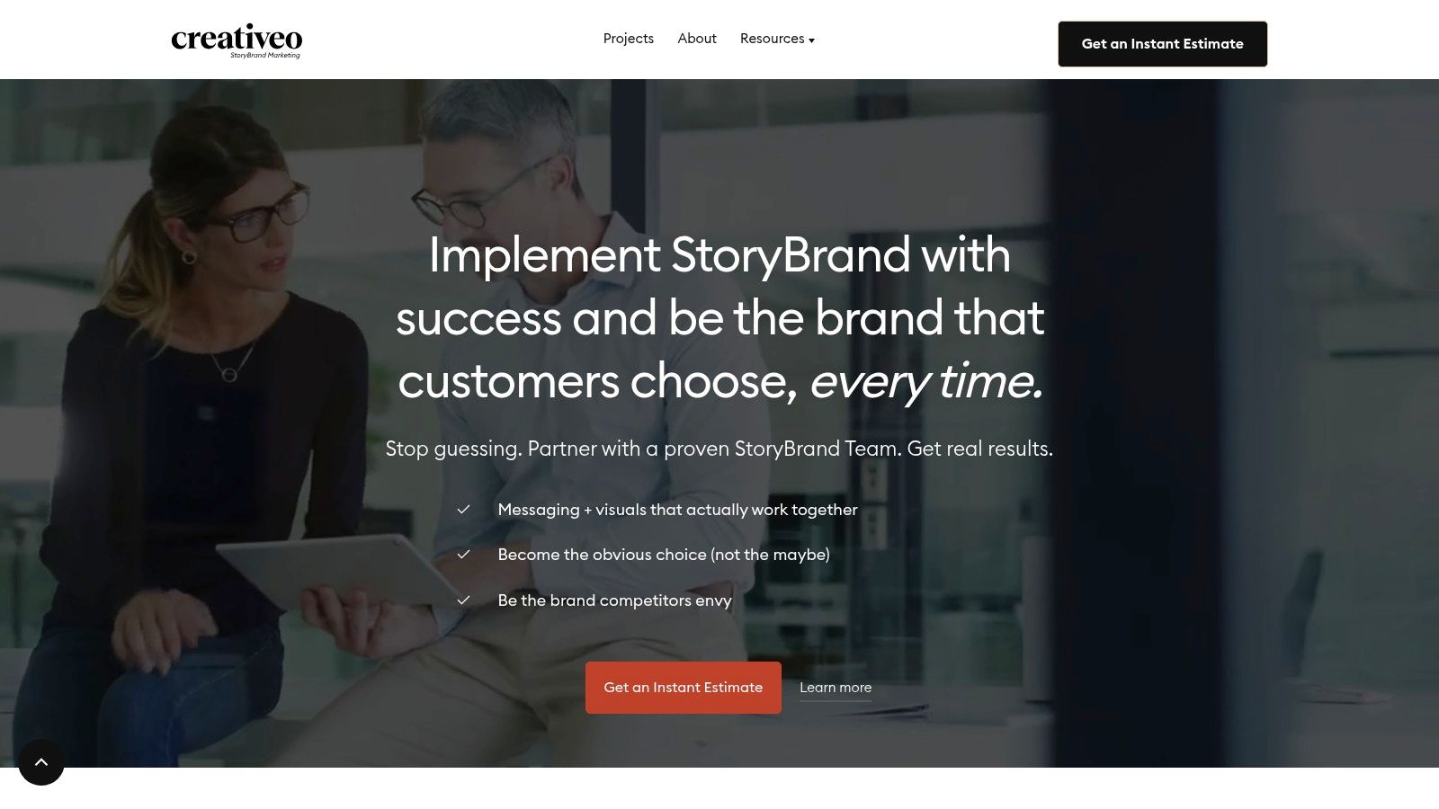
A Cincinnati owner usually feels this problem before they can name it. The site looks current, the team likes the design, and traffic shows up, but inquiries stay flat because the message never gets clear enough to carry the sale.
Creativeo is useful for that stage. It focuses less on collecting attractive homepage screenshots and more on how StoryBrand thinking turns into a working website structure. That makes it a better reference for businesses trying to fix conversion problems, not just refresh the look.
The practical value is the sequence. Creativeo treats StoryBrand as a messaging system first, then a page-building system. For local service businesses, that distinction matters. If your homepage promises one thing, your contact form asks for something else, and your sales call starts in a third direction, prospects feel the mismatch right away.
That shows up a lot with firms selling higher-trust services. Law offices, consultants, home service companies, B2B providers, and healthcare-adjacent businesses often need the site to do more pre-selling before someone reaches out.
The strongest takeaway is simple:
-
Clarify the customer and problem first. If that part is fuzzy, every headline after it gets weaker.
-
Build the homepage around message order. Visitors need a clear promise, a next step, and proof without hunting for it.
-
Match the CTA to your real sales process. If your team closes business through consultations, estimates, or discovery calls, the site should ask for that directly.
I like this resource because it reflects a real trade-off. Creativeo gives you more strategic value than a fast inspiration roundup, but it asks more from the reader too. You have to slow down and examine how the words, offer, and conversion path fit together.
That makes it especially useful for Cincinnati companies with an established business and an underperforming site. If your brand is already known locally, small messaging fixes can outperform a full redesign. Creativeo helps you see where that work should start.
It also reinforces a point owners often miss. StoryBrand works across WordPress, Shopify, Squarespace, and HubSpot because the framework depends on clear communication, not a specific platform.
Use Creativeo if your site needs better alignment between message and sales conversation. If you only want a quick batch of examples to scroll through, it will feel slower than some of the other resources on this list.
6. 10Web Blog
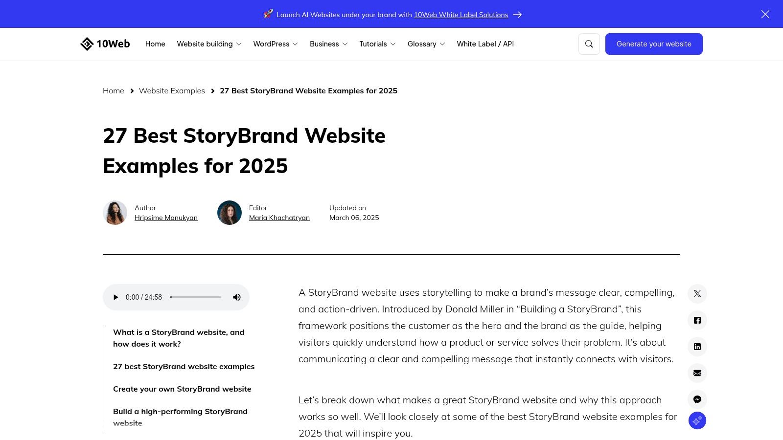
A Cincinnati owner usually hits this kind of resource during a practical moment. The site is underperforming, the team needs examples fast, and nobody has time to sort through a long strategic lecture before the next sales meeting.
10Web's StoryBrand website examples roundup works well for that job. It gives you a broad set of examples quickly, with enough context to spot common StoryBrand patterns across different types of businesses.
That speed is the main advantage.
If you run a local service company, this is useful for pattern recognition. You can scan a few examples and quickly see how other brands handle headlines, calls to action, page flow, and trust elements. That makes it a good working session resource for teams who need to react, not just study.
Best used as a fast scan, not a final standard
What stands out here is less about any single example and more about the category itself. StoryBrand-style structure now shows up across a wide range of websites, which tells local businesses something important. Clear messaging is no longer a niche copywriting preference. It is standard website practice for companies that want more leads from existing traffic.
The recurring patterns are familiar, but still worth paying attention to:
-
A plainspoken headline: Visitors can tell what the company does without decoding clever brand language.
-
A direct CTA: The page asks for a real next step, such as booking, calling, or requesting a quote.
-
A simple process: The site explains how to get started in a few steps.
-
Visible proof: Testimonials, results, reviews, or client logos reduce hesitation.
For Cincinnati businesses, the lesson is to translate those patterns to a local buying decision. A homeowner comparing roofers in Hyde Park or a buyer looking for a commercial contractor in Blue Ash does not need novelty. They need clarity, confidence, and an obvious next move.
There is a trade-off, though. Fast editorial roundups can flatten the differences between a site built on StoryBrand principles and one that just borrows the visual cues. So I would use 10Web to collect ideas, then pressure-test those ideas against your own sales process, market, and customer objections before you copy anything.
7. WebsiteBuilderExpert
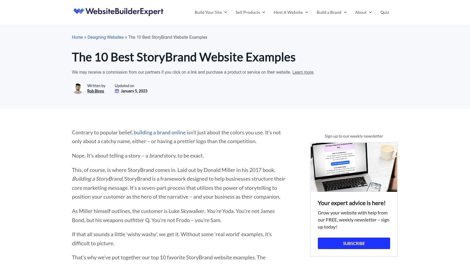
WebsiteBuilderExpert is the most approachable option here for non-technical teams. It's concise, easier to digest than the giant galleries, and good for business owners who want a manageable shortlist rather than an endless research rabbit hole.
If you're new to StoryBrand, that's a real advantage. Too many examples can blur together. A shorter list makes it easier to talk through what you're seeing and why it matters.
Good primer, but not the final word
This is a good workshop resource. If you're sitting with a business partner, office manager, or marketing coordinator and trying to critique your current homepage, a shorter list is easier to use.
It also helps newer teams see that StoryBrand-style layouts show up across platforms. Other documented roundups have noted use across WordPress, Shopify, Squarespace, and HubSpot, which reinforces the point that message clarity matters more than platform preference.
Still, there's an important caveat for more complex industries. One of the biggest gaps in StoryBrand example content is adaptation for regulated or high-trust businesses. As noted in a review of the category, many examples focus on template-friendly homepage elements but don't fully answer how to preserve clarity while still addressing compliance, process depth, risk, and reassurance for healthcare, legal, and other complex B2B sites. That's a real issue for firms around Cincinnati working in law, healthcare, or enterprise services.
A law firm, medical practice, or specialized B2B company can't simplify so much that credibility disappears.
So use WebsiteBuilderExpert as a clean introduction. Just don't assume a simple homepage formula is enough for every type of buyer.
StoryBrand Website Examples: 7-Site Comparison
| Resource | Implementation complexity | Resource requirements | Expected outcomes | Ideal use cases | Key advantages |
| --- | --- | --- | --- | --- | --- |
| ClearBrand | Low, browseable gallery | Minimal, time to scan, internet | Broad benchmarking and pattern spotting | Quick audits, inspiration across verticals | Very large, actively maintained collection |
| BrandNerd | Low–Medium, guided commentary | Moderate, time to read analyses | Practical understanding of StoryBrand application | Teams learning to apply framework to copy/layout | Certified-guide perspective and framework fidelity |
| Banker Creative | Medium, requires studying case comparisons | Moderate, time for before/after review, conversion focus | Conversion-focused heuristics and structuring tips | B2B lead gen and conversion optimization projects | Many real builds with conversion-oriented insights |
| Agency Boon | Low–Medium, portfolio review | Minimal, visual review of client sites | Examples of consistent execution and scannable layouts | Service businesses and nonprofits seeking real examples | Real client sites showing messaging-design alignment |
| Creativeo | Medium, follows case-study workflow | Moderate, review of Brandscripts and case details | Alignment of messaging strategy to site and sales process | Teams building internal messaging assets and UX flows | Shows Brandscript → copy → UI pipeline |
| 10Web Blog | Low, editorial roundup | Low, quick scans per example | Time-efficient survey of StoryBrand practices | Fast idea generation and cross-industry comparisons | Concise multi-industry examples with brief rationales |
| WebsiteBuilderExpert | Low, short curated list | Low, accessible read for non-technical teams | Primer-level takeaways for messaging and design | Workshops, quick internal critiques for beginners | Cross-platform examples and clear, practical callouts |
Turn Your Website into Your Best Salesperson
A clear message is the foundation of a high-performing website. That's the biggest lesson behind these StoryBrand website examples. The framework works because it gives businesses a repeatable way to explain what they do, why it matters, and what a visitor should do next.
For most small and mid-sized businesses, the problem isn't lack of effort. It's message overload. The homepage tries to explain every service, every credential, and every detail all at once. That usually creates friction, not confidence.
A better approach is simpler. Start with your headline. Can a first-time visitor understand what you do and who you help right away? Then look at your call to action. Is it obvious? Then review your plan. Does the site make the next steps feel easy? Finally, ask whether you've included the right trust signals. Testimonials, logos, certifications, and clear process language all help reduce hesitation.
If you're a Cincinnati-area business owner, this doesn't have to turn into a giant branding exercise. In many cases, a strong homepage revision starts with sharper messaging and better structure, not a full rebuild. That's especially true for local service companies that already do good work but aren't explaining it clearly online.
This is also where judgment matters. Not every StoryBrand example should be copied exactly. A roofer in Northern Kentucky, a healthcare provider in Cincinnati, and a B2B manufacturer in Dayton won't all need the same amount of detail. The framework should clarify your message, not flatten it.
At HDM, this kind of website work is part of the day-to-day. HDM works with businesses that need websites to do more than sit online and look decent. If your current site feels unclear, outdated, or too hard for customers to act on, the next step is a simple audit. Can a new visitor understand what you do, how it helps them, and how to take action quickly? If not, your website is probably due for a clearer story.
If your website isn't explaining your value clearly, HDM can help you audit the message, tighten the structure, and build a site that supports real business growth across the Cincinnati area.