

A customer opens your website on her phone on a Saturday afternoon, thumb hovering. She taps Services, then a dropdown, then a page titled Our Capabilities, and still can't find whether you're open. Forty seconds later she's on a competitor's site making an appointment, and you never know she was there.
That story plays out on small business websites every day, and the fix is usually sitting in the header, half hidden, unread: the search bar on website pages that nobody on the team has opened since launch.
Most owners treat that field as decoration. It's closer to a focus group that runs every hour of every day, because it's the one place where a customer tells you, in her own words, what she came for.
What a Search Bar Does for Visitors and Your Business
Picture the same visitor with a burst pipe at 9:40 on a Sunday night. She taps Services, then Residential, then a page about installations that mentions emergency work in one buried sentence. Three menus in, she gives up, taps the number on a competitor's site, and pays a call-out fee to someone else. You never learn you lost her.
A working search field cuts that to about eight seconds. She types emergency plumber, sees the right page first, and calls you. Instead of decoding the labels your team chose, she states her need the way she'd state it on the phone.

That's the thing to hold onto: typing is a statement of intent. Nobody searches when they're content. They search because something on your site didn't answer the question they arrived with.
The habit is common enough to plan around. A peer-reviewed analysis of the Inter-university Consortium for Political and Social Research website examined repository data covering more than 500,000 searches per year in 2014 and 2015 and found that around 50% of website sessions included an internal site search, with 50.03% of visits in 2014 involving search rather than browsing alone. That site is an information-dense research archive, not a survey of Cincinnati businesses, so read the figure as a benchmark for what's possible rather than a forecast for your traffic.
Visitors reach for the field in three situations, and each asks something different of your site.
- A named service or product. Someone types knee doctor, roof replacement, or a model number and expects the matching page to appear first, not the page where your marketing team buried it.
- A practical detail. Hours, a location, a phone number, whether you take a particular insurance plan. These answers should be one search away instead of three menus deep.
- A problem they can't name yet. Leaking ceiling. Rash on a forearm. This is the most valuable search of all, because the visitor describes a symptom while your pages use industry language, and the gap between the two is where the sale is won or lost.
What this means for you: if even a fraction of your visitors search, you're holding a running list of customer questions in their own words. The only real failure is never reading it.
For the business, the same field does three jobs. It saves visitors time, so fewer leave. It shows you what people want that your navigation doesn't cover, which is a content plan written by your own customers. And it hands you their exact wording, which your page titles and headings should echo back. That evidence feeds directly into how to improve customer experience across the rest of the site.
Where to Place the Search Bar and How Big It Should Be
Put the field in the header so it appears on every page, not only on the homepage, and don't route people to a separate search page where they have to start over. Nielsen Norman Group's homepage usability guidelines call for a visible search input on the homepage and a field wide enough to hold at least 30 characters at the normal font size. Thirty characters is roughly the length of emergency roof repair near me, a phrase a homeowner will type without editing a single word.
Search the whole site by default. If the results are limited to one section, such as blog posts or products, say so right next to the field. An unexplained limit makes people conclude you don't offer the thing they just typed, and they leave without ever telling you. On phones, keep a visible field, or use a clearly labeled magnifying glass that opens a full-width field with the keyboard already up.
| Element | Recommended setting | Why it matters |
|---|---|---|
| Location | Visible in the header on every page | Visitors look for the field in predictable places |
| Field width | Room for at least 30 characters | Full phrases fit without visitors editing them |
| Search scope | Whole site by default | Visitors assume a search covers everything unless told otherwise |
| Mobile version | Visible field, or a labeled icon that opens a full-width field | Small screens hide icon-only controls |
| Placeholder text | Specific words such as services, products, or staff | Guides visitors toward terms the site understands |
A vague placeholder like Search... wastes the most-read piece of text in the whole control. Search services, products, or staff tells people what kinds of words will work, and it signals that the field searches everything.
Run This Check in Ten Minutes
Open your site on a phone and on a laptop. From the homepage and from an inside page, find the field, type a full sentence-length phrase, and submit it without shortening anything. If you have to hunt for the icon, scroll inside the box, or trim the phrase to fit, that's your fix list.
Practical rule: a customer should find the search field within a few seconds from any page and type a phrase as long as the one she'd say out loud on the phone.
How Results and Suggestions Should Behave
Two things happen once someone starts typing, and they do different jobs. Results are the pages that answer the query, ordered with the best match first. Suggestions are the options offered as she types, built to help her pick words that work and type less. Confusing the two is where site search goes wrong, because a confident dropdown starts to look like a complete list of everything you sell.
Five rules cover most of it.
- Offer a suggestion only when it leads to real results. A suggestion that lands on an empty page is worse than no suggestion at all.
- Keep pressing Enter valid at all times. The dropdown assists the query; it never replaces free typing.
- Label each suggestion by type, so a visitor can tell a page from a product from a category from another query.
- Make suggestions appear fast enough to keep pace with typing. A list that arrives after she's finished typing is noise.
- Support keyboard and screen-reader navigation, including arrow keys, Enter to select, touch-friendly targets, and clear labels.
A dental practice shows how this plays out. Its search suggests teeth whitening and emergency dentist only because pages exist for both, it never suggests a service it doesn't offer, and a visitor who types whitening still gets results even though she skipped the suggestion entirely.
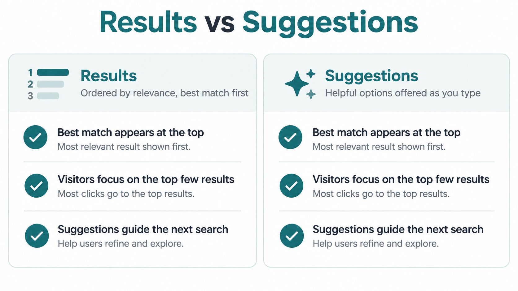
Suggestions are meant to assist, not dominate. Nielsen Norman Group's research on site search suggestions found that suggested queries were selected in only 23% of the instances in which they were offered, which means the majority of users either keep typing or don't need the help.
Result ordering matters just as much, because attention concentrates at the top. A comparative study of search behavior across 558 users in Germany and 563 in Switzerland found that more than 50% of searches led users to click the first result, and 97.11% of Google clicks landed on the first results page. Your visitors bring that expectation to your internal search bar, so weak ranking feels broken even when the right page exists somewhere in the list.
If you run WordPress and want to see what the available options do before you commit, it's worth taking twenty minutes to compare WordPress search plugins rather than accepting whatever the theme shipped with. Then run the owner's test: type three common misspellings of your top services, along with the shorthand customers use on the phone, and confirm the right page shows up first each time.
Metrics That Show Whether Your Search Works
Judge the search bar by what happens after someone uses it, not by how many people click it. A heavily used bar with poor results is worse than a quiet one that sends people to the right page, and the raw usage number can't tell those apart.
Start with what fails. In a 2025 ecommerce search evaluation, use-case and subjective queries together generated 63% of zero-result searches, while consumer research in the same report found 68% of shoppers believe retailer search needs improvement, 86% reformulate a query at least once, and 66% abandon a retailer for Amazon when results disappoint.
Two very different problems hide inside a bad search. A no-match problem means the content is missing: you have no page about the thing someone asked for. A ranking problem means the content exists but sits too far down the list or arrives after a second or third try. They need opposite fixes, so diagnosing which one you have comes before any change.
| Metric | What It Tells You | Watch For |
|---|---|---|
| Search usage | Share of visits that use the search bar | Rising use can mean navigation is hard to follow |
| First-try success | Visitors who find what they wanted on their first query | A wide gap between first-try and eventual success points to vocabulary gaps |
| Zero-result rate | Searches that come back empty | Repeated phrases point to missing pages or missing synonyms, so drive it down from your first-month baseline |
| Reformulation rate | Searches followed by a second query | Some retyping is normal, so watch for the same phrases being entered again and again |
| Exit after search | Visitors who leave straight from a results page | High exit suggests the results missed the intent |
| Conversion after search | Visits that end in a contact, booking, or sale | Compare against visits that never touched the bar, month over month |
Reading the Numbers Together
High zero-result rate with little reformulation usually means content is missing, and customers aren't bothering to try again. A normal zero-result rate paired with heavy reformulation points at ranking, because people can sense the answer is there and keep rewording. High exit straight from a results page is the clearest signal of all: they searched, they looked, they didn't believe you.
Set a baseline in your first month, then compare monthly. Targets shift with your industry and your catalog size, so your own first month is the honest reference point. Most website platforms can log search queries once the feature is switched on, and Google Search Console, which is free, shows the phrases that bring people to your site from Google results. Both belong in the same marketing analytics dashboard so you can see search behavior next to traffic and conversions. Ask your developer for one simple monthly report with these six numbers, and hold every later month against the first.
Fixing Searches That Return Nothing Useful
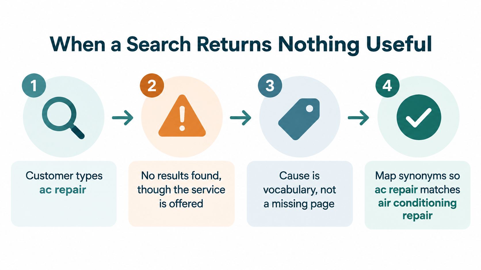
The most common failure isn't a broken search engine. It's a vocabulary gap. A customer types ac repair, your page says air conditioning service, and the search returns nothing even though you've done that work for twenty years.
Work through the causes in the order a site owner would check them.
- Pull the phrase from the log and count it. Ten appearances is a pattern worth a fix; one appearance is probably noise.
- Check whether a page already covers the service under different words. Often it does, and the wording is the only problem.
- Add the customer's phrase as a synonym (an alternate word the search treats as the same thing) or as a page keyword, so both ways of saying it resolve to the same page.
- Turn on typo tolerance where the issue is spelling, so plumbr still finds plumber and restaraunt still finds restaurant.
- If no page exists, add one, or write a short glossary entry that explains the term and links to your closest service.
- Retest the exact phrase after every change and note the date, so you know which fix worked.
The baseline comes from Nielsen Norman Group's testing of ecommerce search, where users found the desired item on their first search attempt 64% of the time, rising to 74% once they were allowed to try more queries. That ten-point gap is the diagnostic. It marks the searches where your matching or your wording let people down, and it points at query understanding rather than at the box itself.
More results is not the goal. A long list of loosely related pages usually signals weak ranking, and it buries the one page that would have answered the question. Put exact title and service matches first, then let filters narrow from there.
| Symptom | Likely cause | Fix |
|---|---|---|
| Zero results for a service the site offers | Customer uses different words from the page | Add the customer's phrase as a synonym or page keyword |
| Zero results for a misspelled term | No typo tolerance | Turn on spelling-tolerant matching |
| Zero results for a service never listed | Page does not exist | Add a service page or glossary entry, then retest |
| Hundreds of loosely related results | Weak ranking or broad matching | Rank exact title and service matches first, then filter |
| Visitors search, then leave the site | Results do not match intent | Review the top results for that phrase and point to the right page |
Search Bar Examples for Local Businesses
Three typical local businesses show the same pattern in different clothes, and each one needs a single change rather than a rebuild.
A Physical Therapy Clinic
Patients type knee doctor or sports injury when they mean physical therapy, and a fair number type orthopedics because that's who they saw last time. The clinic's fix is small: add both customer phrases as keywords on the physical therapy page and as synonyms in the search settings, so all three routes land in the same place.
A Roofing Contractor
Homeowners arrive with roof repair, roof replacement, or leaking ceiling, and each phrase maps to a different page with a different price range and urgency. The fix is to confirm each of those three searches returns its matching service page, not the generic contact form that currently ranks for everything.
A Retailer With a Catalog
Shoppers type model numbers, brand names, and plain descriptions like blue rain jacket, often in the same session. Catalog search has to match product codes and descriptive language together, which usually means checking that both the SKU field and the descriptive copy are indexed, then adding filters for size and color.
Location phrasing matters just as much for anyone selling property or place-based services. Buyers type a place name plus a property type, so a coastal listing site needs pages that answer queries such as homes for sale in Destin Florida instead of one generic listings page that tries to cover every town.
For all four, the method is identical. Collect the phrases customers use, from emails, phone questions, and Search Console queries. Decide which page each phrase should reach, one page per phrase. Change one thing, a synonym, a keyword, or a filter, then retest. Ask the front desk or the sales team for the last ten questions they heard from customers, and build the first synonym list from those exact words. Your internal terminology, the shorthand your team uses on invoices, is usually the worst possible source.
When AI Answers Help and When Filters Should Win
A homeowner types "leak near the skylight after heavy rain" and gets a cheerful paragraph naming three services, none of them the emergency repair page. The words were clear. A generated answer stood in for a short, checkable list. On a business site, that box is a measurement tool: the phrases people type show what they came for, and a wrong result shows where the site failed them.
A 2025 study of an independent search platform collected questionnaire responses from 802 participants and found the most favorable acceptance, particularly among older and less-educated users, when the experience emphasized advertising-free design, filtering, transparency, evidence-based content, and privacy. Acceptance rose when people could see how results were narrowed and where the information came from, not merely because the reply sounded conversational.
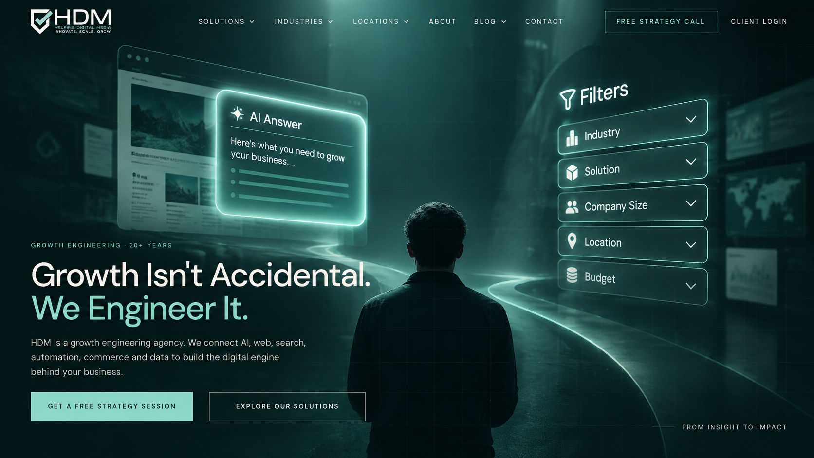
Filters work like labeled drawers. Open "city," then "insurance plan," and the contents stay the same on the next visit. An AI answer works like a clerk who summarizes those drawers in one sentence. The summary helps while someone is still browsing. It gets in the way when they need one exact item and a way to confirm it.
Let AI handle low-stakes, conversational questions. Which product suits a fifty-dollar gift budget. Which service fits a general need. Getting it slightly wrong costs a click, not a decision. Send consequential tasks to filters and exact navigation: a provider by city and insurance plan, a price, a policy term. Those need a short, verifiable list, not a paragraph that blends several pages.
Show the source behind any generated answer, label general information as not personal advice, and offer a route to a person, a phone number or a contact form. Put limits on the logs. Decide how long search records are kept, tell visitors what is recorded, and keep sensitive health or legal wording out of them. Repeated questions that AI answers vaguely, or that filters cannot narrow, mark the pages and categories the site still lacks.
The same restraint applies on the sales side, where AI sales agents that qualify prospects work best when they handle early questions and hand off to a human for anything binding. Novelty is not the value. Transparency and tightly constrained retrieval are, especially when someone is deciding about their health, their legal exposure, or their money.
Default to filters and exact navigation for high-stakes questions. Reserve AI answers for low-risk discovery, where you can show where the answer came from.
Audit Your Search Bar Before Your Next Redesign
A shopper types "same-day oil change" and gets a three-year-old blog post. The owner is already sketching a new homepage. The log already names the failure: the service exists, and the page does not use the customer's words. The search bar works like a suggestion box that also records the misses. Read it before you pick a new template.
One afternoon turns opinions about the search bar on website pages into fixes you can point to.
- Test on two devices. Phone and laptop, starting from the homepage and from an inside page, using phrases a customer would really type.
- Pull the top twenty queries from your site's search log and Search Console for the last ninety days.
- Count the zero-result searches and note which phrases repeat. A phrase that keeps coming back with nothing useful is a missing synonym, a missing page, or the wrong page ranking first.
- Run the five placement checks on the same phone and laptop, so the box is findable where people start.
- List the customer phrases that need a synonym or a page keyword, then apply one change per phrase.
- Split the list. Decide what gets fixed this month and what belongs in the next rebuild.
Helbling Digital Media, a Springboro, Ohio agency serving Greater Cincinnati, builds custom websites and redesigns and offers SEO and analytics. The PHP, Security & AI-Readiness Audit checks which software the site runs, including PHP, CMS, and plugins, what is publicly exposed, and whether AI search tools can read and understand the site, at a fixed price agreed up front. On an older platform, that check is often the smarter first step. Pair it with user testing on the current site so you watch people type the phrases from the log. You can request a proposal when you are ready to scope the work.
Those typed words are the customer's own description of the need. A rebuild that skips the log repaints the header and leaves the same dead ends. Visit Helbling Digital Media to start the conversation about what your search bar is telling you.