

A homeowner in Cincinnati searches for a plumber at 9 p.m. with water spreading across the bathroom floor. They tap your site, scan for a phone number, can't find one quickly, and call the next company instead. You paid for that visit through ads, search work, or referrals, and lost the job in seconds.
Conversion rate optimization, often shortened to CRO, means improving the share of visitors who take a useful next step, such as calling, booking, requesting a quote, or buying. It isn't about tricking people. It's about removing the small points of confusion, delay, and doubt that stop interested visitors from acting.
These conversion rate optimization tips are written for owners who don't have a technical team on staff. Each one is a small, testable change you can make this month on one important page. Start with the page that brings you the most calls or sales, write down what happens now, change one thing, and compare.
You don't need to rebuild everything at once. A clearer button, a faster page, or a shorter form can turn traffic you already earn into more customers, and that's usually cheaper than buying more traffic.
1. Make Your Call to Action Clear and Your Offer Easy to Understand
A call to action, or CTA, tells a visitor what to do next. Replace vague buttons such as “Submit” or “Learn More” with specific options like “Request a Quote” or “Book a New Patient Visit.”

A landscaping company could place its phone number and quote button near the top of its mobile page. A homeowner checking a yard project can then call or request pricing without searching through a menu. Try a clearer button label or a more visible placement on one page this month, then compare calls and form submissions.
Remove the Guesswork Around Cost and Process
Unclear costs and next steps can make an interested visitor pause. For an online retailer, display shipping costs, delivery timing, and return details on the product page, rather than waiting until checkout.
- Give each page one main job: Decide what you want visitors to do after reading the page.
- Describe the offer plainly: A short statement of who you help and how can keep the message focused. See these examples of clear business one-liners.
- Show what happens next: Outline the process and typical timing. Include a starting price or range when you can.
- Limit competing links: Keep secondary options from drawing attention away from the main action.
Clearer messaging can help visitors understand an offer and decide whether to act. For practical guidance on sharper landing page copy and CTAs, make the button describe the benefit or next step.
2. Improve Your Website Speed
Website speed is how quickly a page loads and becomes usable, not just how fast the first image appears. A visitor on a phone in a parking lot won't wait while a large photo slider loads. They'll go back to the search results.
Say a retail shop uploads product photos straight from a camera. Each file is far larger than the space where it displays, so phones download more than they need. Resizing those images and moving to better hosting can help every product page at once.
Fix the Obvious Slowdowns First
Run your homepage and main service pages through Google PageSpeed Insights, a free tool that lists specific problems and suggested fixes. Test on your own phone over cellular data too, because your office connection hides problems customers feel. Our guide to Core Web Vitals optimization explains the speed measures Google uses in plain terms.
- Resize images: Upload photos at the size they'll display, then compress them before publishing.
- Remove unused plugins: Every add-on you no longer use can add scripts and weight to each page.
- Check your hosting: Cheap, overloaded hosting often shows up as a slow first response before anything appears.
- Retest after one fix: Record the score, make one change, and check again so you know what helped.
I recommend fixing speed before redesigning anything. A faster page helps search visibility, ad traffic, and repeat visitors at the same time, while a pretty page that loads slowly still loses the customer at the door.
3. Design for Mobile Visitors First
Mobile-first design means planning the page for a phone screen first, then expanding it for larger screens. For many local businesses, the phone visitor is the one ready to act. They're searching nearby, comparing two or three options, and tapping the easiest one.
Say a plumbing company adds a large, tappable Call Now button that stays at the bottom of the mobile screen. A stressed homeowner doesn't have to scroll back to the top or copy a number. That one change is easy to test by tracking calls from phones before and after.
A healthcare clinic can use the same logic with its appointment form. If the form asks for insurance details, pharmacy information, and full history on a small screen, people quit halfway. Ask for the essentials first and gather the rest later through a secure step.
Try your own most important task on your phone, with one thumb, without zooming. If you get annoyed, your customers already are.
- Make phone numbers tappable: Place a clickable number near the top of every page.
- Shorten the menu: Keep the main mobile menu to five or six clear items.
- Increase button size: Buttons and links need enough space that a thumb doesn't hit the wrong one.
- Check both phone types: Look at the page on iPhone and Android, since spacing and forms can render differently.
We build mobile-first layouts in Figma, a design tool that lets clients review phone-sized screens before development. The trade-off is simple, you may show less at once, but what you show is usable.
4. Write Clear, Benefit-Focused Headlines
Your headline is the first sentence a visitor uses to decide whether they're in the right place. "Welcome to Our Website" and "Quality Service Since 1998" don't answer that question. They describe you, not the customer's problem or result.
Compare "Excellence in Dental Care" with "Gentle Family Dentistry in Hamilton, Same-Week Appointments for New Patients." The second version names the service, the place, and a reason to act now. A visitor doesn't have to work to understand it.
Say Who It's for and What Changes
Say an accounting firm replaces "Your Trusted Financial Partner" with "Tax Help for Cincinnati Small Businesses, With Clear Pricing Upfront." The new headline matches what owners search for and addresses their biggest worry in the same breath. Test that kind of change on one service page before rewriting the whole site.
- Read it aloud: Ask someone who doesn't know your business to explain your offer after hearing only the headline.
- Name your area: Include your city or service area when local customers are your main audience.
- Use plain words: Say "quick same-day repairs" instead of "expedited remediation solutions."
- Add one specific underneath: A supporting line can mention timing, who you serve, or how the first step works.
Don't chase cleverness. A headline that sounds smart in a meeting but needs explaining will lose to a plain one every time. I'd rather have a boring headline that a busy owner understands in three seconds than a slogan they have to decode.
5. Build Trust with Reviews, Testimonials, and Proof
Social proof means evidence from other people that you're safe to hire or buy from. Reviews, testimonials, credentials, licenses, and clear contact details all answer the same question, why should I believe you. Visitors ask it before they share payment details or personal information.
Trust is not a soft issue at checkout. The Baymard Institute quantitative research on American online shoppers found 18% reported abandoning a purchase because of a lack of trust in the site with payment details. Recognizable payment options, a real address, and a clear return policy belong near the buy button, not buried in a footer.
Put Specific Proof Near the Decision
Say a roofing company adds a short homeowner quote and a photo of the finished roof beside its quote form. That proof is more useful there than on a separate reviews page the visitor may never open. A law firm can list bar association membership and permitted case results without breaking confidentiality rules.
- Ask soon after the job: Request a review while the good experience is still fresh.
- Use names with permission: A named customer and a real photo carry more weight than an anonymous quote.
- Follow your industry rules: Healthcare and legal businesses need to check privacy and advertising requirements before publishing client stories.
- Show how to reach a person: A phone number, address, and hours make the business feel real.
We work with healthcare and legal clients where trust language has to stay compliant. The goal isn't more claims, it's fewer unanswered doubts at the moment of decision.
6. Simplify Your Forms and Contact Process
A form is where interest turns into a lead or dies. Every extra field asks for more effort and makes people wonder why you need that information. On a phone, a long form feels even longer.
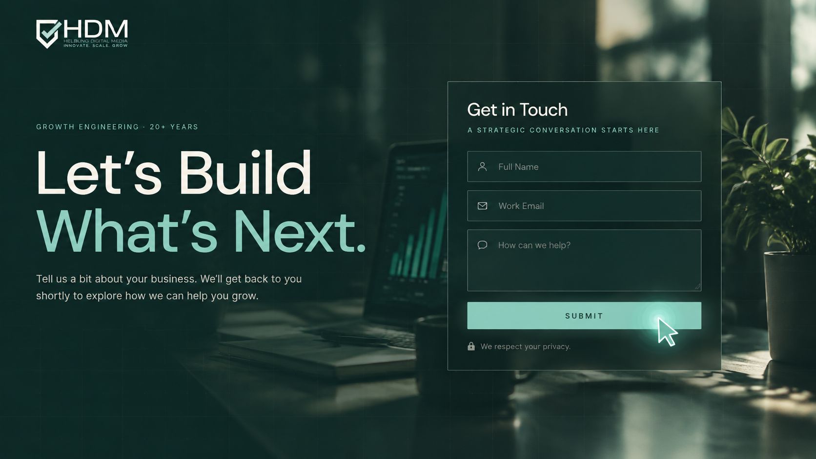
The Baymard Institute cart abandonment research reports that the average U.S. checkout displays 23.48 form elements by default, whereas an ideal flow can be reduced to approximately 12 to 14 elements. The same principle applies to a quote form, ask only what you need for a useful first response.
Say a cleaning service cuts its quote form from nine fields to four, name, phone, home size, and preferred date. Staff can ask about pets, access, and add-on services during the follow-up call. You'll likely get more starts, and the trade-off is a slightly longer first conversation.
Keep Required Fields Honest
- Delete unused questions: If your team doesn't use a field in the first conversation, move it later or remove it.
- Explain sensitive requests: If you need a birth date or insurance detail, say why in one short line.
- Use the right keyboard: Phone and email fields should trigger the matching mobile keyboard and support autofill.
- Confirm receipt: Send an automatic message that says what happens next and when.
Good form optimization for higher-quality leads doesn't mean accepting junk submissions. Keep the fields that protect quality, remove the ones that only satisfy internal habit, and test the shorter version against completed, qualified inquiries.
7. Test Changes and Measure Results
Analytics means tracking what visitors do, such as which pages they view, where they click, and where they leave. An A/B test compares two versions of a page or element to see which produces more calls, bookings, or sales. Without a baseline, you're guessing whether a change helped.
This short video walks through the basic idea before you set up your first comparison.
<iframe src="https://www.youtube.com/embed/cHGVQkQ6s3o" width="100%" height="400" frameborder="0" allowfullscreen></iframe>Say a furniture store sees many visitors leave on the shipping step. Instead of redesigning the whole store, it tests clearer shipping cost and delivery timing earlier in checkout. That targets the point where people quit.
Be realistic about small samples. The Ploy website experimentation statistics roundup reports that Optimizely's dataset produced winning results in only 12% of experiments. A low-traffic site shouldn't copy a big retailer's testing calendar or call a two-day lift a winner.
Match the Method to Your Traffic
- Set one goal first: Track your most important action before you change anything, and use this evidence checklist for reliable tests before you trust a result.
- Test one meaningful change: A clearer offer beats a button color when you have limited visitors.
- Wait long enough: Let the test run through normal weekly patterns instead of ending it after a good weekend.
- Split the results: Check phones separately from desktops, and new visitors separately from returning ones.
Our guide to B2B conversion rate optimization covers this measurement problem for low-volume, high-value leads. When traffic is thin, I recommend fixing obvious friction first and treating directional results as clues, not proof.
8. Reduce Distractions and Clarify Navigation
Navigation is the menu and linking structure that helps visitors find the right page. When every service, offer, photo, and announcement competes at once, people don't feel informed. They feel stuck, and stuck visitors leave.
Say a bakery cuts its menu from twelve items to six categories, Cakes, Weddings, Daily Menu, Ordering, About, and Contact. A customer who wants a birthday cake reaches the ordering page faster and sees pickup timing sooner. The site didn't lose information, it grouped it.
A law firm can do the same by placing practice areas under one Services menu with short descriptions. A person searching for help with a specific problem can recognize their issue without knowing legal labels. Plain names beat creative ones here.
Practical rule: Every important page should answer one question and point to one clear next step before the visitor reaches the footer.
- Keep key goals within two clicks: Calling, booking, directions, and your main services shouldn't require detective work.
- Limit pop-ups: If you use one, make it easy to close, especially on phones, and don't show it immediately.
- Remove rotating banners: One clear message usually works better than four messages sliding past before anyone can read them.
- End each page with a next step: Add a phone number, booking link, or related service so the visitor is never stranded.
This isn't about making your site plain. It's about giving each section a job and removing anything that doesn't help the visitor decide or act.
How the eight conversion rate optimization tips compare at a glance
| Item | Main Benefit | Main Trade-off | Best Fit |
|---|---|---|---|
| Make Your Call to Action Clear and Your Offer Easy to Understand | Reduces uncertainty and encourages visitors to take action | Too many CTAs or excessive detail can overwhelm visitors | Businesses seeking more qualified inquiries or purchases |
| Improve Your Website Speed | Improves user experience and search visibility across the site | Technical fixes and ongoing monitoring may be needed | Sites with slow-loading pages, especially on mobile |
| Design for Mobile Visitors First | Makes it easier for phone users to find information and contact the business | Requires testing across devices; older sites may need a rebuild | Local businesses whose customers commonly browse on phones |
| Write Clear, Benefit-Focused Headlines | Helps visitors quickly understand the offer and whether it suits them | Clear copy can take practice and may feel less expressive | Businesses with generic messaging or unclear value propositions |
| Build Trust with Reviews, Testimonials, and Proof | Reassures visitors and strengthens credibility | Reviews must be genuine, current, and compliant with industry rules | Businesses that need to build confidence with first-time customers |
| Simplify Your Forms and Contact Process | Reduces friction and can increase completed submissions | Shorter forms may provide less detail for lead qualification | Businesses seeking more inquiries through mobile-friendly forms |
| Test Changes and Measure Results | Replaces guesswork with evidence about what improves conversions | Reliable testing requires sound tracking and sufficient traffic | Businesses ready to make data-informed website improvements |
| Reduce Distractions and Clarify Navigation | Helps visitors find information and take action more easily | Removing options requires balance; URL changes can affect rankings | Sites with cluttered layouts, confusing menus, or many service pages |
Turn These Tips Into a Simple Plan for Next Quarter
Don't try all eight changes at once. You'll spend more time, learn less, and have no clean way to tell which change moved calls or sales. Pick your most important page, then choose one clarity fix and one measurement fix for this month.
Start by writing down the current numbers for that page, visitors, calls, form submissions, bookings, or completed orders. If you sell online, look closely at where shoppers leave, because the Baymard Institute checkout usability research reports a global average cart-abandonment rate of approximately 70.19%. That doesn't mean your store should accept losing most carts, it means checkout friction deserves attention before you buy more traffic.
For the clarity fix, choose the problem customers mention most. Maybe they can't find service areas, don't understand what a consultation includes, or only see shipping costs at the last step. Rewrite that part in plain language, move it earlier, and put your strongest proof beside the action you want.
For the measurement fix, separate results by phone and desktop and by traffic source. Visitors arriving from AI tools may behave differently from regular search visitors, so don't lump everyone together if you can identify the source. The SMK report on AI traffic conversion research describes an Ahrefs analysis of nearly 82,000 websites that reported AI-platform traffic converted 12% higher than traditional organic search, while cautioning that conversion tracking remains limited. Treat that as a reason to measure your own AI referrals separately, not as a promise for your business.
Keep the work honest. The U.S. Federal Trade Commission 2022 report on dark patterns describes an ABCmouse cancellation flow that required consumers to move through six to nine screens. Making cancellation hard or hiding recurring terms may protect a short-term signup number, but it damages trust, reviews, and repeat business.
Run your chosen change for several weeks, compare it with your starting point, and write down what you learned. If results improve, keep it and choose the next friction point. If they don't, you've still learned something useful about your customers without rebuilding the site on a hunch.
If you'd rather have help prioritizing, we offer a free 30-minute strategy call where we can review your key pages and suggest a practical order of work. You can also request a proposal or send a message to get started, and a senior person works on every engagement.
Helbling Digital Media helps Cincinnati-area businesses turn existing website traffic into more calls, bookings, and sales through clear page structure, faster performance, simpler forms, and measured testing. If you want a prioritized plan for your most important pages, visit Helbling Digital Media and book a free strategy call. We'll look at what visitors see now, identify the friction most likely costing you customers, and outline your next practical step.