
You've done the hard part already. You got someone in Cincinnati, or anywhere else, to find your site, browse your products, and add something to the cart. Then checkout starts, and they disappear.
That's one of the most frustrating leaks in ecommerce because the buyer was close. They weren't casually scrolling. They had intent. In a lot of small and mid-sized businesses, owners respond by spending more on traffic, more on ads, or more on promotions, when the underlying problem is the last few minutes before the sale.
Ecommerce checkout optimization is usually one of the fastest ways to recover revenue from traffic you already paid for. It doesn't require guessing what customers might want. It requires removing the things that slow them down, confuse them, or make them hesitate right when they're about to hand over payment details.
Why Shoppers Abandon Carts and What It Costs Your Business
A customer adds products to the cart, clicks checkout, fills in a few fields, sees the final screen, and leaves. If you own a retail business, that should bother you as much as someone loading up a basket in your physical store and walking out at the register.
This isn't rare. According to the Baymard Institute, the average cart abandonment rate across global ecommerce platforms is approximately 70.19%, which means only about three out of ten shoppers who add items to a cart complete the purchase, as cited in Ping Identity's checkout optimization summary. For a business owner, that's not just a usability issue. It's lost revenue sitting in plain sight.
The reasons are usually simple
Most abandoned carts don't happen because the customer suddenly forgot what they wanted. They happen because checkout introduces friction late in the process.
Common examples look like this:
-
Unexpected costs appear late: Shipping, taxes, or fees show up after the customer thought they understood the total.
-
The form feels like paperwork: Too many fields make a simple order feel like an application.
-
The site asks for an account first: Some buyers don't want another password to manage.
-
The page feels risky: If the checkout looks outdated or confusing, buyers start to question whether payment is safe.
The biggest checkout problems are rarely dramatic. They're small doubts that pile up at the worst possible moment.
For many business owners, the first useful shift is to stop treating abandonment as a mystery. It's usually a process problem. If you want a practical outside perspective on where those leaks typically show up, this guide on how to reduce cart abandonment is a helpful companion read.
If you're evaluating your own store, it also helps to review examples of shopping cart abandonment solutions so you can compare your checkout against common failure points and quick wins.
Your First Step A Checkout Process Audit
Before changing buttons, forms, or payment tools, you need to know where people are dropping off. Otherwise, you're fixing checkout by instinct, and instinct is expensive.
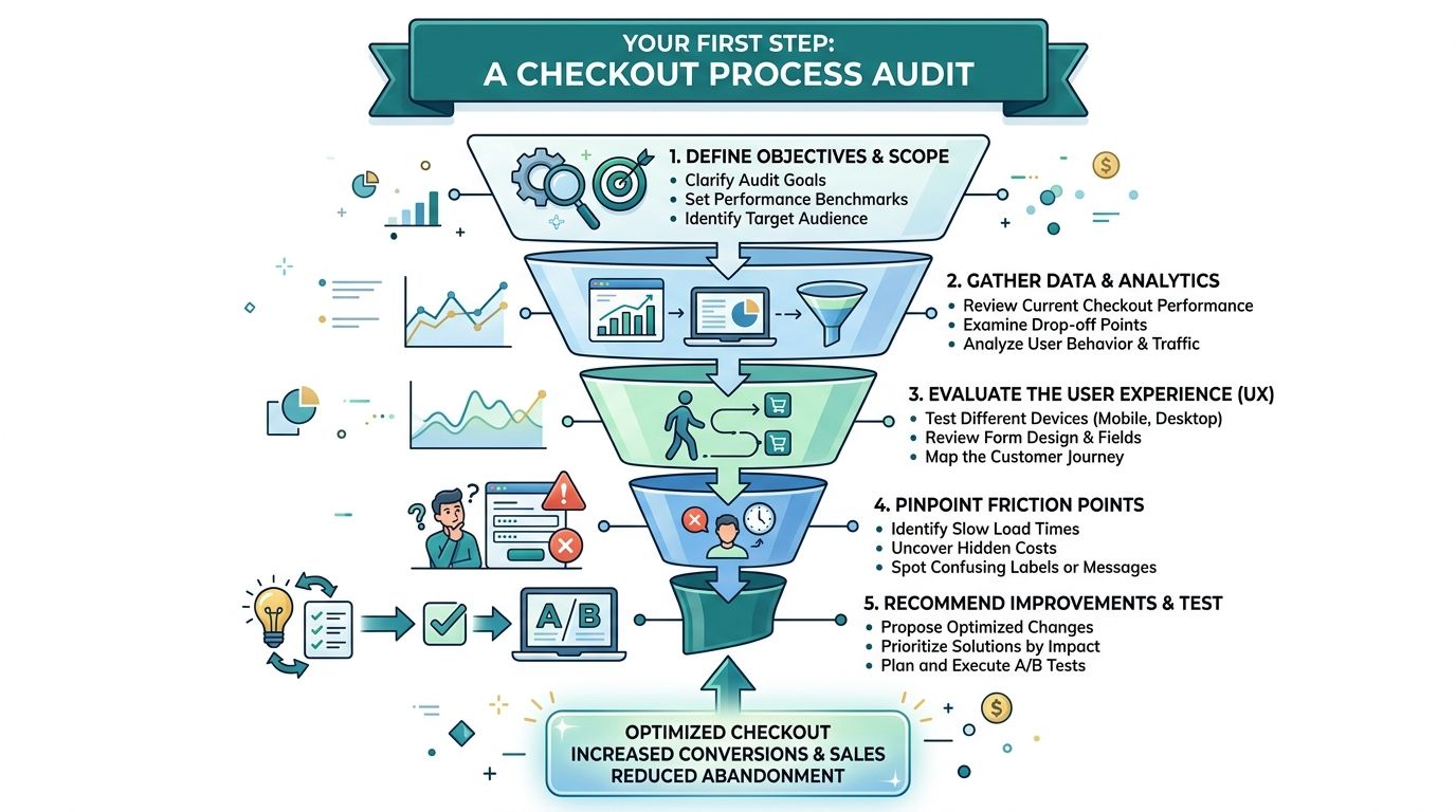
A checkout audit is a structured review of what happens between cart and completed order. You don't need to be technical to do it well. You do need to be disciplined enough to look at the actual path your customers take instead of the one you assume they take.
A simple visual helps when you're mapping that funnel:
Start with your checkout conversion rate
Your first benchmark is checkout conversion rate. According to Alexander Jarvis, ecommerce stores should target a benchmark between 30% and 62%, with 45.7% identified as the sweet spot for most online retailers. That gives you a practical range. If you're below it, your checkout likely has obvious friction. If you're inside that range, there's still room to improve, but you can prioritize more carefully.
In Google Analytics or your ecommerce platform dashboard, look for the points where users move from:
-
Cart
-
Checkout start
-
Shipping or contact info
-
Payment
-
Purchase
You're not just looking for totals. You're looking for the sharpest drop.
Review the flow as a customer, not as the owner
Business owners often know their own site too well. They already know where shipping info lives, what terms mean, and which payment button is the right one. Customers don't.
Open your checkout on an iPhone, an Android device, and a laptop. Then walk through it like a first-time buyer.
Ask these questions:
-
Where does hesitation start: Is it the cart, the account step, shipping selection, or payment?
-
What feels slower than it should: Long load times, delayed form validation, or lag after clicking continue.
-
What creates uncertainty: Missing delivery estimates, no clear return policy, or weak visual trust cues.
-
What breaks the flow: Promo code distractions, pop-ups, unnecessary navigation, or confusing error messages.
Practical rule: If you can't explain your checkout steps in one short sentence each, the customer probably feels that complexity too.
If you want a modern framework for finding friction faster, this guide to AI-driven UX audits offers a useful way to think about spotting issues that internal teams often miss.
Watch for three signals owners often overlook
A checkout audit shouldn't stop at "people leave on the payment page." That's too broad. You need to know what kind of friction is happening there.
| What to review | Why it matters | What a problem looks like |
| --- | --- | --- |
| Form completion | Reveals whether fields are too demanding | Repeated retries, abandoned address entry |
| Error handling | Shows whether mistakes are easy to fix | Vague errors, lost form data, broken promo code logic |
| Mobile usability | Exposes typing and layout issues | Tiny buttons, cramped fields, payment buttons below the fold |
Video walkthroughs can also help owners and internal teams align on what "good" checkout looks like before making changes:
The value of the audit is clarity. It tells you whether your issue is trust, speed, complexity, or mobile usability. Once you know that, the fixes get a lot more straightforward.
Removing Friction for a Faster Smoother Checkout
The easiest way to lose a sale is to make checkout feel like work.
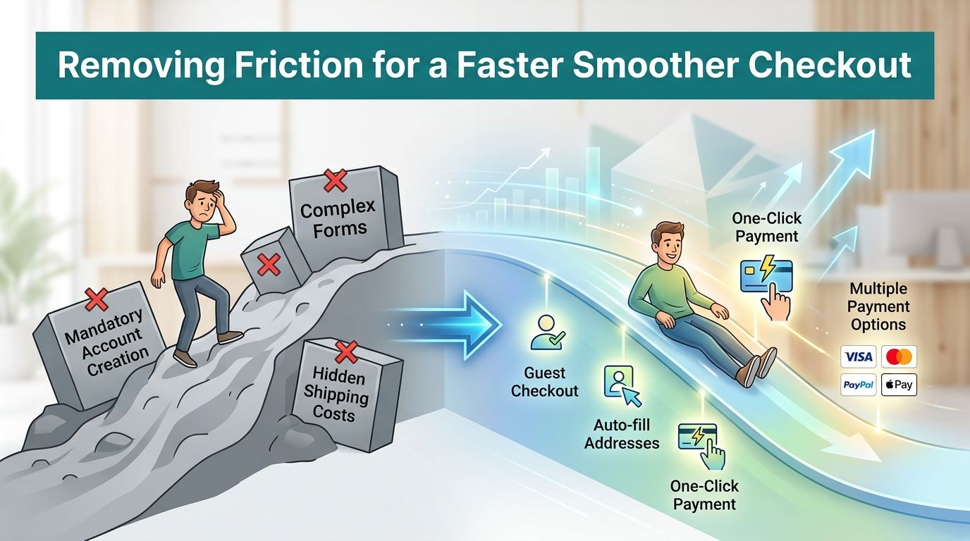
Customers are most impatient at the end of the buying process. They've already decided they want the product. Now they want to finish. Every extra field, extra click, and extra second of waiting gives them a reason to reconsider.
Simplify the structure first
According to Yotpo's checkout optimization overview, a single-page checkout can reduce cart abandonment by approximately 20% compared to multi-step flows. The same source recommends limiting fields to 12 essential elements and using address auto-fill to speed entry.
That matters because multi-step checkout often creates uncertainty. Customers start asking practical questions:
-
How many screens are left?
-
Did my information save?
-
Why am I still doing this?
-
Is this worth it for one order?
A single-page layout reduces that mental drag. The customer sees the path, understands the work involved, and finishes faster.
Cut what doesn't help the sale
Many checkouts ask for information the business doesn't need at that moment. That happens because the checkout inherited fields from a template, a plugin, or an old internal process.
Here's where to prune aggressively:
-
Account creation before purchase: Let customers buy first. Ask for account setup later if it adds value.
-
Optional business fields: Company name, second address line, or internal delivery notes should never block progress.
-
Extra navigation: Remove header menus, side promos, and unrelated links that invite people to wander off.
-
Coupon field clutter: If promo codes matter to your business, keep the field available but don't let it dominate the page.
A strong checkout feels narrower than the rest of the website. That's the point. Focus closes sales.
Make mobile entry easier
A lot of small businesses still review checkout on a desktop and assume the experience is "good enough" everywhere else. That's a mistake. Mobile checkout punishes every bit of friction.
A few practical improvements carry real weight:
Use input types that match the field
When someone taps into a phone number or credit card field, the keyboard should help them, not fight them. Numeric fields should open a numeric keypad. Email fields should use an email-friendly keyboard layout. That sounds minor until you test a checkout that gets it wrong.
Turn on address auto-fill
Address auto-fill reduces typing, lowers the chance of mistakes, and speeds the path to payment. It also helps customers who are checking out while distracted, which is common on mobile.
Keep buttons large and obvious
Small tap targets create accidental errors. Your primary action should be unmistakable. "Place Order" should look like the next step, not one button among many.
Speed is part of checkout design
Checkout isn't only about forms. It's also about performance. A beautifully designed page that loads slowly still costs you orders.
Review these operational fixes with your developer or agency partner:
-
Compress checkout images: Remove anything heavy that doesn't support the transaction.
-
Use browser caching: Returning visitors shouldn't reload everything from scratch.
-
Strip out pop-ups: Newsletter asks, chat interruptions, and timed overlays often create more friction than value during checkout.
-
Test on average devices: Don't approve checkout based only on a fast office connection and a new laptop.
A smoother checkout usually doesn't come from a dramatic redesign. It comes from removing avoidable obstacles. That's why this part of ecommerce checkout optimization often produces the fastest wins.
Building Trust with Secure and Flexible Payments
A buyer can tolerate a plain checkout if it feels safe. They won't tolerate a polished checkout if it feels questionable.
That's why trust isn't a decorative layer. It's part of conversion. At the payment step, customers are making a risk decision as much as a purchase decision. They're asking whether your business looks legitimate, whether the transaction feels protected, and whether they can pay the way they prefer.
A quick summary of those trust drivers looks like this:
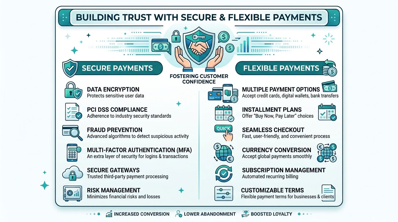
Security signals need to be visible
A secure site certificate is necessary, but it's mostly invisible to a typical shopper. Customers don't inspect your setup. They scan for clues.
Useful trust signals include:
-
Recognizable payment logos: Visa, Mastercard, PayPal, Apple Pay, and Google Pay tell buyers they're in familiar territory.
-
Security badges near payment fields: If you use them, they should be authentic and placed where customers are making the decision.
-
Clear return and refund information: Buyers want to know what happens if the order isn't right.
-
Business contact details: A visible phone number, email address, or support option tells customers there are real people behind the store.
What doesn't help is stuffing the page with generic badges or clutter. Too many trust elements can feel like overcompensation. The goal is reassurance, not noise.
Worth remembering: Customers rarely say, "I abandoned because the trust icon was missing." They just leave when the page doesn't feel credible.
If security, updates, and ongoing maintenance are weak, checkout confidence drops fast over time. That's why many businesses benefit from a more formal approach to website security and maintenance, especially when ecommerce is a meaningful revenue channel.
Payment flexibility removes hesitation
Different customers want different ways to pay. Some prefer entering a card. Others trust digital wallets more because they don't have to type card details into your site. Some want installment options for larger purchases. The point isn't to offer every payment method on the market. The point is to offer the methods your customers expect.
A simple way to conceptualize this is:
| Payment option | Best use case | Why it helps |
| --- | --- | --- |
| Credit and debit cards | Baseline for nearly every store | Familiar and expected |
| Digital wallets | Mobile-heavy traffic | Faster entry, less typing |
| PayPal or similar wallets | Buyers who want separation from direct card entry | Adds a layer of comfort |
| Installment or flexible payment tools | Higher-consideration purchases | Can reduce last-minute hesitation |
If you sell outside your immediate local market, it also helps to study how payment expectations vary by region and buyer type. This overview of 12 top payment solutions for UAE SMEs is region-specific, but it's a useful reminder that payment preferences aren't one-size-fits-all.
Trust is created by consistency
The strongest checkout pages don't suddenly become "salesy" at the payment step. They stay clear, direct, and stable.
That means:
-
Your order summary matches what the customer expects.
-
Shipping details are understandable.
-
The total isn't changing unexpectedly.
-
The primary button says exactly what will happen next.
-
Error messages are calm and specific instead of vague or alarming.
Trust is cumulative. It starts on the product page, continues in the cart, and either holds together or falls apart during payment. If your checkout asks for money before it earns confidence, shoppers notice.
Platform-Specific Tips for Shopify and WooCommerce
The advice above applies broadly, but implementation depends a lot on what your store runs on. For most Cincinnati small and mid-sized businesses, that means Shopify or WooCommerce.
The right platform isn't the one with the longest feature list. It's the one that lets you create a cleaner buying experience without turning every checkout improvement into a custom project.
According to Stripe's ecommerce checkout guidance, the global ecommerce market is projected to reach $4.8 trillion by 2025, with mobile commerce accounting for as high as 73% of that market share. That's why mobile-first checkout isn't a nice extra. It's a baseline requirement.
Shopify works well when speed and standardization matter
Shopify is usually the easier path for business owners who want reliable checkout infrastructure with less maintenance overhead. It tends to be a strong fit when you want:
-
Built-in payment flexibility
-
Fast setup for wallets like Apple Pay or Google Pay
-
A more controlled app ecosystem
-
Less developer dependency for routine store management
The trade-off is flexibility. Shopify is efficient, but it's opinionated. If your checkout needs unusual logic, complex product rules, or highly specific integrations, you may run into platform boundaries.
WooCommerce gives you more control, and more responsibility
WooCommerce is a good choice when your site already runs on WordPress or when you need deeper customization. It can be a strong fit for businesses with unique workflows, specialized shipping rules, or content-heavy marketing sites tied closely to ecommerce.
That flexibility comes with more moving parts:
-
Plugin quality varies
-
Updates require attention
-
Performance depends heavily on hosting and development choices
-
Checkout conflicts can appear after plugin changes
For businesses already on that stack, improving WooCommerce ecommerce performance often starts with simplifying the plugin load, tightening the checkout fields, and reviewing how mobile users interact with the flow.
A simple comparison
| Platform | Best for | Main strength | Main caution |
| --- | --- | --- | --- |
| Shopify | Businesses that want speed and operational simplicity | Streamlined ecommerce management | Less checkout customization in some cases |
| WooCommerce | Businesses needing flexibility inside WordPress | Deep control over store behavior | More maintenance and performance oversight |
Choose the platform that supports a better customer experience with less internal strain. The "best" platform on paper isn't the best one if your team can't maintain it well.
Some businesses eventually outgrow both and move to custom or headless solutions. That can make sense when checkout logic is tightly tied to inventory systems, subscriptions, account portals, or unusual customer journeys. For most SMBs, though, cleaner execution on Shopify or WooCommerce will solve more problems than a full rebuild.
How to Measure Success and Continuously Improve
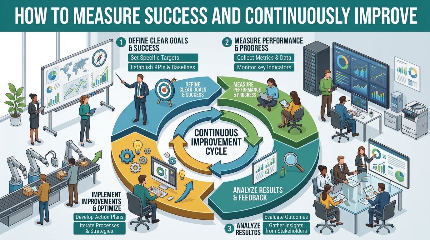
Checkout optimization isn't a one-time cleanup. It works better as a habit.
Once you've audited the flow, removed friction, and strengthened trust, the next job is to keep learning from customer behavior. That's where testing becomes useful. Not complicated testing. Practical testing.
Test one meaningful change at a time
If you change your layout, payment options, field order, button copy, and shipping display all at once, you won't know what helped and what hurt.
Start smaller. Good test ideas include:
-
Guest checkout visibility: Make it more prominent and compare completion behavior.
-
Form reduction: Remove a non-essential field and monitor whether more users reach payment.
-
Button language: "Place Order" is often clearer than vague labels like "Continue."
-
Payment order: Move the most-used payment option higher and see whether completion improves.
This doesn't require enterprise-level tooling to begin. It requires discipline. Pick one change, define what success looks like, and watch the result before moving on.
Pay special attention to mobile
Mobile checkout deserves its own review loop because typing friction shows up there first. According to Balkan Ecommerce, on mobile devices, every additional character a customer must type on an on-screen keyboard increases the risk of checkout abandonment, which is why native payment options that eliminate typing matter so much.
That should shape your post-launch checklist.
A simple mobile review list
-
Check form entry: Are users typing more than necessary?
-
Review wallet visibility: Are Apple Pay or Google Pay easy to find?
-
Test error recovery: If a user makes a mistake, can they fix it without starting over?
-
Watch button behavior: Does the primary action stay easy to tap?
Small mobile annoyances don't stay small. They stack up quickly when someone is trying to buy from a phone in a parking lot, on a couch, or between meetings.
Build a rhythm instead of chasing perfection
The best-performing ecommerce teams don't wait for a full redesign to improve checkout. They keep tuning it. They review user behavior, fix the obvious issues, and test the next likely improvement.
That mindset matters for SMBs because time is limited. You probably don't need a massive optimization program. You need a repeatable process:
-
Audit the checkout
-
Prioritize the biggest friction point
-
Make one clear improvement
-
Measure the outcome
-
Repeat
That's how ecommerce checkout optimization becomes a growth system instead of a one-off project.
Turning Carts into Conversions
Checkout is where your marketing, your website, and your customer experience all meet. If that final step is clunky, confusing, or untrustworthy, earlier wins don't matter much.
The practical path is straightforward. Audit the flow. Remove unnecessary friction. Make payment feel safe and familiar. Improve the mobile experience. Then keep testing instead of assuming the job is done.
For many Cincinnati business owners, the challenge isn't knowing checkout matters. It's finding the time to diagnose the issues, prioritize the right fixes, and implement them without breaking something else. That's why the most effective approach is usually steady, measured improvement rather than a rushed overhaul.
A better checkout doesn't just recover abandoned carts. It protects the revenue you've already worked hard to earn.
If your business has traffic and carts but too many buyers drop off before payment, HDM can help you audit the checkout experience, identify friction, and implement practical improvements that support more completed sales without turning your site into a science project.