
You're probably dealing with this right now. Someone clicks your ad, lands on your site, browses a few products, adds one to the cart, starts checkout, and then disappears. You paid to get that visitor. You earned enough trust to get a cart add. Then the sale stalled at the finish line.
For a Cincinnati business owner, that's one of the most frustrating leaks in the revenue pipeline because it's easy to miss. Store traffic can look decent. Product interest can look strong. Even your marketing can appear to be working. But if checkout breaks down, your site turns into an expensive window display.
The good news is that shopping cart abandonment solutions are usually more practical than people expect. You typically don't need a total rebuild. You need better diagnosis, sharper checkout decisions, and a recovery system that brings buyers back before they move on to a competitor.
Why Shoppers Leave Items in Their Digital Carts
If someone filled a basket in your physical store, walked to the counter, and then left it there, you'd want to know why. Online, that happens constantly. The global average shopping cart abandonment rate has reached 70.22% as of 2026, which means roughly seven out of ten shoppers who add an item to cart leave without buying, and 48% of abandonments are tied to unexpected costs like shipping and taxes according to Baymard Institute's cart abandonment data.
That number should change how you look at your website. Cart abandonment isn't a side metric. It's a direct measure of how much revenue your checkout experience is giving away.
How to calculate your own abandonment rate
You don't need advanced analytics to get a useful baseline. Use this simple formula:
- Count total completed purchases.
- Count total shopping carts created.
- Subtract completed purchases from carts created.
- Divide that number by carts created.
If you had 100 carts and 30 purchases, 70 carts were abandoned. That gives you a 70% abandonment rate.
Why this matters more than most business owners think
A high abandonment rate usually means one of two things. Your checkout creates friction, or your pricing and purchase experience create doubt. Sometimes it's both.
Practical rule: Treat every abandoned cart like a customer who raised their hand, asked to buy, and then hit a barrier.
For local businesses selling online, this is also where competitor pressure shows up fast. A shopper can compare your total cost, delivery promise, and return terms in minutes. If you haven't reviewed how your prices stack up in the market, HDM's guide to competitor price monitoring is worth a look because hesitation often starts before the checkout form ever becomes the issue.
The point is simple. Don't treat abandonment as failure. Treat it as your clearest list of near-sales. That's recoverable revenue, and it usually responds well to targeted fixes.
Diagnosing the Root Causes of Your Abandonment
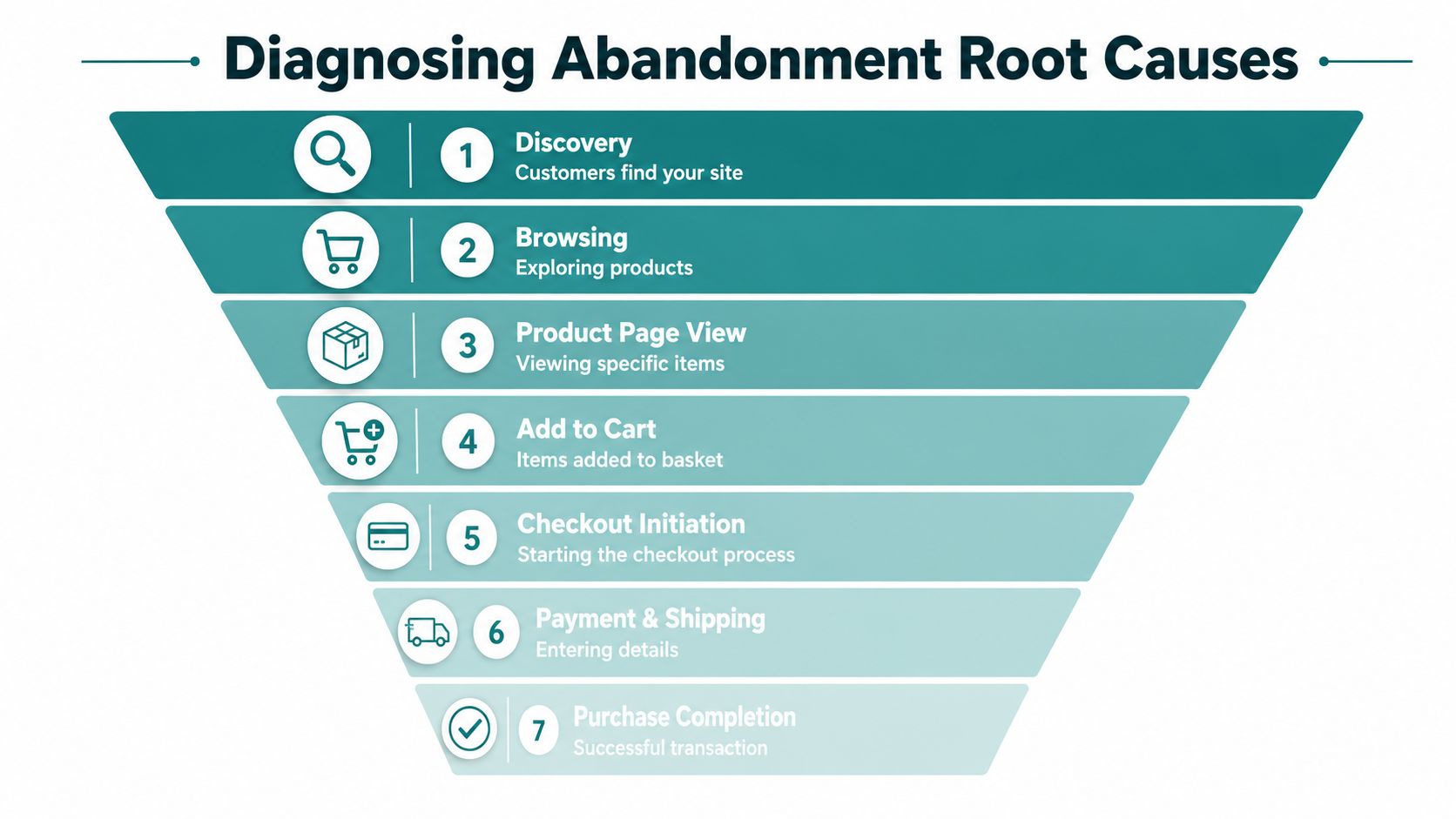
Most businesses jump straight to solutions. That's backward. If you don't know where people drop off, you'll waste time fixing the wrong thing.
Start with your analytics. In Google Analytics or your e-commerce platform's funnel reports, look at the path from product page to cart, from cart to checkout, and from checkout to payment confirmation. You're not hunting for abstract “user behavior.” You're trying to answer a plain business question: where exactly are buyers getting cold feet or getting stuck?
Separate friction from hesitation
This is the distinction most store owners miss. Some abandonments happen because the site creates friction. Others happen because the shopper isn't ready to commit.
Friction looks like this:
- Broken forms: Address fields fail, coupon boxes misfire, or mobile keyboards make entry annoying.
- Clunky steps: Too many screens, too many required fields, or confusing buttons.
- Weak trust signals: The checkout feels unfinished, insecure, or inconsistent with the rest of the site.
Hesitation looks different:
- Price checking: The buyer wants to compare totals elsewhere.
- Saving for later: They use the cart like a wishlist.
- Second thoughts: They like the product but need more confidence.
A deeper analysis from Fullstory on reducing cart abandonment found that 60% of shoppers abandon carts to compare prices or save for later, not because of technical friction. That's a big deal. It means a smoother form alone won't solve the whole problem.
What to review this week
If you want a fast diagnosis, review these five areas:
| Checkpoint | What to look for | What it usually means |
|---|---|---|
| Cart page exits | People leave before clicking checkout | Price concern, unclear totals, weak urgency |
| Checkout step exits | Drop-off spikes on one screen | Form friction or trust issue |
| Mobile-specific exits | Abandonment heavier on phones | Usability or payment mismatch |
| Coupon behavior | Shoppers pause at discount field | They're bargain hunting |
| Return visits to same cart | Same users come back but don't buy | Comparison shopping or delayed decision |
You can also learn a lot by asking. Send a short follow-up survey to cart abandoners. Keep it short. Ask whether shipping, payment options, account requirements, timing, or comparison shopping stopped the purchase.
If buyers keep leaving at the same step, stop guessing. That step is where your money is leaking.
For businesses that want a more proactive system, tools that automate cart recovery with AI can help identify patterns and trigger follow-up before the opportunity goes stale. That's useful once you know whether your issue is technical friction, psychological hesitation, or a mix of both.
Quick Wins to Immediately Reduce Abandonment
A Cincinnati shopper adds two products, gets to cart, sees a surprise shipping charge, can't tell whether returns are easy, and leaves to “check one more site.” You did the hard part and won the click. Then the cart created doubt.
Show total cost before checkout starts
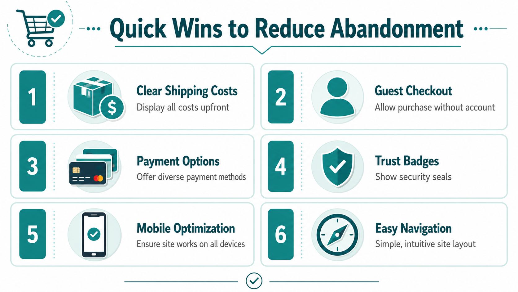
Price surprises kill intent. Put estimated shipping in the cart. Surface tax language early. If delivery timing affects the sale, show that too.
Shoppers do not expect perfect totals the second they land on a product page. They do expect honesty. If you sell physical products, add a shipping estimator in cart and mention thresholds for free shipping before the buyer reaches payment. If you run a Cincinnati-area service business selling appointments, packages, or deposits online, spell out fees and cancellation terms before the final step.
Turn on guest checkout and ask for the account later
Forced account creation blocks revenue. Keep the path to purchase short, then offer account setup on the thank-you page or in the confirmation email.
This matters even more for first-time buyers, mobile shoppers, and local service clients who want speed over loyalty perks. For healthcare providers and law firms, the rule is the same with one added caution. Keep intake and payment separate unless your system is built to handle protected data correctly. For HIPAA-sensitive workflows, collect only the minimum needed at checkout.
Put answers where hesitation happens
A buyer with one unresolved question often leaves. They rarely go hunting through your footer for help.
Use live chat, short FAQ prompts, and clear policy links on product, cart, and checkout pages. If you want to Automate e-commerce customer support, use it to answer the questions that block purchases: delivery windows, returns, insurance acceptance, document requirements, sizing, compatibility, and payment options.
At HDM, we see this with Cincinnati SMBs all the time. The issue is usually not traffic quality. It is unanswered friction right before the sale.
Fix the four buyer-facing elements that pay back fast
Start here:
- Payment methods: Offer major cards, digital wallets, and the options your audience already uses.
- Trust signals: Show secure checkout messaging, return policy access, contact information, and recognizable payment logos.
- Mobile clarity: Keep totals, CTA buttons, and form fields visible and easy to use on smaller screens.
- Checkout focus: Remove extra navigation, promo clutter, and distractions that pull people back into browsing mode.
These are not cosmetic tweaks. They reduce uncertainty, and uncertainty is what stalls revenue.
If you want a wider plan beyond cart fixes, HDM's guide to e-commerce growth strategies for Cincinnati brands shows how checkout, merchandising, retention, and support need to work together.
Building a High-Performance Checkout Experience
Quick fixes help, but serious revenue gains come from building a checkout that feels easy, fast, and dependable. That's where a lot of SMBs in Cincinnati hit a wall. Their storefront looks fine, yet the actual purchase path is patched together, slow on mobile, or awkward on custom platforms.
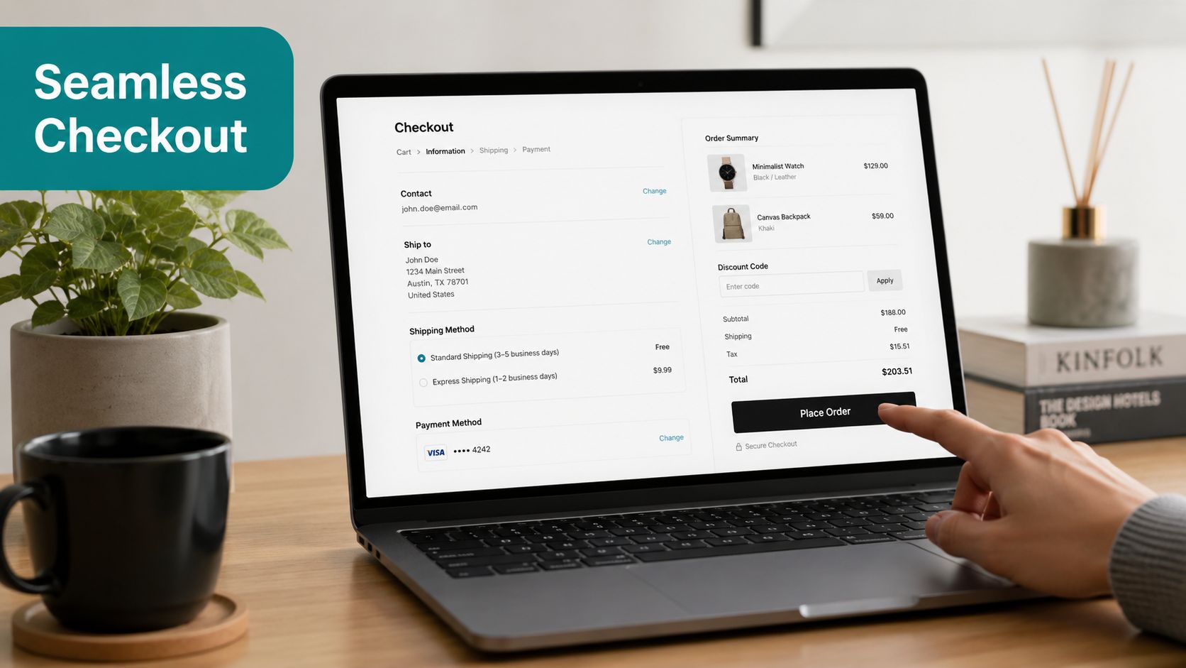
Mobile checkout is where many stores quietly lose sales
A responsive site isn't enough. Often, the breakdown occurs at payment. Storis reports that 78% of mobile cart abandonment happens during the payment method selection phase, often because digital wallet integrations don't work cleanly on headless or custom e-commerce builds.
That's the mobile-first abandonment paradox. A site can look polished on a phone and still lose buyers when Apple Pay, Google Wallet, or saved card flows fail at the last step.
If your mobile shoppers reach checkout and disappear, look closely at:
- Wallet compatibility: Apple Pay and similar options should appear correctly on supported devices.
- Payment routing: Don't make mobile users dig through desktop-style payment menus.
- Field behavior: Address autofill, zip code formatting, and card entry should work naturally on mobile keyboards.
Simplify the form without making it feel cheap
Good checkout design feels predictable. Buyers should know what's next, what's required, and whether their payment is secure.
A strong checkout usually includes:
| Element | What good looks like | Why it matters |
|---|---|---|
| Form length | Only essential fields | Less effort, fewer errors |
| Progress clarity | Clear steps or a short layout | Reduces uncertainty |
| Error handling | Helpful messages beside the field | Stops frustration fast |
| Security cues | Secure payment language and trusted processors | Builds confidence |
| Speed | Fast page loads and fast step transitions | Keeps momentum alive |
One practical resource for ongoing tuning is HDM's website performance and wellness support, which covers the kind of maintenance work that often affects checkout reliability, including speed, updates, and site health.
For stores on Shopify, WooCommerce, or custom stacks, this is also where a technical partner becomes useful. HDM builds and maintains e-commerce systems, headless CMS setups, and custom checkout experiences for businesses that need more than template-level fixes.
What a stronger checkout feels like to a buyer
The customer doesn't think in terms like optimization, conversion path, or form architecture. They think in simpler terms.
This feels easy. I trust it. I can finish this on my phone.
That's the standard. If your checkout feels even slightly awkward, buyers assume the fulfillment experience may be awkward too.
A short explainer on checkout experience is useful here:
<iframe width="100%" style="aspect-ratio: 16 / 9;" src="https://www.youtube.com/embed/CJHc_3tow0c" frameborder="0" allow="autoplay; encrypted-media" allowfullscreen></iframe>When owners hesitate to invest in deeper technical work, I usually give blunt advice. If you're already paying for traffic, then checkout performance is not a design detail. It's sales infrastructure.
Smart Recovery Tactics for Lost Sales
Even a polished checkout won't stop every abandonment. Some shoppers get distracted. Some need more time. Some want a final nudge. That's why recovery matters.
The most effective shopping cart abandonment solutions don't rely on one reminder email. They combine on-site intervention with off-site follow-up so the buyer sees a consistent message at the right moments.
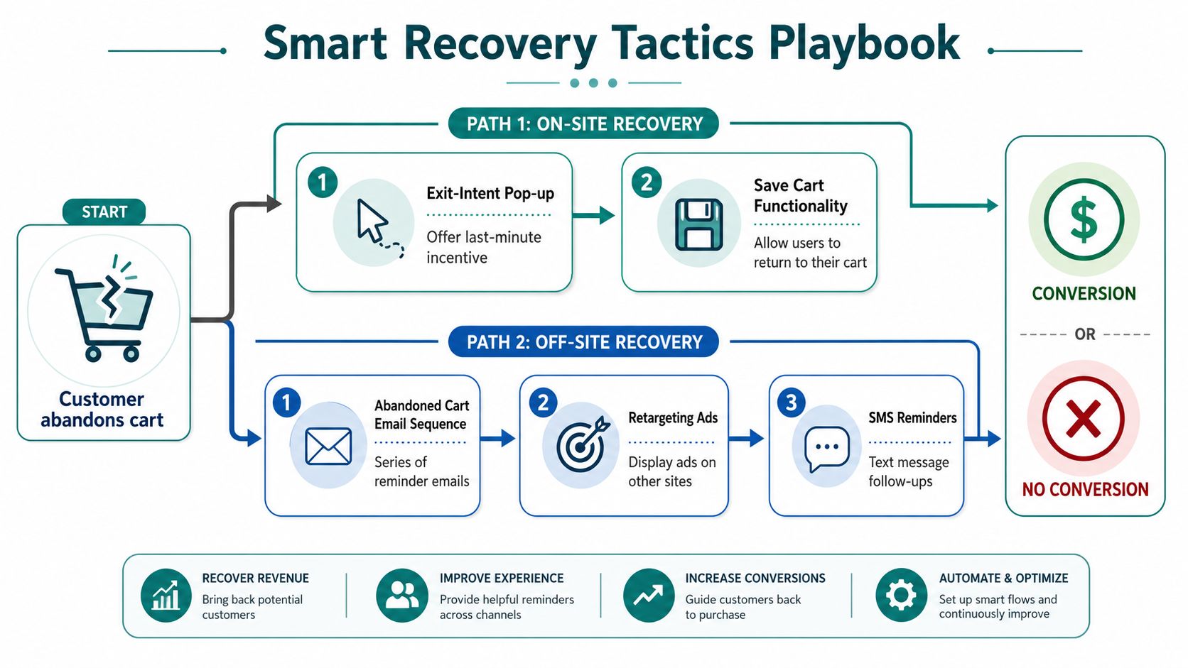
Start recovery before the visitor leaves
On-site recovery should do one job well. Interrupt hesitation without feeling desperate.
Good options include:
- Exit-intent popups: Show a clear message when someone moves to leave the page. Offer help, a shipping reminder, or a time-limited incentive.
- Save-cart functionality: Let users keep their cart and return without rebuilding it.
- Cart reassurance: Reinforce returns, shipping timing, or secure checkout right before exit.
This works especially well for buyers who aren't blocked by friction but are wavering psychologically. A direct reminder about value, timing, or convenience can be enough.
Use a real sequence, not a single reminder
Drip's cart abandonment data shows that automated cart abandonment email and SMS campaigns can recover up to 16.4% of abandoned carts, and that sending the first message within 60 minutes with a time-limited incentive like a 10% discount can dramatically boost recovery rates.
That doesn't mean every business should immediately discount. It means speed matters, and relevance matters more than generic copy.
A practical sequence looks like this:
- First touch within 60 minutes: Remind them what they left behind. Keep it simple and product-focused.
- Second touch later if no purchase happens: Address objections like shipping, fit, timing, or trust.
- Final touch with a clear reason to act: Use urgency carefully. A limited incentive can work if margins allow it.
Match the message to the business type
Not every cart follow-up should sound like a retail promo.
| Business type | Best follow-up angle | What to avoid |
|---|---|---|
| E-commerce brand | Product image, cart reminder, shipping clarity | Overloading with copy |
| Healthcare payment portal | Privacy, ease of completion, secure access | Aggressive discounts or casual tone |
| Law firm intake or payment | Reassurance, confidentiality, clear next step | Pushy sales language |
| Local service business | Convenience, appointment completion, support availability | Generic e-commerce templates |
Recover the sale by answering the question that stopped the buyer, not by shouting louder.
SMS can be strong when used carefully, but consent matters. Email is often the safer baseline. Retargeting ads can support both by showing the exact items or service context the person already considered. The key is coordination. Your popup, your email, your SMS, and your retargeting creative should feel like parts of one plan.
Your Implementation Roadmap and Checklists
A Cincinnati owner sees the same pattern every week. Orders start strong in the morning, carts fill up by lunch, then too many buyers disappear before payment goes through. The fix is rarely a flashy redesign. It is a tighter checkout, fewer points of friction, and follow-up that matches how local customers buy.
Use the checklist that fits your business. Then execute in order.
For Cincinnati e-commerce and DTC brands
Start with the money leaks closest to purchase. For local product brands, that usually means shipping clarity, pickup options, and mobile payment friction.
Your checklist
- Show delivery costs before checkout gets serious: If a Hyde Park shopper only learns about shipping at the last step, you created the hesitation.
- Put local pickup front and center: If you offer pickup in Cincinnati, Northern Kentucky, or nearby suburbs, say it early on product pages and in the cart.
- Offer the payment methods customers expect on phones: Test Apple Pay, Google Pay, major cards, PayPal, and autofill on actual iPhones and Android devices.
- Keep tax, shipping, and delivery timing easy to understand: Ohio buyers want to know the final total and when the order will arrive.
- Send recovery emails with the exact product left behind: Include the product image, variant, and direct cart link.
- Keep the cart saved across visits: Returning shoppers should not have to rebuild what they already selected.
- Answer local buying questions near checkout: Cover pickup windows, return policy, shipping zones, and who handles delivery.
If you use local delivery, be specific about the service area and timing. “Delivered in Cincinnati” is weaker than “same-day delivery inside Route 275” or “pickup available in Oakley.”
For Cincinnati SMBs selling online
Many Cincinnati small businesses are not running a large e-commerce catalog. They are selling gift cards, event tickets, classes, meal packages, memberships, or seasonal offers. That changes the checklist.
Focus on these priorities
- Cut extra steps between selection and payment: A simple offer should not require multiple account screens.
- Spell out what the buyer gets: Include timing, redemption details, location, and what happens after payment.
- Use real business trust cues: Show your local address, service area, phone number, and clear contact options.
- Keep the checkout page focused: Remove popups, oversized navigation, and promotions that pull attention away from finishing the purchase.
- Make confirmation immediate: Buyers should know right away whether they booked, paid, or registered successfully.
- Automate follow-up for incomplete checkouts: Send the reminder with a direct link back to the exact step they left.
For Cincinnati SMBs, local credibility matters more than polished branding language. Buyers are asking a simple question: Is this a real business, nearby, and easy to deal with?
For healthcare organizations with HIPAA considerations
Healthcare abandonment usually happens in bill pay, appointment deposits, portal registration, intake forms, and service enrollment. Patients stop when the process feels confusing, invasive, or insecure.
Your checklist
- Use HIPAA-appropriate tools and messaging: Recovery messages should stay minimal and avoid protected health information.
- Explain each step in plain language: Replace internal billing terms with instructions patients can understand quickly.
- State how privacy is handled before sensitive fields appear: Patients need reassurance before entering payment details or personal information.
- Ask only for the information required to complete the action: Extra fields create drop-off and raise privacy concerns.
- Offer immediate help: Add a billing phone number, portal support contact, or office line where the patient can get unstuck.
- Test the flow on mobile devices: Many patients start on a phone after hours, especially for bill payment and scheduling.
- Review vendors and forms with compliance in mind: The convenience of a faster form means nothing if the setup creates risk.
Healthcare groups in Cincinnati have another layer to manage. Many serve patients across multiple offices, hospital systems, and partner providers. If the handoff between those systems is clumsy, abandonment goes up fast.
For law firms
Law firm abandonment usually shows up in consultation requests, client intake forms, and payment pages. The person is already under stress. Long forms and weak reassurance push them out.
Use this checklist
- Shorten the first form: Collect only what your team needs to qualify the matter and make contact.
- State confidentiality clearly and early: Prospective clients need that reassurance before sharing sensitive details.
- Explain what happens after submission: Tell them whether they will get a call, email, consultation link, or invoice.
- Give people more than one way to continue: Some prospects will finish online. Others want to call the office or request a callback.
- Keep reminder messages professional: A law firm follow-up should sound calm, clear, and private.
- Check mobile usability after business hours: A large share of legal inquiries happen at night, on phones, when someone is finally ready to reach out.
- Review intake burden by practice area: Personal injury, family law, estate planning, and business law should not all use the same form length.
For Cincinnati firms, local trust matters here too. Prospects are often comparing you with another firm across town. Fast response and a clean intake process can decide who gets the case.
A practical 30-day rollout
Do this in a month, not six months.
Week 1: Audit the friction
- Review analytics and session recordings.
- Identify the highest-exit step.
- Test the full path on mobile, desktop, and tablet.
- Check whether Cincinnati pickup, delivery, or service-area details are missing where buyers need them.
Week 2: Fix the checkout basics
- Turn on guest checkout if it is off.
- Make pricing, taxes, and shipping clear earlier.
- Improve mobile payment options.
- Remove unnecessary fields.
Week 3: Add trust and continuity
- Save carts for returning visitors.
- Add support access at checkout.
- Tighten form copy, error messages, and confirmation screens.
- For healthcare and legal sites, review privacy and confidentiality language line by line.
Week 4: Launch recovery and measure results
- Turn on abandoned cart or incomplete form reminders.
- Segment by business type, product, or service line.
- Measure recovery rate, completion rate, and device-specific drop-off.
- Keep what improves completed purchases. Cut what does not.
Strong shopping cart abandonment solutions win on execution. Clear totals, easy payment, local trust signals, and a recovery plan built for your industry.
That is the difference between generic advice and a plan that works for Cincinnati businesses. A DTC brand in Over-the-Rhine, a multi-location healthcare group, and a downtown law firm should not use the same checklist.
If your website is getting traffic but too many buyers drop off before completing the sale, HDM can help you diagnose the friction, improve checkout performance, and build a recovery system that fits your business, whether you run an e-commerce store, healthcare portal, law firm site, or service-based company in the Cincinnati area.