

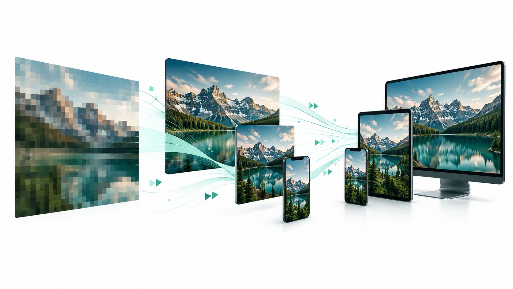
Images are the largest visible element on 85.3% of desktop pages and 76.0% of mobile pages, according to the 2025 Web Almanac performance report. That reframes image optimization: your first job isn't shrinking every file. It's making sure the image visitors need first loads first.
For a Cincinnati business, that might be a storefront banner, an attorney portrait, or a product photo next to the purchase button. Learning how to optimize images for web means balancing loading priority, file size, visual quality, and accessibility, without making every upload a technical project.
Choose the Right Format for Each Image
Images are the largest non-video contributor to page weight. The 2024 Web Almanac media report measured median homepage image transfers of 1,054 KB on desktop and 900 KB on mobile, compared with 442 KB and 348 KB, respectively, on inner pages.
KB means kilobytes, a measure of how much data visitors download. Those homepage totals make format selection a meaningful speed decision, especially when your main banner occupies much of the first screen.
Image formats compared for business websites
Baseline means the usual starting point for comparison. Lossy means some fine detail is discarded to make a file smaller.
| Format | Best for | Size compared with JPEG | Watch out for |
|---|---|---|---|
| JPEG | Photos such as staff portraits, storefronts, and product shots | Baseline for photos | Re-saving repeatedly degrades quality; no transparency |
| PNG | Logos, screenshots, and graphics needing transparent backgrounds | Often much larger for photos | Using PNG for photographs wastes bandwidth |
| WebP | Most photos and illustrations on the main site | Usually smaller at comparable visual quality | Keep a JPEG fallback for older publishing tools |
| AVIF | Large photos where maximum savings matter | Can be substantially smaller | Slower to encode; confirm your publishing tools can export it |
| SVG | Logos, icons, and simple line drawings | Tiny for simple art; wrong for photos | Request clean exports rather than unprocessed design files |
JPEG stores photographs efficiently but can introduce visible defects as compression increases. PNG preserves exact pixel information and supports transparent backgrounds. WebP offers compact photographs and graphics, while AVIF can reduce photographic file weight further. SVG describes shapes rather than storing a grid of pixels, so simple artwork stays sharp when enlarged.
The same Web Almanac dataset recorded desktop image sizes at the 90th percentile of 274 KB for JPEG, 116 KB for WebP, and 45 KB for AVIF. These were different images across real websites, not identical photographs converted under controlled settings, so they show a trend rather than guaranteed savings.
Practical rule: Use AVIF or WebP for photos, with JPEG as a fallback. Use SVG for clean logos and simple icons, or PNG when SVG isn't available.
Don't start by converting every tiny icon. Start with the largest banner or product photograph, where the format decision can make a more useful difference.
Which Images Load First and Which Can Wait
A compressed image can still appear late. If the browser doesn't find your main photograph promptly, a smaller file won't fix the entire delay.
Largest Contentful Paint, or LCP, measures when the largest visible content element appears. That's often the hero image, the prominent photograph or banner at the top of a page.
Give the first screen priority
Apply these changes in order:
- Stop lazy-loading the hero. Lazy loading postpones an image download until it approaches the visible area as someone scrolls. That suits lower-page galleries, not the photograph visitors should see immediately.
- Prioritize the actual LCP image. A developer can add
fetchpriority="high", a setting that asks the browser to give that image higher download priority. It's a hint, not a command to download it before absolutely everything else. - Make the image discoverable immediately. Keep its reference in the initial HTML, the page instructions the server sends first. Don't make the browser wait for an animation or additional software to insert it.
Marking every image high priority defeats the purpose. Identify the true LCP candidate for the layout, including any differences between phone and desktop views.
Reserve its space before it arrives
Cumulative Layout Shift, or CLS, measures unexpected movement while a page loads. Setting image width and height lets the browser reserve the right proportions before the download finishes.
Say a Cincinnati law firm's attorney portrait loads late and pushes the phone number down the page. A visitor reaching for that number may lose their place. Compressing the portrait helps its transfer, but reserving its space addresses the movement.
Use a Core Web Vitals optimization checklist to connect image fixes with these broader measures of loading and stability.
This video offers additional context for the performance work.
<iframe src="https://www.youtube.com/embed/FcQOA6clEb8" width="100%" height="400" frameborder="0" allowfullscreen></iframe>Choose the priority images for each reusable page layout: homepage banner, service-page portrait, and product-page main photo. Optimize those before the lower-page supporting images.
How to Optimize Each Image in Six Steps
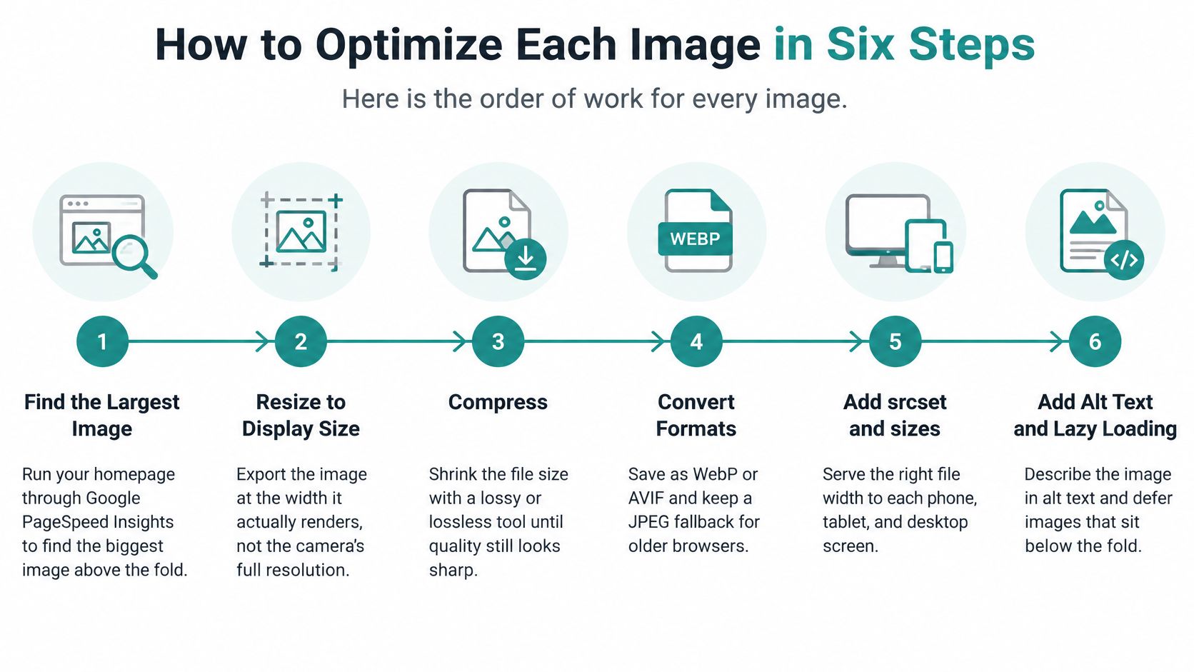
Use a repeatable sequence rather than experimenting with settings on the live website. Keep a short record of the page, image filename, original file weight, replacement file weight, and test result.
The workflow below separates preparing the file from checking how the website delivers it.
Prepare, publish, and verify
-
Find the largest image above the fold. Run your homepage through Google PageSpeed Insights, which reports performance issues and identifies the LCP element; above the fold means the first screen visitors see. Save both mobile and desktop results, and don't assume the visually widest image is always the measured LCP element.
-
Keep an untouched master file. Store the original photograph or designer export outside the website's upload folder so future edits start from a clean source. Compressing the only copy leaves you without a reliable way to recover lost detail.
-
Export an appropriate format. For photographs, test AVIF first, WebP second, and retain JPEG where a fallback is needed; reserve PNG or SVG for suitable graphics and transparency requirements. MDN's image-format guide describes lossy AVIF as approximately 50% smaller than comparable JPEGs and WebP as typically 25–35% smaller at similar visual quality, but your photograph still needs a visual check.
-
Resize for the actual display. Export the widths your page needs, including a suitable option for high-density screens, rather than uploading the camera's full-resolution file as the only choice. For example, a hypothetical photograph that's 6,000 pixels wide shouldn't automatically be delivered unchanged to a slot displayed at 1,200 pixels.
-
Compress and compare. Place the export beside the master at the size visitors will see, paying attention to faces, lettering, product texture, and edges. Don't judge everything from an enlarged editor preview, and back off the compression when meaningful detail starts to disappear.
-
Upload and rerun the same test. Confirm that the published page requests the replacement file, then compare its transfer weight and mobile loading result under comparable conditions. A common slip is testing an old cached version and concluding that nothing changed.
Check the outcome, not just the export
A useful result is a lighter image that appears sooner without losing meaning or sharpness. An improved mobile test score supports that result, but a single score isn't proof that every visitor has a faster experience.
Ask your developer to verify the actual image request as well. If the new file is smaller but the LCP result barely changes, investigate discovery, server response, and competing downloads rather than repeatedly lowering image quality.
Resize Images So Every Screen Gets the Right File
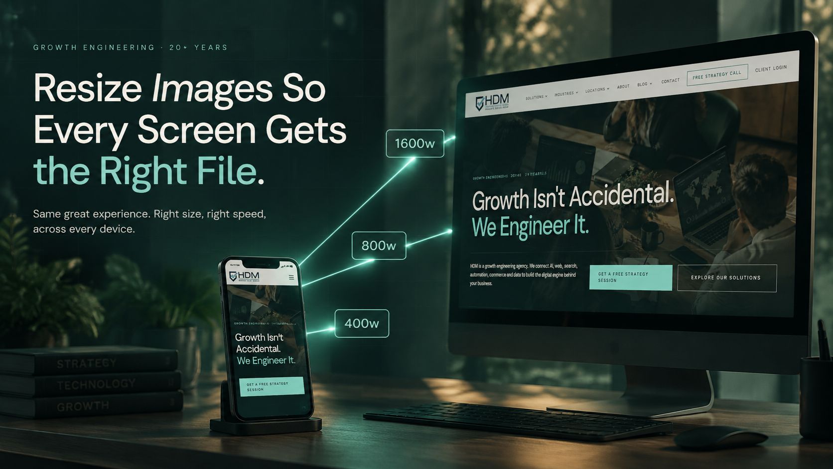
Think of srcset as a rack of the same shirt in different sizes, and sizes as the instructions describing which fit the page needs. The browser uses both to choose an appropriate image instead of giving every visitor the largest version.
A phone on a cellular connection shouldn't automatically receive the same hero file as a large desktop display. Responsive images provide alternative files for different display conditions.
Match the download to the layout
A developer might offer widths of 480, 800, 1,200, and 1,600 pixels as practical export candidates. Those are starting options, not universal requirements.
The sizes value describes how wide the image appears within the page. For example, (width <= 600px) 100vw describes a full-width image on smaller screens; 100vw means the full viewport width, or visible browser width. A sidebar thumbnail needs a smaller declared slot.
The picture element, an HTML container for alternative image sources, can offer AVIF and WebP while retaining JPEG as the fallback. For the detailed browser-selection behavior, consult MDN's responsive images guide.
An oversized
sizesvalue can make the browser download a larger file even when smaller alternatives exist.
Check a phone-sized request
Say a Norwood dental practice serves its desktop waiting-room banner to every visitor. The fix is to generate suitable alternatives and ensure the page describes their display width accurately.
- Inspect the request. On a desktop browser, right-click the page, choose Inspect, and open the Network tab.
- Simulate a phone. Enable the developer tools' mobile view, reload, and filter requests to images.
- Compare the result. Check the downloaded filename, dimensions, and transferred size against the desktop request. Confirm the appearance on a real phone too.
Phones generally don't offer that same right-click workflow, so use desktop developer tools or ask your developer to inspect the connected device.
For hands-on preparation, the RevelRaw image resizing guide is a useful companion when creating resized copies. Have your web team build these rules into page templates so future uploads don't require manual intervention every time.
Compression Settings and Tools That Fit Each Image
Lossy compression removes some fine detail to shrink a file, which often suits photographs. Lossless compression preserves pixel information, making it useful when small lettering, crisp edges, or exact graphics matter.
A quality slider isn't a universal measurement. The same setting can produce different results across formats and export tools.
Starting compression settings by image type
MDN's multimedia performance guide recommends a quality setting around 75% as a reasonable starting point, followed by visual checks. Treat the other settings below as trial exports, not promises of equivalent quality across encoders.
| Image type | Format | Starting quality | What to check |
|---|---|---|---|
| Photos of people, products, or storefronts | AVIF or WebP | Around the photo baseline, then review | Skin tones and fine detail at display size |
| Text-heavy menus, certificates, or infographics | WebP lossless or PNG | Lossless | Small text stays crisp |
| Logos and simple icons | SVG, or PNG if SVG isn't available | Lossless | Color accuracy against the brand file |
| Transparent product cutouts | WebP or PNG | Lossless first; test high-quality WebP if needed | Light or dark halos around edges |
| Hero banners with faces | AVIF or WebP | Start near the photo baseline and adjust | Waxy skin or blurred facial detail on phones |
Faces deserve close inspection because aggressive compression can smooth away natural texture. A restaurant menu needs a different check: whether someone can comfortably read the smallest item and price.
Choose a tool your team will use
- Squoosh is a free browser tool with a side-by-side comparison, useful when an owner wants to see exactly what a setting changes.
- TinyPNG and TinyJPG suit batch uploads when you need a straightforward processing workflow.
- ImageOptim is an option for Mac users handling local files.
- Photoshop or GIMP lets a designer combine cropping, resizing, and export review in one application.
Developers can use cwebp, avifenc, ImageMagick, or the Sharp library to process many images automatically. These command-line tools and software components are more appropriate for a maintained publishing system than an owner's occasional upload.
Avoid repeatedly recompressing an already compressed file, exporting ordinary photographs as PNG, and stripping color profiles without checking the result. Color profiles describe how colors should appear; removing them carelessly can change the appearance of products or brand materials.
Write down one preferred tool and starting setting for each image category. Then make the final acceptance rule visual: readable text, accurate products, natural faces, and no distracting defects at the published size.
Alt Text, Filenames and Metadata for Search and Accessibility
Could someone who cannot see the image still understand the same information or take the same action? That's the useful test for alt text, the text alternative a screen reader can announce.
Alt text should preserve the image's purpose, not narrate every visible detail. The W3C images tutorial distinguishes informative, decorative, functional, and complex images because they need different treatment.
Write for the image's job
- Informative photographs need the relevant information. A waiting-room image might describe step-free seating access if that feature matters to the page, rather than merely saying office photo.
- Decorative images should use
alt="", an empty alternative, so assistive technology can skip them. - Linked logos should identify the organization and make the destination clear, such as the organization's homepage.
- Image buttons need the action, such as Schedule an appointment, rather than a description of their shape or color.
- Charts need a short summary and a detailed text equivalent, such as an accessible table containing the figures.
Healthcare instructions, legal evidence, and product claims warrant subject-matter review. Don't accept an automatically generated caption without checking whether it preserves the information a patient, prospective client, or buyer actually needs.
Accessibility check: Compression and mobile cropping are unacceptable if they remove information people need to understand the page.
Keep search signals descriptive
Use filenames such as norwood-dental-waiting-room.jpg rather than a camera-generated filename. That makes the asset easier to identify and maintain without turning the filename into a string of marketing keywords.
Alt text can support search relevance, but irrelevant city names and repeated service terms don't make a useful description. For product catalogs, include image review within your broader e-commerce SEO workflow, alongside product information and page organization.
Metadata is information stored inside a file. Camera photographs can contain location coordinates and device details, so remove unnecessary private information from staff and office exports while preserving the archival master.
Before publishing, ask:
- Meaning: Does the text alternative communicate the relevant information or action?
- Readability: Did compression or cropping remove anything important?
- Privacy: Does the public file contain unnecessary personal or location information?
Set Up Your Image Routine and Check Results
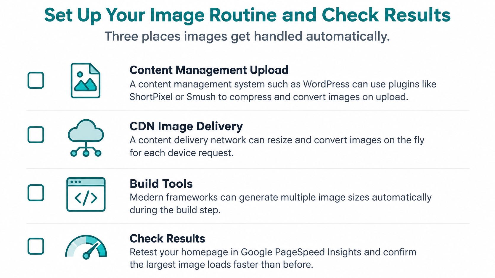
Automate image handling where your website already supports it. The main options are a content management system, software used to publish pages; your hosting platform's delivery service; or a developer-controlled build process that prepares files before publication.
Don't install another image plugin until you know what your existing setup does. Overlapping tools can create redundant files or conflicting delivery rules.
Configure the platform you have
- WordPress: Choose one compression plugin, such as ShortPixel or Smush. Enable WebP where supported, apply your tested photographic quality setting, and confirm that the theme supplies image dimensions and appropriate loading behavior.
- Shopify or Squarespace: Check which resizing and conversion features your platform already provides. Upload a suitable high-quality source, then inspect and retest the actual product page rather than assuming the upload settings guarantee efficient delivery.
- Custom-built sites: Ask the developer to generate required widths and formats during the build, the process that prepares the website for publication. Include a report of generated files so unusually heavy assets are easy to catch.
A content delivery network, or CDN, stores copies of files on distributed servers so visitors can receive them from an appropriate location. Browser caching lets returning visitors reuse downloaded images.
Use long cache lifetimes for stable image files, paired with versioned filenames when the image changes. That allows efficient reuse without leaving visitors stuck with an outdated product photograph.
Measure loading and stability
Core Web Vitals are measures of real visitor experience. Image work should improve the relevant metric, not merely the appearance of a test report.
| Metric | Usual image cause |
|---|---|
| LCP, time until the largest element appears | Oversized hero image or late discovery in the HTML |
| CLS, how much content shifts while loading | Images without set width and height |
PageSpeed Insights combines controlled tests with real-user information when available. Search Console's Core Web Vitals report helps identify affected groups of pages and labels their performance good, needs improvement, or poor.
The 75th percentile is the result at or below which three quarters of recorded experiences fall, not an average visitor's score. Use available field results alongside repeatable tests, and don't confuse an immediate laboratory improvement with a completed change in real-user reporting.
Assign ownership and a review date
Each month, test your five most important pages as a manageable review routine. Record the LCP element, image transfer weight, mobile test results, and any visible movement; investigate changes as part of a technical SEO audit.
Also review inquiries, appointment requests, or purchases for the affected page types. Don't promise a revenue lift from smaller files alone, and don't attribute every conversion change to image work.
Decide who uploads images, which format and size rules they follow, and when the review happens. A documented routine prevents the next campaign banner from undoing your improvements.
Helbling Digital Media offers web design, SEO, and performance optimization for Greater Cincinnati businesses, with ongoing performance tuning through its Website Wellness plans. Visit Helbling Digital Media to discuss an image-delivery review, identify the priority fixes on your key pages, and build a publishing routine your team can maintain.