

Google's modeling found that when mobile page complexity increased from approximately 400 to 6,000 elements, the probability of conversion fell by 95%, according to its mobile page-speed analysis. That's a useful warning for any Cincinnati business considering a redesign: adding more features isn't the same as earning more inquiries.
Lead generation website design means helping the right visitor understand your offer, trust your business, and complete a useful next step. Accessibility, form friction, and tracking belong in that conversation because each can determine whether an interested prospect becomes a sales opportunity or disappears.
The Core Elements Every Lead Page Needs
| Element | Standard to aim for | Why it matters | Quick check |
|---|---|---|---|
| Above-the-fold headline | Names the service and city in one line | Visitors need to recognize whether you can help | Show someone the page for five seconds and ask what it offers |
| Primary call to action | One action, repeated after each section | Competing buttons split attention | Count the distinct actions on the page |
| First-contact form | Three to five fields as a starting recommendation | Extra questions add effort and can discourage completion | Count visible fields on a phone |
| Mobile load time | Aim for under 3 seconds | Slow pages lose visitors before they read | Run a mobile speed test over cellular |
| Body text contrast | At least 4.5 to 1 | Phone users outdoors and people with low vision need legible text | Run a contrast checker on copy and buttons |
| Trust proof | Reviews, licenses or credentials, and a named team member | Prospects need a reason to trust you | Confirm proof is visible without scrolling far |
| Tap-to-call number | Clickable phone number in the mobile header | Calling should be an easy alternative | Tap the number on a phone |
| Follow-up notice | States what email or call comes next | Unexpected follow-up can cause complaints | Read the form area for a clear notice |
Treat these as starting standards, not a finished design. The form recommendation isn't a universal optimum, and the speed target isn't permission to ignore a page that feels sluggish despite passing a test.
Make the essentials work together
The headline should identify the service before it tries to sound clever. A call to action, meaning the button or prompt that asks visitors to act, should describe the next step rather than say Submit.
Place relevant proof near that decision. A roofing license, a specific customer review, and a named estimator answer different concerns, so don't substitute a row of anonymous badges for meaningful evidence.
MakeAutomation's guide to build landing pages for qualified leads is a useful companion when deciding how tightly to match the offer, audience, and qualification questions.
The follow-up note should describe your actual process, not an optimistic response promise nobody owns. Likewise, test the phone number rather than assuming the designer made it clickable.
Load time deserves particular attention because an attractive desktop preview can hide a cumbersome mobile experience. Contrast deserves the same scrutiny: brand colors aren't automatically readable colors.
Quick acceptance test: A stranger should be able to name the service, the city, and the next step after looking at the page for five seconds.
Industry Requirements That Change Your Lead Page
Find the row that resembles your buyer's task, then check the form and trust requirements before writing copy. The main lead action determines what information you need now and what can wait for a conversation.
| Business type | Main lead action | Form fields to ask for | Trust element to show |
|---|---|---|---|
| Home services (HVAC, roofing, plumbing) | Call now or request a quote | Phone, service address, service needed | Licensing, response time, reviews |
| Healthcare practice | Request an appointment | Name, contact details, general reason for visit | HIPAA-compliant form handling, credentials, patient reviews |
| Law firm | Request a consultation | Name, phone, matter type | Attorney bios, practice areas, case results where permitted |
| Real estate | Schedule a showing or valuation | Name, property address, timeline | Local market pages, recent sales, agent photos |
| E-commerce store | Start checkout | Email, shipping address, payment method | Total cost shown early, return policy, guest checkout |
| Professional services | Book a discovery call | Name, company, budget range | Client results, named team members, case studies |
Where mistakes cost more than convenience
For emergency home services, prioritize a clear service area and an immediately usable phone number. Publish response-time claims only when operations can support them; a compelling promise that dispatch can't honor creates the wrong expectations.
Healthcare organizations should confirm HIPAA-compliant handling with their form vendor, including storage, notifications, and integrations. Keep sensitive health details out of open contact forms, and don't mistake a security badge for confirmation that the entire workflow is appropriate.
Law firms need practice-area context and a clear notice that submitting an inquiry doesn't create an attorney-client relationship. HDM's attorney lead-generation guidance provides additional context for matching intake to legal-service demand.
For stores, show charges before the final purchase decision and avoid unnecessary account creation. Baymard's cart-abandonment guidance identifies early total-cost disclosure, guest checkout, and fewer unnecessary fields as controllable improvements.
Match the workflow, not just the template
Say a Hamilton County roofing company needs an address to determine service coverage. A Northern Kentucky law practice needs a matter category to route an inquiry, but shouldn't invite a detailed confidential narrative through a generic form.
Live chat adds another collection point. If your operation serves people covered by European privacy rules, SignalZen's guide to meeting GDPR requirements in live chat can help frame the questions to resolve before launch.
Choose the row that matches the buyer's situation, not the industry label alone. A scheduled roof replacement and an active leak require different levels of urgency even within the same company.
How to Plan the Message Before the Design
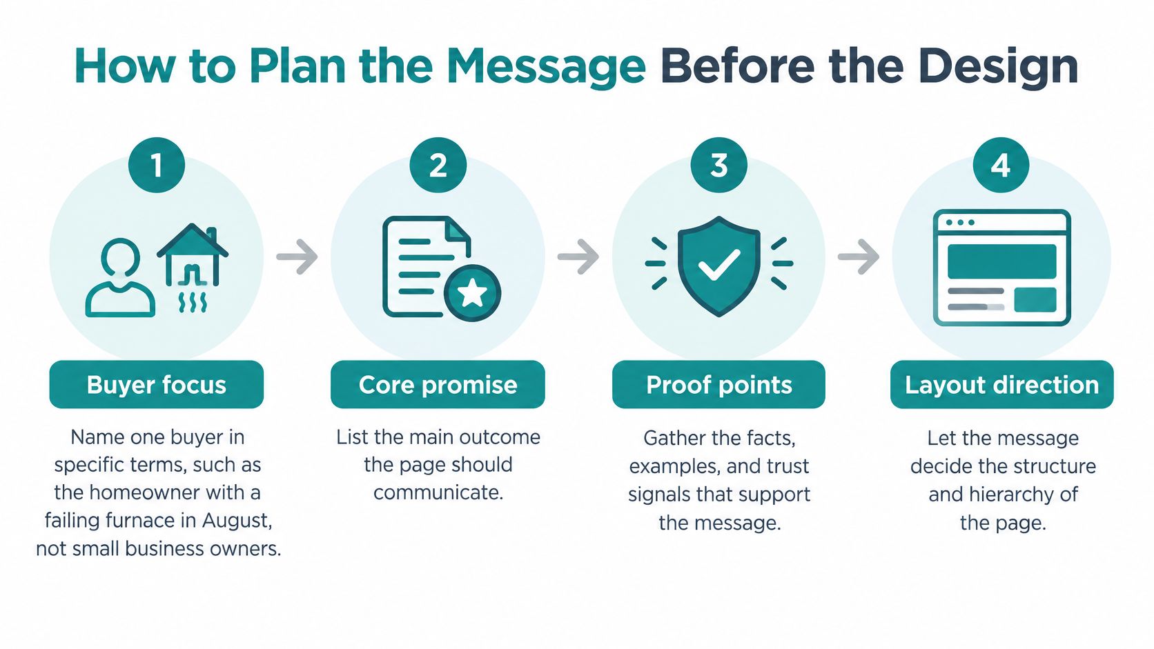
Write the message before choosing page layouts. For a local example, consider an HVAC company helping a Hamilton County homeowner whose air conditioning has stopped working during hot weather.
The planning sequence below keeps the offer connected to that homeowner's immediate decision.
-
Name a specific buyer. Write for the homeowner trying to restore cooling, not everyone who owns a building. The common slip is combining emergency repair, commercial maintenance, and replacement-system shopping into a headline that serves none of them clearly.
-
List the questions blocking the call. Start with what the visit might cost, how soon someone can arrive, and whether the company is licensed. Don't substitute internal talking points, such as company history or equipment partnerships, for answers the homeowner needs.
-
Write a promise you can fulfill. A same-day AC repair promise across Hamilton County works only if availability and coverage support it. If scheduling changes, explain the conditions rather than presenting a blanket guarantee.
-
Choose the primary action. For this page, make requesting repair the main outcome and remove equally prominent replacement-financing or newsletter buttons. Supporting information can remain available through quieter links without competing with the booking decision.
-
Match proof to the uncertainty. Use a relevant review for confidence, an accurate availability statement for timing, and a real crew photo for reassurance. Don't use an unrelated installation testimonial to answer a concern about urgent repair.
-
Arrange the page around the decision. Order the content as problem, promise, proof, offer, then form. Avoid opening with a long company introduction that makes an uncomfortable homeowner search for the service details.
Turn the message into layout direction
These planning activities can be grouped into a simple visual workflow.
One service in one area is a useful organizing principle for focused landing pages. Separate service and service-area pages can support relevant search visibility and give visitors a more appropriate conversion path, provided each page contains useful local information.
Don't manufacture interchangeable location pages by swapping city names. Explain actual coverage, scheduling considerations, service limitations, and examples of the work available in that area.
A homepage has a broader routing job, so it doesn't need to pretend every visitor wants emergency AC repair. It should help people reach the relevant page without forcing them through a generic inquiry process.
Read only the headings aloud. If they don't explain the offer and make the next step understandable, redesign the message before redesigning the page.
Keep a written version of the promise, proof, and primary action beside the design mockup. That gives the owner, writer, and developer a shared basis for deciding whether a proposed section helps the buyer or merely fills space.
Designing Forms and Calls to Action That Get Completed
Start by deciding what makes an inquiry useful to the person who will answer it. A form should support that first conversation, not reproduce your entire sales questionnaire.
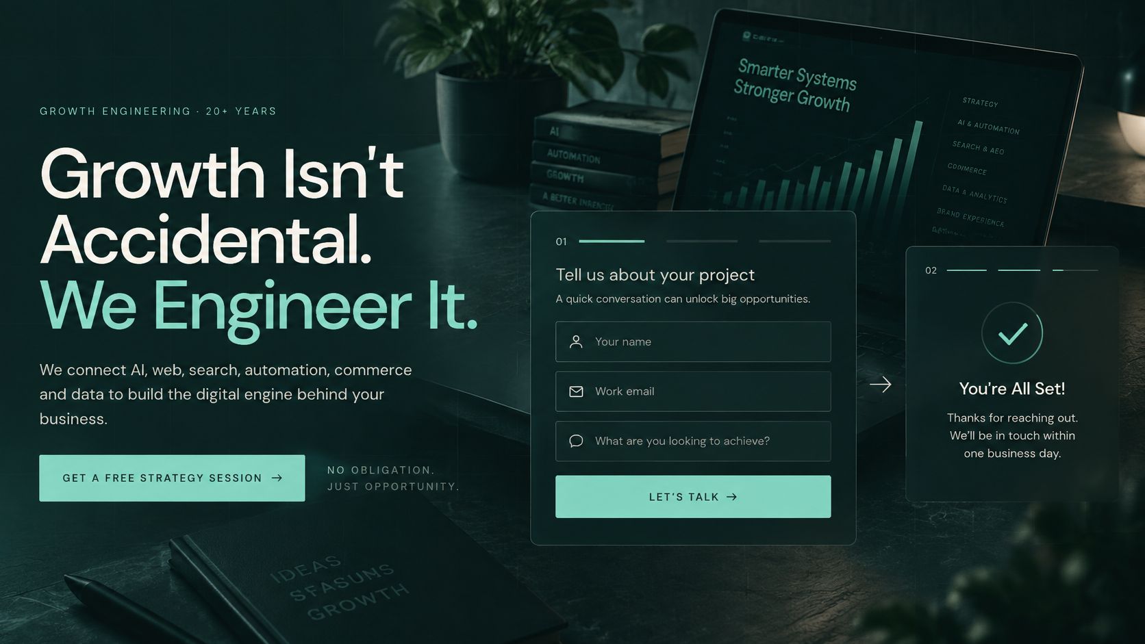
This example shows how a consultation request can sit alongside a clear service proposition.
Reduce effort without removing qualification
Use a staged process rather than deleting fields indiscriminately:
- Define minimum qualification. Start with a name, a usable contact method, and a question that establishes service fit. Keep information that changes whether or how your team responds.
- Move optional questions later. Company size, project background, or detailed timelines can often wait. Don't label a question optional if the form secretly requires an answer.
- Enable browser autofill. Use standard field types and appropriate mobile keyboards. Preserve entered information when someone encounters an error.
- Explain errors at the field. Tell people what to fix, such as the missing area code, instead of showing a generic invalid-input warning at the top.
- Watch prospects complete the task. A practical initial usability test can involve five to eight representative prospects. Ask them to inquire without coaching, then record hesitation, errors, and abandonment.
Count the work visitors must do, not just the screens they see. Baymard's checkout usability research found that total field burden matters more than step count, with usability tending to deteriorate after roughly eight steps.
That's checkout evidence, not a prescription for every business inquiry. The transferable lesson is to evaluate effort throughout the task rather than assuming a multistep form is automatically easier.
Make the next step explicit
Progressive profiling means collecting essential contact information first and gathering additional qualification details later. It works when the follow-up process collects those details; otherwise, sales receives incomplete inquiries and spends time chasing context.
Use outcome-based button wording, such as Get my free estimate or Book a consultation, only when the offer matches. Place the primary button where visitors can see it without scrolling, then repeat it after meaningful proof.
The embedded video provides another format for reviewing the conversion experience.
<iframe src="https://www.youtube.com/embed/X29ErGhrCZ0" width="100%" height="400" frameborder="0" allowfullscreen></iframe>If chat supports the form, define when a person takes over. SupportGPT's guide to planning chatbot handoffs to human agents is relevant when a visitor needs an answer the automated flow can't responsibly provide.
For business-to-business inquiries, B2B conversion-rate optimization should connect form changes to sales readiness, not just submission volume.
Test these next:
- Field burden: Compare completion, errors, and abandonment by field.
- Lead quality: Measure qualified-lead rate alongside time to completion.
- Audience differences: Run separate experiments for healthcare, legal, e-commerce, and B2B visitors.
- Button clarity: Compare specific outcomes without changing the underlying offer simultaneously.
Speed and Accessibility Checks That Protect Your Leads
Speed isn't a back-office concern. A prospect who leaves before the form appears never gets the chance to evaluate your credentials, pricing, or service.
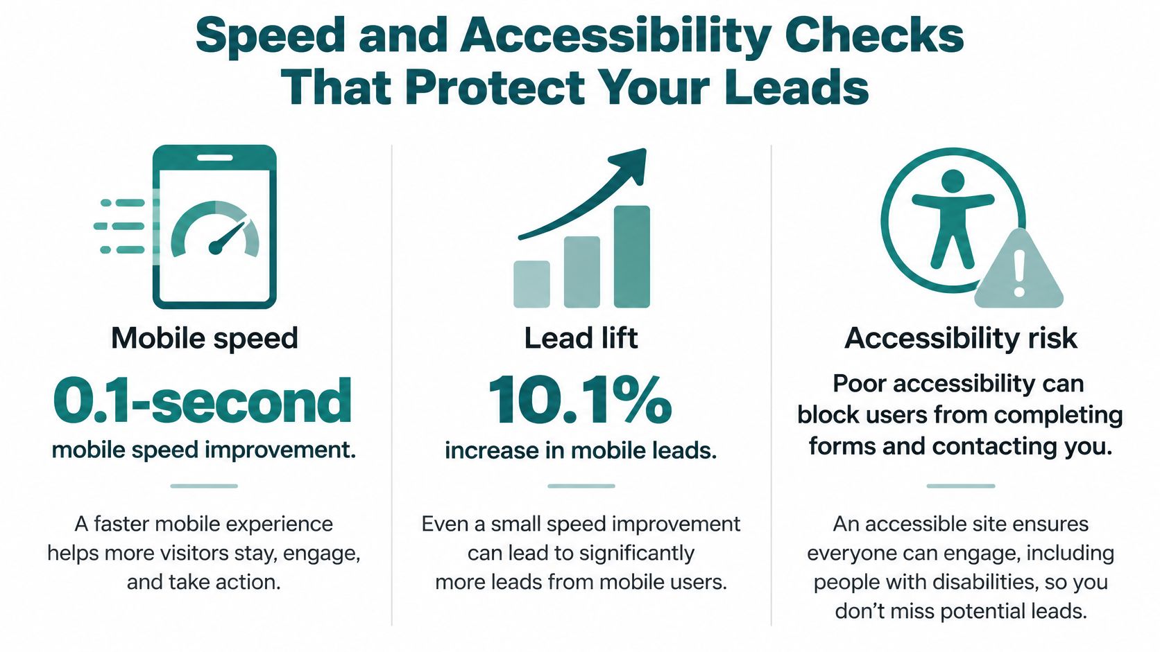
Google and Deloitte Digital's Milliseconds Make Millions report, based on mobile data from 37 brands, associated a 0.1-second speed improvement with a 10.1% increase in mobile conversion rates and, for lead-generation journeys, a 21.6% uplift from the first form step to submission. Those are study associations, not a guaranteed lift for your website.
Remove weight before adding features
Test on a phone over cellular data, not just an office connection. Use PageSpeed Insights to identify problems, then compare its findings with the actual experience of opening the page and completing an inquiry.
Compress oversized images, remove scripts the landing page doesn't need, and delay third-party chat widgets until the main content loads. Review decorative sliders, duplicate banners, and unused plugins before approving another feature.
HDM's guide to Core Web Vitals optimization explains the measurements behind loading, responsiveness, and visual stability. Ask for a usable page, not merely a good-looking test score.
The relationship between performance and a usable conversion path is summarized below.
Treat accessibility barriers as blocked inquiries
Missing labels, faint text, and controls that require a mouse can stop an otherwise qualified prospect. Accessibility testing belongs on the actual inquiry path, including validation errors and confirmation screens.
Under WCAG 2.2, normal text generally needs 4.5:1 contrast, while large text needs 3:1, as explained in the U.S. Access Board's contrast baseline. Exceptions apply to items such as logos, decorative text, and inactive controls.
Don't assume an automated overlay makes a site accessible. LegalClarity's accessibility-risk overview describes FTC action over deceptive overlay claims, reinforcing the need to correct the underlying interface.
A form isn't working simply because someone using a mouse on a large monitor can submit it.
Repeat this routine after updates:
- Mobile journey: Open the page over cellular, complete the form, and check for slow or shifting controls.
- Keyboard and zoom: Tab through every field and button without a mouse, then inspect the page at 200 percent zoom for clipped content.
- Screen-reader submission: Use VoiceOver or NVDA to check labels, instructions, error announcements, and confirmation. Record anything you can't complete and have it corrected.
These checks don't replace a professional accessibility audit. They give an owner a repeatable way to catch obvious revenue-blocking problems before they remain live unnoticed.
Tracking Leads Back to the Pages That Earn Them
A submission count can't tell you which pages generate sales-ready inquiries. You need to connect the initial visit, the inquiry, and the sales outcome without collecting unnecessary personal information.
Set up that connection in a deliberate order:
- Capture page and campaign. Add hidden form fields for the originating page and campaign parameters. Test that navigation doesn't overwrite the original source unintentionally.
- Attribute calls. Configure call-tracking numbers to associate calls with the relevant page or campaign. Keep your public business information consistent.
- Carry the source into your CRM. HubSpot, Salesforce, and GoHighLevel can hold the lead record, but the integration must map the source fields.
- Score at intake. Separate service-ready inquiries from newsletter signups using explicit criteria such as service fit and location.
- Ask the visitor. Include a How did you hear about us? question with a free-text option, preferably without making it another mandatory obstacle.
| Method | What it records | Setup effort |
|---|---|---|
| Hidden source field | Page and campaign behind each form submission | Low |
| Call tracking number | Page associated with each phone call | Medium |
| CRM source field | Source carried through every lead record | Medium |
| How did you hear about us question | Self-reported sources analytics miss | Low |
| Branded search and direct traffic trends | Possible assisted demand after AI or offline discovery | Medium |
Separate discovery from attribution
In a September 2025 survey, 44% of small businesses reported more leads from AI-powered search and chatbots, while most surveyed businesses still blocked the associated crawlers, according to Clutch's AI-crawler survey.
A prospect may discover your expertise inside an AI answer, then search your company name later. Last-click reporting may credit that branded visit without identifying the earlier influence.
Publish clear service facts, named expertise, and useful original evidence. Decide separately which proprietary or sensitive material shouldn't be exposed; broad crawler access isn't automatically the right choice for every page.
Use a dashboard to connect inquiry records with business outcomes rather than treating visits as the final result.
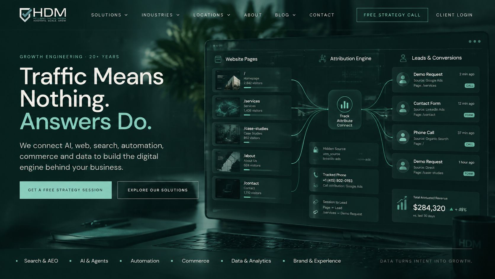
Follow up responsibly
The FTC's CAN-SPAM compliance guide states that the law has no business-to-business exception. Commercial follow-up needs accurate sender details and compliant unsubscribe handling; a form submission isn't unrestricted permission for every future campaign.
Explain the expected follow-up beside the form and distinguish service responses from marketing messages. Then review a simple monthly report: leads by page, source, and qualified rate, with self-reported discovery kept alongside analytics attribution rather than overwritten by it.
Confirm Your Page Plan Before You Redesign
Run a small acceptance test before approving a new visual direction. You'll get a more useful project scope by documenting where the current journey fails than by collecting screenshots of websites you like.
- Audit the key pages. Apply the core-elements checklist to your homepage and main service page. Record missing information, competing actions, and proof that doesn't support the offer.
- Submit on a phone. Count the visible fields, note errors, and time your attempt. Check whether the confirmation explains what happens next.
- Follow a test lead. Confirm it reaches the correct person and appears in the CRM with its source attached. An email notification alone doesn't establish that the tracking works.
- Check access. Test form contrast, keyboard navigation, and button visibility. Save screenshots or recordings of anything that prevents completion.
Choose a repair or a rebuild
Repair the current site when its structure is sound and the problems are concentrated in the form, performance, or proof. Consider rebuilding when the underlying system prevents reliable tracking, usable mobile performance, or basic accessibility improvements without extensive workarounds.
Helbling Digital Media is a Cincinnati-area agency based in Springboro, Ohio, and one option for reviewing those results. We put a senior person on every engagement, so the conversation can address business decisions as well as visual preferences.
Our Lead Generation & Scoring service includes form abandonment recovery, lead quality scoring, CRM sync with HubSpot, Salesforce and GHL, and routing with alerts. Those capabilities are relevant when the gap lies between receiving an inquiry and getting it to the right person.
Bring your test results to a proposal discussion. Request a written scope covering speed testing, accessibility checks, source tracking, and acceptance criteria, not just page layouts.
Helbling Digital Media offers a free 30-minute strategy call and a free design preview to help you evaluate a buyer-focused website direction. Visit Helbling Digital Media with your page audit and test-lead results to discuss whether targeted fixes or a redesign would better support qualified inquiries.