
You're paying for ads, showing up in local search, and watching shoppers put products in their carts. Then the orders stop short. Before you approve a new checkout design or increase your marketing budget, find out what those buyers encountered between deciding to buy and trying to pay.
WooCommerce checkout optimization starts with diagnosis, not a one-page redesign. For a Greater Cincinnati business, the right fix might be clearer shipping costs, fewer required fields, a working payment option, or a mobile page customers can use.
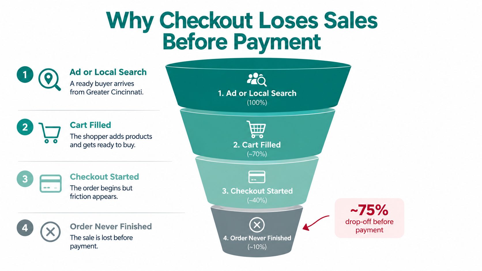
Why Checkout Loses Sales Before Payment
Consider a Cincinnati retailer reviewing store activity after a promotion. Visitors arrived, selected products, and started checkout, but some never placed an order. It's tempting to blame an outdated theme. That's a design opinion, not yet a diagnosis.
Different shoppers can leave the same page for entirely different reasons. One sees an unexpected shipping charge. Another needs delivery sooner. Someone else doesn't trust the payment screen, refuses to create an account, or encounters an error.
Baymard's cart abandonment research identifies extra costs, slow delivery, payment-security concerns, forced registration, checkout complexity, and site errors among abandonment reasons. Those problems need different remedies. A shorter form won't resolve an unacceptable delivery date or a total that changes unexpectedly.
The buying path gives you a useful starting point for investigating where customers leave.
What Is Stopping the Order
| Likely cause | What the shopper experiences | First place to look |
|---|---|---|
| Surprise costs | The final total exceeds expectations | Exits after shipping or tax updates |
| Delivery mismatch | Available arrival timing doesn't work | Shipping selections and delivery messaging |
| Forced registration | Buying requires creating an account | Exits at account creation |
| Form complexity | Too much information is requested | Field errors and incomplete forms |
| Payment failure | Payment is rejected or unavailable | Gateway records and decline codes |
| Technical instability | The page freezes or stops responding | Mobile behavior and error logs |
Don't combine every abandoned visit into a single explanation. Ask your agency to separate checkout activity by device, country, shipping method, payment method, and error type. Compare shoppers who reach payment with those who leave after an address correction or total recalculation.
Collect Evidence Before Approving Design Work
Have your developer record address-validation failures, declined payments, shipping and tax recalculations, and technical errors without collecting sensitive payment information. Ask them to distinguish a customer leaving voluntarily from a transaction that couldn't finish.
For a practical way to organize that investigation, Figr's resource on understanding user journey maps is a useful companion. Map what the shopper sees and does, rather than documenting only what your team intended.
Practical rule: Show the full payable cost as early as you can calculate it accurately. If an address is needed first, explain that instead of presenting an incomplete total as final.
Use that evidence alongside these shopping cart abandonment solutions. The decision should be which obstacle to remove, not which redesign looks most impressive.
Reduce Checkout Fields Without Breaking Orders
Every required field needs a business reason. Keep information needed for fulfillment, tax, fraud prevention, or compliance. Challenge everything else.
Start by reviewing the information request and order summary together.
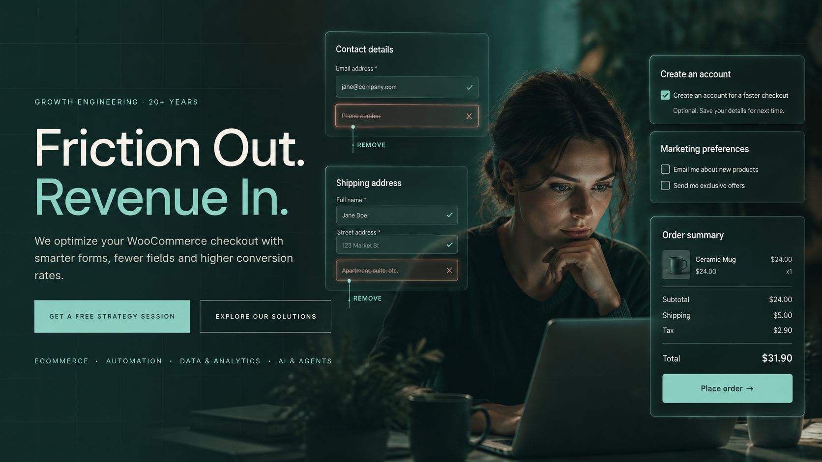
Baymard's 2024 checkout research found an average of 11.3 form fields and 5.1 steps, while 17% of shoppers reported abandoning an order because checkout was too long or complicated. Those are audit benchmarks, not a prescription to force every store into an identical layout.
Audit What You Ask Customers to Enter
Read the form as a first-time buyer, then review it with whoever handles fulfillment and accounting. A field that looks unnecessary to the designer may support a real operational requirement.
- Contact details: Keep what you need for receipts and order support. Require a phone number only when you can explain its purpose.
- Address information: Retain delivery and tax essentials. Make apartment or suite details available without making everyone complete them.
- Account creation: Offer guest purchasing where your business model permits it. Don't make ordinary retail customers invent a password before buying.
- Marketing permission: Separate optional subscription choices from purchase requirements.
- Order notes: Keep them when customers need to provide fulfillment instructions.
- Payment information: Confirm processor requirements before changing billing fields.
For a healthcare or legal organization, required information deserves a careful workflow and compliance review. Don't treat removing fields as permission to discard necessary records. Equally, don't collect sensitive information in an ordinary checkout merely because a form builder makes it possible.
Give Your Developer a Before-and-After List
Consider a hypothetical Springboro shop asking for a company name, second address line, and account password before showing the total. The owner should question that sequence rather than request smaller text boxes.
| Before | Recommended change |
|---|---|
| Company name required for every shopper | Make it optional unless the transaction requires it |
| Extra address details always expanded | Reveal an optional apartment or suite field when needed |
| Password required before purchase | Allow guest checkout where appropriate |
| Unclear field names | Use visible, plain-language labels |
| Errors shown only after submission | Identify problems beside the affected field |
Use sensible defaults, such as carrying forward an address the shopper already supplied. Use progressive disclosure, which means showing additional questions only when they're relevant. Neither should make an important choice for the customer without their knowledge.
Use the video below as a discussion prompt while reviewing your own checkout.
<iframe src="https://www.youtube.com/embed/Nnx-P1j8QKI" width="100%" height="400" frameborder="0" allowfullscreen></iframe>Ask your developer to document what each removed field previously supported. Approve the change only after a test order still contains everything your team needs to ship, calculate tax, answer questions, and maintain the required records.
Choose Payment Options Shoppers Will Finish
An installed payment extension isn't proof that customers can pay. Compatibility and transaction testing come before presentation.
WooCommerce's Checkout block documentation explains that available payment methods depend on gateway support for the block. If all enabled gateways are incompatible, shoppers have no usable payment methods. That makes a switch from classic checkout a functional change, not just a visual update.
Compare the Payment Experience
WooCommerce gateways can collect payment details directly on checkout or redirect shoppers to another payment experience, as described in the WooCommerce Payment Gateway API. Neither approach deserves automatic approval or rejection.
| Payment presentation | What to evaluate | Owner's decision |
|---|---|---|
| Fields within checkout | Labels, loading, validation, and error recovery | Can shoppers understand and complete the embedded form? |
| Redirected payment | Handoff instructions and return journey | Is it clear where customers are going and what happens next? |
| Methods in the Checkout block | Gateway compatibility and actual availability | Does every intended option appear and work? |
A direct experience can keep the transaction visually connected to your store. A redirect can provide a distinct payment environment. Judge both by successful completion, understandable instructions, and recoverable mistakes, not by whether the buyer stays on the same page.
For a visual review alongside functional testing, Netco Design LLC's checkout design guidance for ecommerce brands provides a relevant design reference. Keep that review separate from proof that payments work.
Make the Choices Understandable
WooCommerce's payment-gateway settings include customer-facing titles, descriptions, enabled status, and display order. Use those controls deliberately.
Choose familiar customer-facing names rather than internal processor terminology. Write short descriptions that explain what happens next. Put options your customers use prominently, based on store evidence rather than assumptions about local preferences.
Remove unused gateways from the customer experience. More choices aren't useful when your staff can't explain them or your team hasn't tested them.
A payment method belongs on checkout only when your team can verify the complete transaction, not merely display its logo.
Test the Uncomfortable Outcomes
Ask your developer to test a declined card, missing required information, invalid billing details, and a successful payment. Cover phone and desktop, guest purchasing, and saved addresses. Use the gateway's supported testing process for simulated failures.
Changing the form can also change what the processor receives. The WooCommerce Checkout API documentation describes payment processing that includes the selected method, billing address, and gateway-specific payment data.
That's why acceptance testing must include taxes, fraud screening, receipts, subscriptions where applicable, refunds, and order-status updates. A confirmation screen alone isn't enough.
For Greater Cincinnati retailers, HDM's Springboro-based team can review gateway compatibility, customer-facing labels, and test orders as part of a checkout project. Whether you use HDM, another agency, or your existing developer, require a documented launch checklist rather than an assurance that the extension is installed.
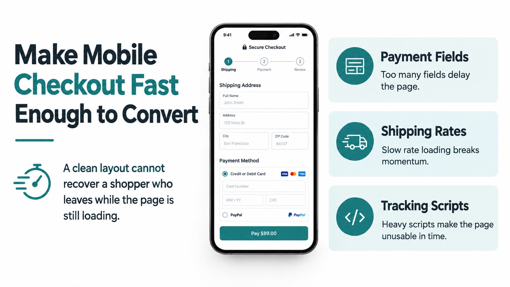
Make Mobile Checkout Fast Enough to Convert
A tidy checkout isn't useful if customers leave before its controls become usable. Payment fields, delivery calculations, and third-party scripts deserve attention alongside the visible design.
Google's historical mobile research found that increasing load time from 1 second to 10 seconds increased bounce probability by 123%; increasing page elements from 400 to 6,000 was associated with a 95% decline in conversion probability, according to its mobile page-speed benchmarks. These findings aren't WooCommerce-specific, and they aren't a forecast for your store. They support treating performance as a sales requirement.
The checkout screen needs to become usable, not merely appear on the phone.
Give Your Developer a Performance Brief
Don't ask vaguely to “speed up the website.” Request an investigation of checkout specifically, including what happens after a shopper changes an address, shipping choice, or payment method.
- Review extensions: Identify which plugins contribute work on checkout. Test disabling nonessential extensions in staging, a separate test environment.
- Reduce unnecessary assets: Compress and correctly size images. Check whether theme features unrelated to purchasing need to load.
- Control third-party scripts: Review chat widgets, analytics tags, and other external tools. Load them selectively without breaking required measurement or payment functions.
- Inspect delivery calculations: Investigate slow shipping-rate requests and repeated calculations.
- Check infrastructure: Review hosting capacity, database requests, and server response behavior before buying another optimization plugin.
Caching needs particular care. Ask the developer to cache only safe assets while keeping cart contents, customer sessions, security checks, and checkout totals dynamic. Don't approve a performance change that displays stale order information.
Measure the Actual Buying Page
Test on a phone using an ordinary cellular connection, not only office Wi-Fi. Enter an address, change delivery options, apply a valid coupon, and switch payment choices. Note waits, unresponsive controls, and movement that makes a button difficult to select.
Request checkout-specific Core Web Vitals reporting. Largest Contentful Paint concerns the main content appearing, Interaction to Next Paint concerns responsiveness, and Cumulative Layout Shift concerns unexpected movement. This guide to Core Web Vitals optimization can help frame that conversation with your developer.
Pair those measurements with add-to-cart activity, checkout starts, payment errors, and completed orders. A better technical score isn't sufficient evidence if shoppers still can't finish.
Approval standard: Ask for a demonstrated improvement in the buying experience, with no regression in totals, sessions, or payment processing.
Roll changes out progressively. Keep a record of what changed so your team can investigate an improvement or reverse a problem without guessing.
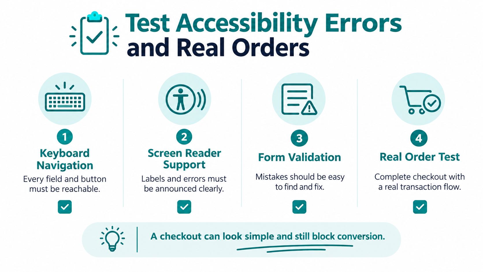
Test Accessibility Errors and Real Orders
A checkout can look simple and still exclude a buyer. A shopper must be able to reach the controls, understand the questions, identify mistakes, and finish payment without relying on a mouse or visual cues alone.
A 2025 Contentsquare Foundation evaluation found that checkout pages failed about half of the accessibility criteria tested, despite performing slightly better than cart pages overall, according to its ecommerce accessibility evaluation. Visual cleanup isn't proof of accessibility.
Treat the entire purchase journey as the test.
Check Whether Someone Can Actually Finish
Pair automated accessibility checks with keyboard and assistive-technology testing. Don't accept an accessibility plugin installation as the acceptance test.
- Keyboard navigation: Move through fields, address suggestions, delivery options, payment controls, and the order button without a mouse. Check that the current position is visible.
- Screen-reader support: Verify that labels, instructions, errors, and order-status messages are announced meaningfully.
- Embedded payment fields: Test payment inputs inside frames, not just the surrounding store page.
- Error recovery: Trigger an invalid coupon and missing required information. Confirm that messages identify the problem beside the affected control.
- Order confirmation: Complete the journey and verify that the shopper can understand whether the purchase succeeded.
Keep information the customer has already entered when they need to correct an error, except where payment-security requirements prevent that. Use real labels rather than placeholder text that disappears while typing. Don't rely only on color to distinguish a problem.
For Cincinnati-area healthcare, legal, and other public-facing organizations, inaccessible purchasing also deserves a reputational and legal-risk review. Ask qualified advisers about your obligations rather than treating a successful automated scan as a compliance guarantee.
Make Small Changes You Can Evaluate
Once blocking defects are resolved, compare focused changes instead of installing a collection of checkout plugins. Test a field removal, a guest-checkout adjustment, or a payment-label revision separately. Choose the change based on the evidence you collected.
Baymard's checkout usability research reports approximately 70.19% average cart abandonment and around 32 potential checkout improvements on the average large-scale site. Those broad benchmarks support systematic investigation, not a promise that your store will recover a particular amount of revenue.
Use completed orders, error-free checkout rate, authorization success, time to completion, and completed revenue per session to evaluate results. Avoid declaring success because more people clicked the order button when payments still failed afterward.
A practical user-testing process can also reveal where people hesitate or misunderstand instructions. Ask participants to complete a realistic purchase task without coaching them through the difficult parts.
Change a specific variable, record the outcome, and retain a rollback path. Otherwise, your team won't know which adjustment helped or introduced the next problem.
What to Fix First on Your Store
Prioritize working transactions before cosmetic preferences. If a payment method is unavailable or a keyboard user can't submit the order, fix that blocker immediately. Don't wait for a broader redesign to resolve a known purchasing failure.
For everything else, make the work follow the evidence. Your store doesn't need every optimization tactic at once. It needs a sequence your team can implement, verify, and maintain.
Put the Work in a Defensible Order
Start by confirming the abandonment cause. Review the affected devices and transaction paths, then reproduce the problem. If your reporting can't distinguish an exit from a failed payment, improve measurement before drawing conclusions.
Next, address cost visibility and remove nonessential form requirements. Apply the payment, mobile, and accessibility checks above before expanding the scope. Move any confirmed completion blocker ahead of routine refinements, regardless of where it sits in the project plan.
Keep a simple owner-facing scorecard.
| Check | What to record | Evidence to request |
|---|---|---|
| Field count | Required and optional fields | Reason for keeping each requirement |
| Visible steps | Screens or stages before confirmation | A walkthrough of the customer path |
| Payment methods tested | Intended methods and results | Completed tests and failure recovery |
| Mobile load experience | Waits and unresponsive controls | Phone testing and checkout measurements |
| Keyboard completion | Whether the journey is completable | A demonstrated purchase without a mouse |
Use the scorecard to discuss scope with your agency. It makes “optimize checkout” concrete enough to estimate and approve. It also helps prevent a project from drifting into unrelated design changes before the sales problem is understood.
Decide Between Configuration and Custom Work
A supported plugin or built-in setting can be enough for a straightforward presentation change. Ask whether it supports your checkout type, works with your gateways, and can be tested safely before release. Prefer the smallest maintainable change that solves the demonstrated problem.
Custom checkout work deserves consideration when the requirement crosses several systems. Subscriptions, unusual tax rules, specialized fulfillment, and fraud checks need coordinated testing, not a pile of extensions making independent decisions.
Ask whoever proposes the solution to explain:
- What will change: Identify the customer-facing behavior and affected integrations.
- What will be verified: Define successful orders, recovery paths, and back-office results.
- How it will be maintained: Establish responsibility for updates, monitoring, and rollback.
For your next review, gather a week of checkout starts, payment errors, and completed orders. Include the scorecard and examples of reproducible failures, but don't assume a short observation period proves every pattern.
Bring that evidence to HDM or your current web partner. You should be able to identify the next sensible investigation without committing to a full rebuild before anyone knows why the orders stopped.
Helbling Digital Media is a Springboro agency serving Greater Cincinnati, offering WooCommerce checkout, payment, and performance reviews within broader website and conversion projects. Visit Helbling Digital Media to discuss your checkout evidence and identify what to fix before investing in a redesign.